Edexcel A-Level Economics (9EC0) | Theme 1 and Theme 3
A single revision page for the microeconomics diagrams used across
the Edexcel Theme 1 and Theme 3 notes. Each card keeps the original
diagram image and adds a quick explanation of what to show in an
exam answer.
Diagram collection: This page includes the
diagrams currently referenced in the Edexcel Theme 1 and Theme 3
revision notes, with exact duplicate image files included once.
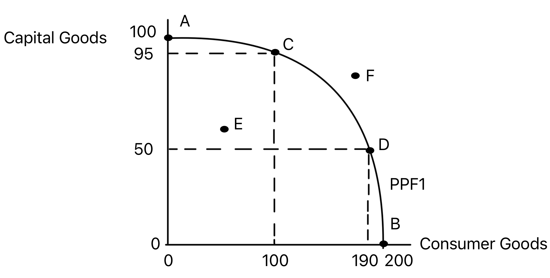
Shows the maximum combinations of two goods that can be
produced with existing resources and technology.
The curve shows scarcity, opportunity cost and productive
efficiency. Points on the frontier are productively
efficient, points inside it show unemployed or inefficiently
used resources, and points beyond it are currently
unattainable.
Use in exams: Use it for trade-offs,
opportunity cost, productive efficiency and short-run spare
capacity.
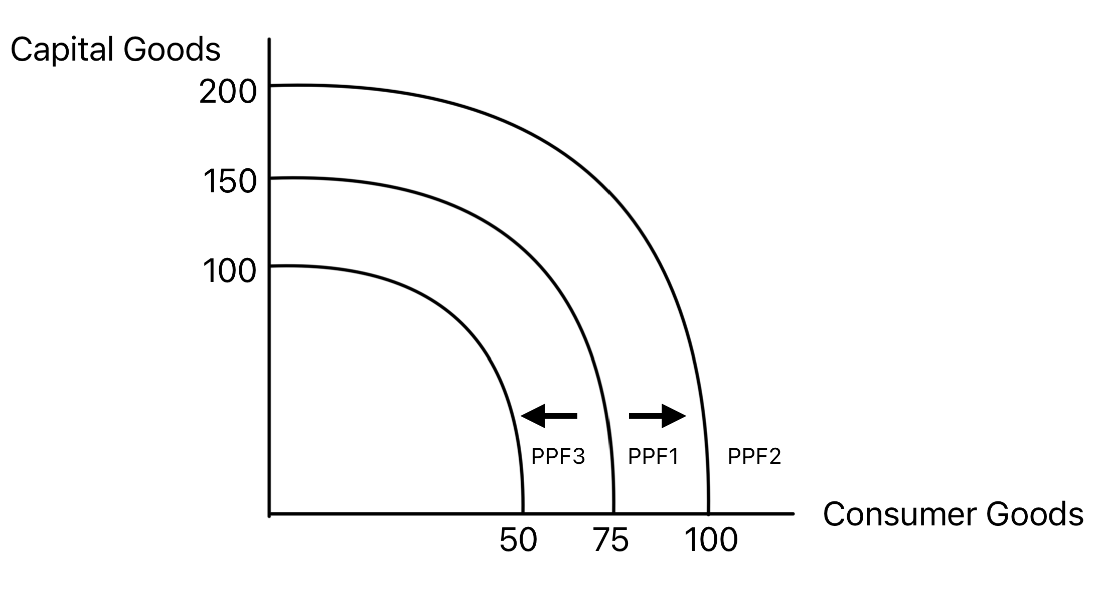
Shows how an economy's productive potential changes when
productive capacity rises or falls.
An outward shift represents economic growth caused by more
or better-quality resources, improved technology, or higher
productivity. An inward shift represents a loss of
productive potential.
Use in exams: Use it when explaining
long-run growth, natural disasters, investment, education,
migration or technological progress.
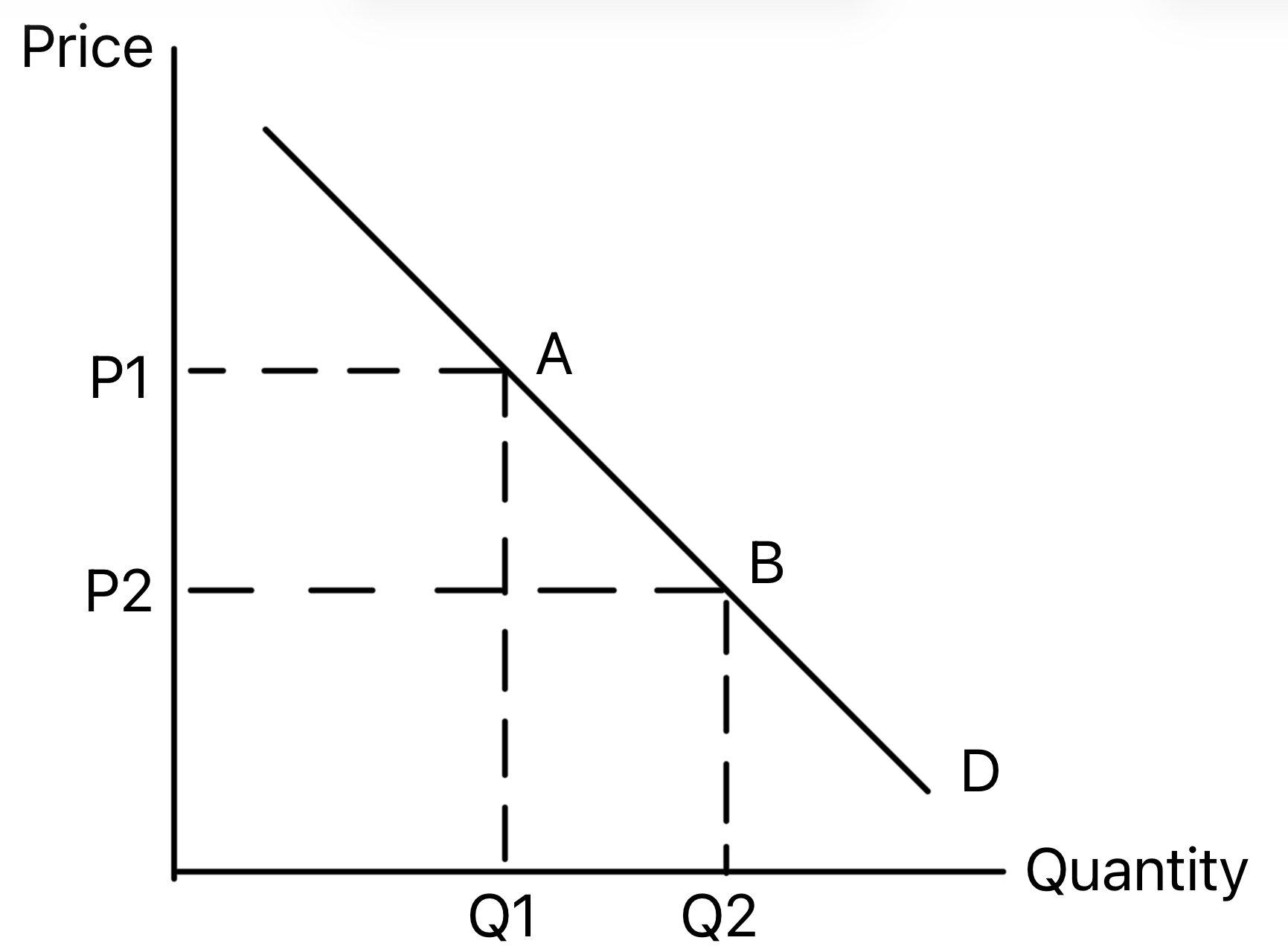
Shows an extension or contraction in quantity demanded
caused by a change in the good's own price.
A fall in price causes an extension down the demand curve,
while a rise in price causes a contraction up the curve. The
demand curve itself does not shift.
Use in exams: Use it when the only direct
cause is a change in the price of the product itself.
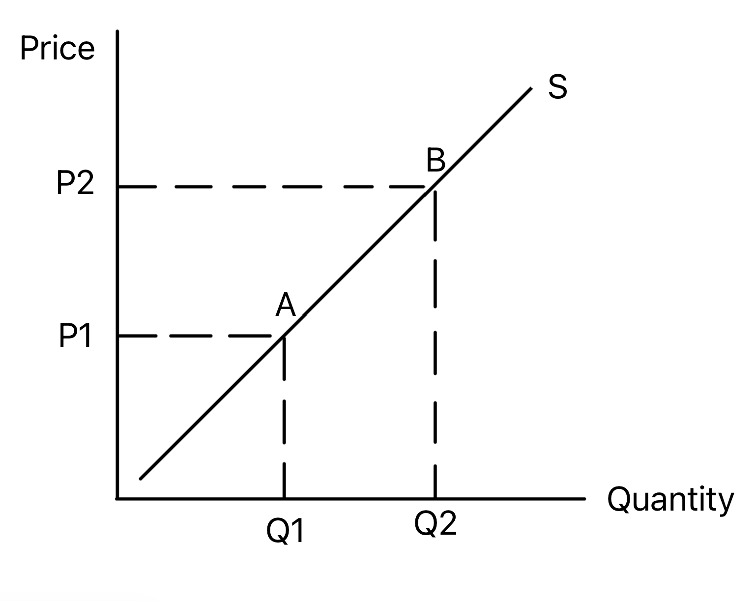
Shows an extension or contraction in quantity supplied
caused by a change in the good's own price.
A rise in price normally causes an extension up the supply
curve, while a fall in price causes a contraction down the
curve. The supply curve itself does not shift.
Use in exams: Use it when producers respond
to a price change rather than a change in production
conditions.
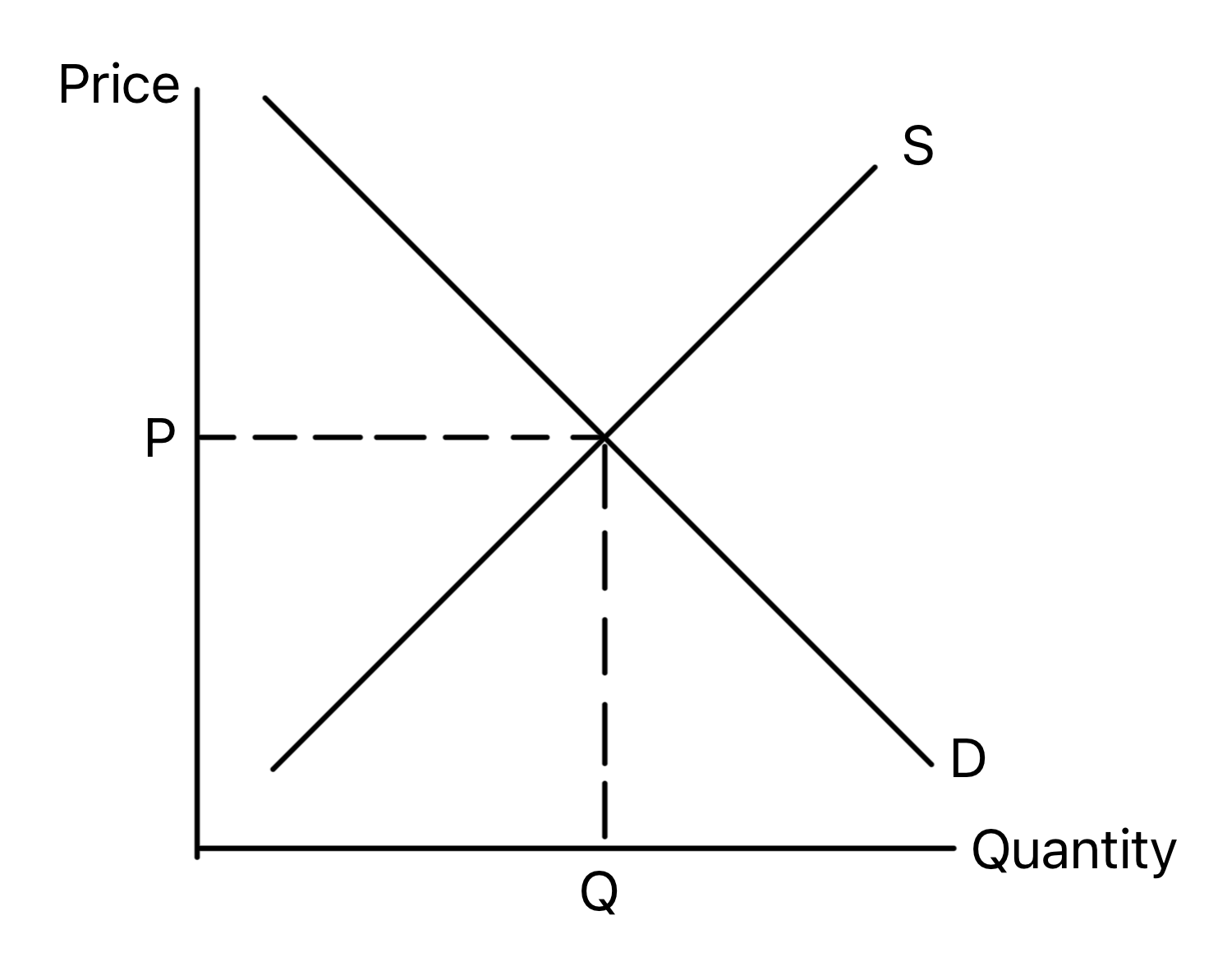
Shows the price and quantity where demand equals supply.
Equilibrium occurs where quantity demanded equals quantity
supplied. At this point there is no tendency for price to
rise or fall, assuming ceteris paribus.
Use in exams: Use it as the starting point
before showing a shift, shortage, surplus or intervention.
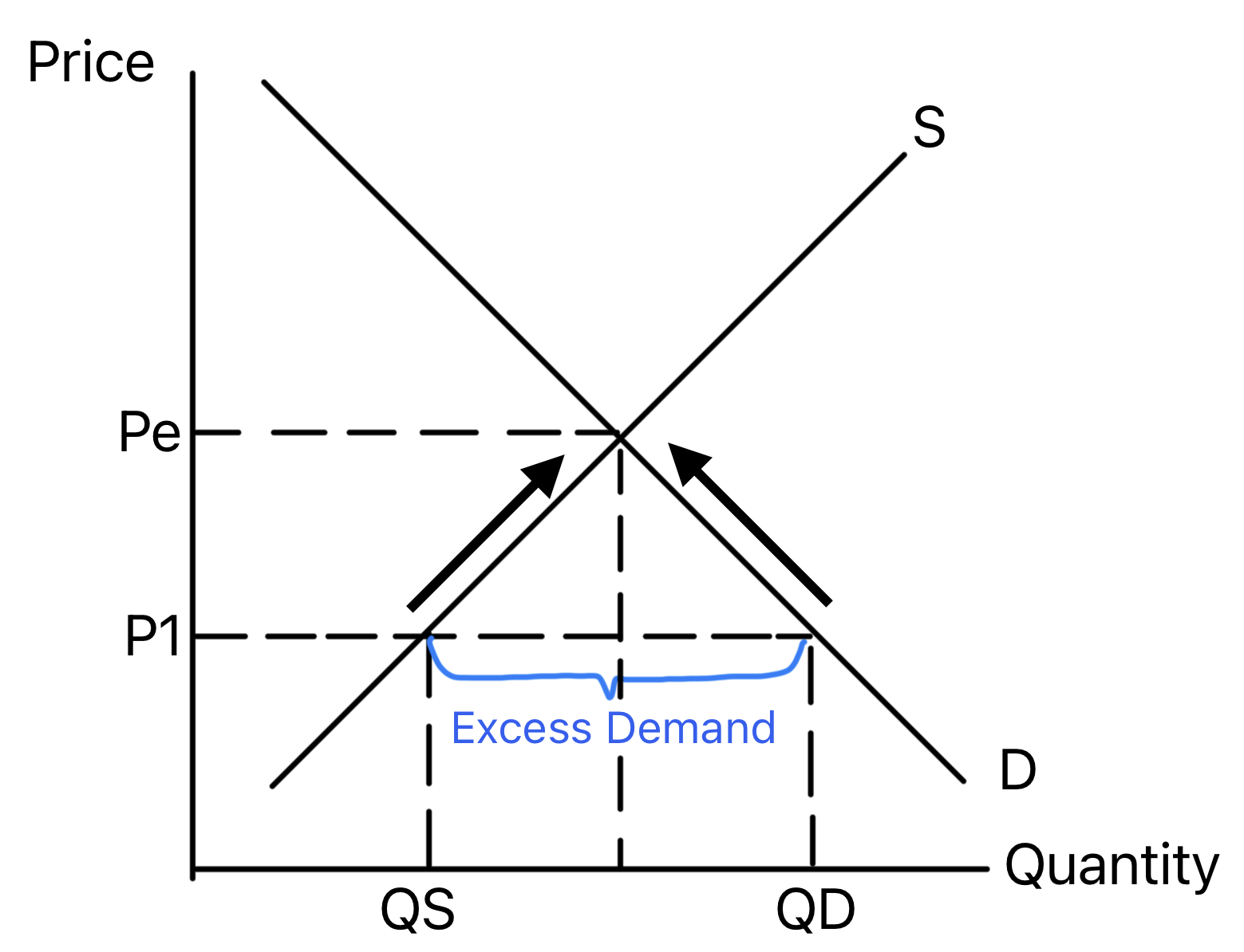
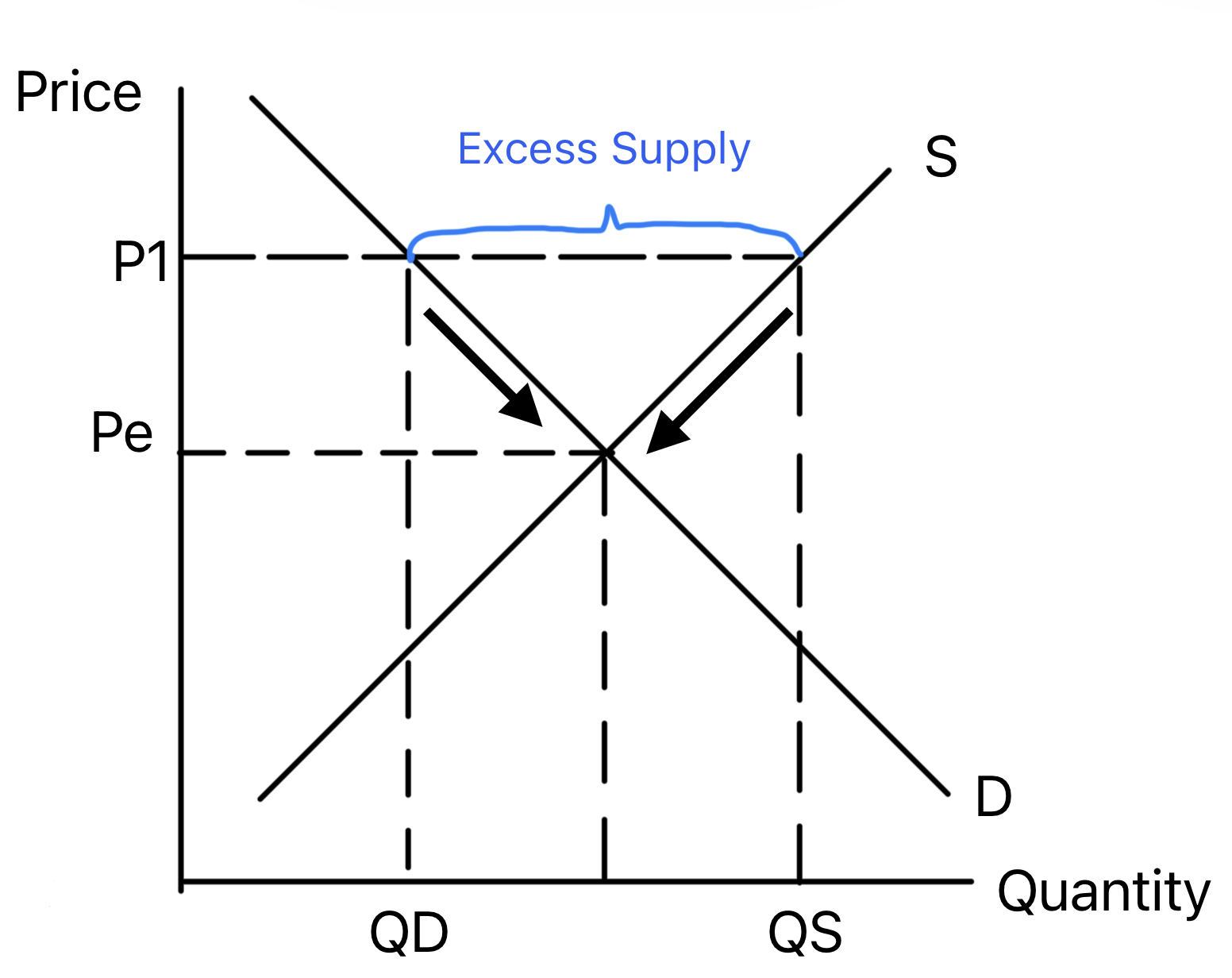
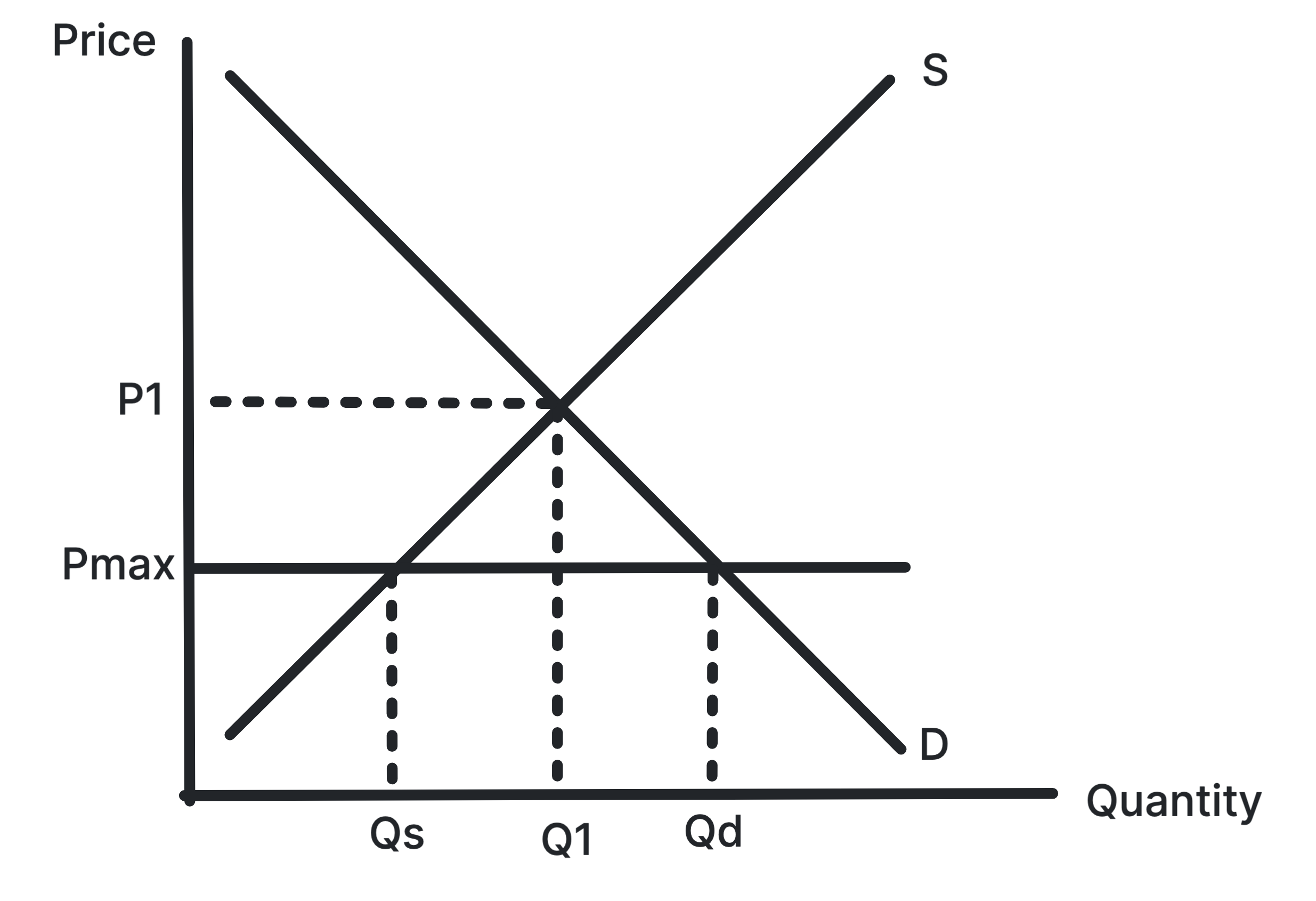
Shows a shortage when price is set below the equilibrium
price.
At a price below equilibrium, consumers want to buy more
than firms are willing to supply. Competitive pressure
should push prices up toward equilibrium.
Use in exams: Use it for shortages,
rationing, queues and maximum price controls below
equilibrium.
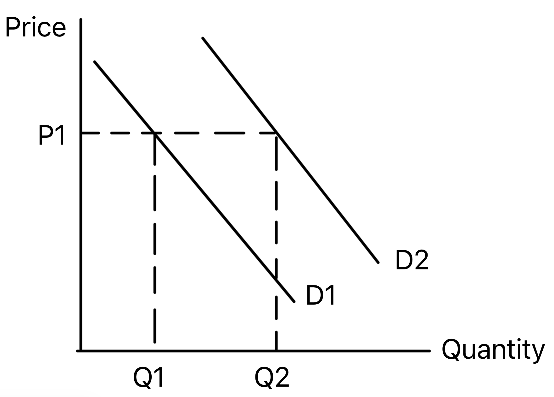
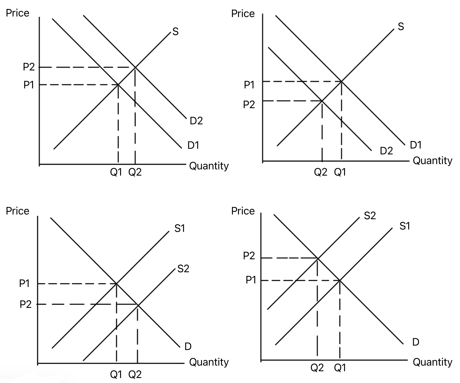
Shows demand shifting right, causing a higher equilibrium
price and quantity.
A rise in demand creates excess demand at the original
price. Price then rises, encouraging more supply and
reducing quantity demanded until the market clears.
Use in exams: Use it for rising popularity,
higher income for normal goods, or higher prices of
substitutes.
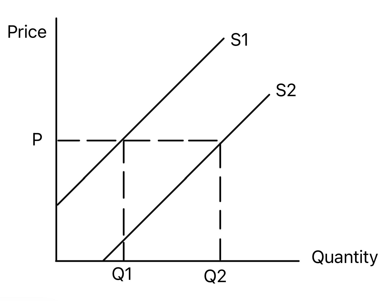
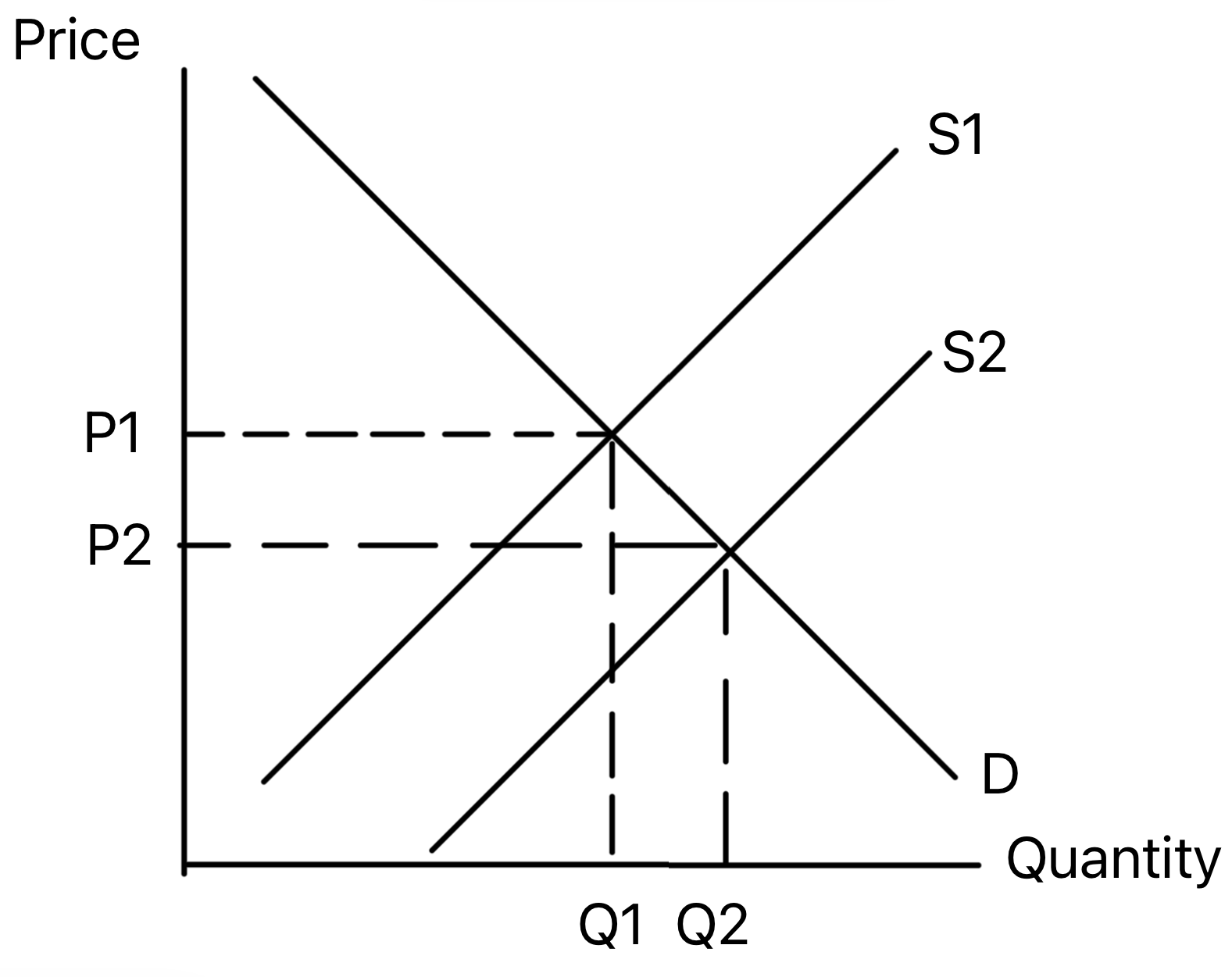
Shows supply shifting right, causing a lower equilibrium
price and higher quantity.
A rise in supply creates excess supply at the original
price. Price then falls, encouraging consumers to buy more
until the market reaches a new equilibrium.
Use in exams: Use it for lower costs,
productivity improvements, subsidies, new firms or improved
technology.
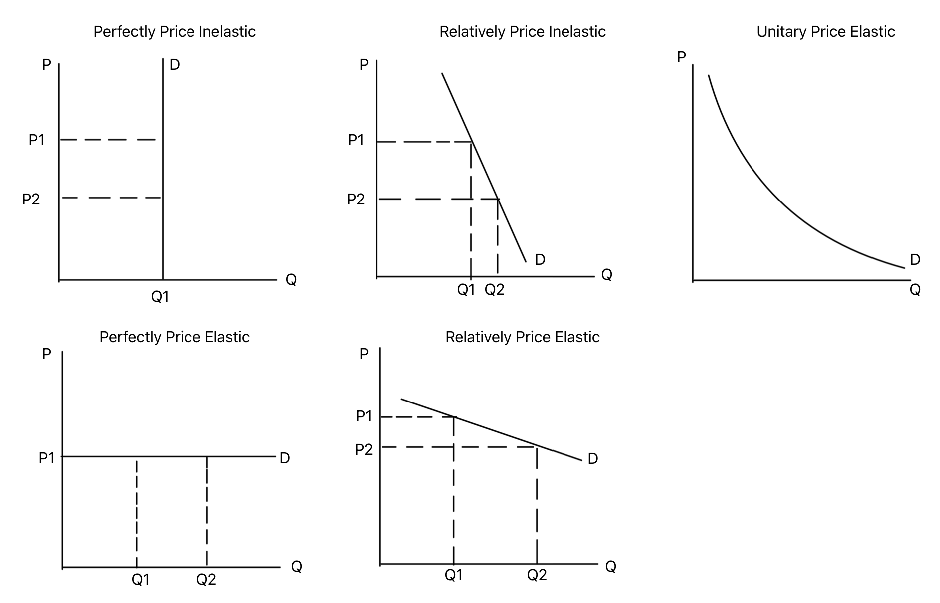
Shows how demand curve steepness relates to price
elasticity of demand.
Steeper demand curves are more price inelastic, while
flatter curves are more price elastic. Perfectly inelastic
demand is vertical, and perfectly elastic demand is
horizontal.
Use in exams: Use it when explaining the
effect of price changes, taxes or market power on revenue and
quantity demanded.
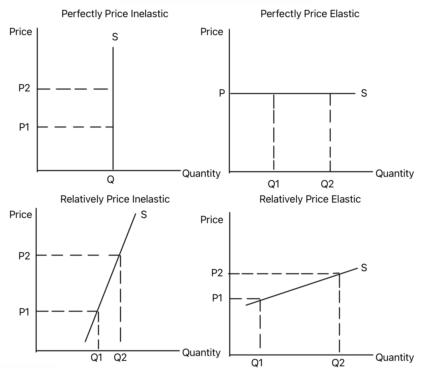
Shows how supply curve steepness relates to price
elasticity of supply.
Steeper supply curves are more price inelastic, while
flatter curves are more price elastic. Elasticity depends on
spare capacity, stock levels, production time and factor
mobility.
Use in exams: Use it when analysing how
quickly firms can respond to price changes or demand shocks.
Consumer Surplus, Producer Surplus, Taxes and Subsidies
Theme 11.2.8
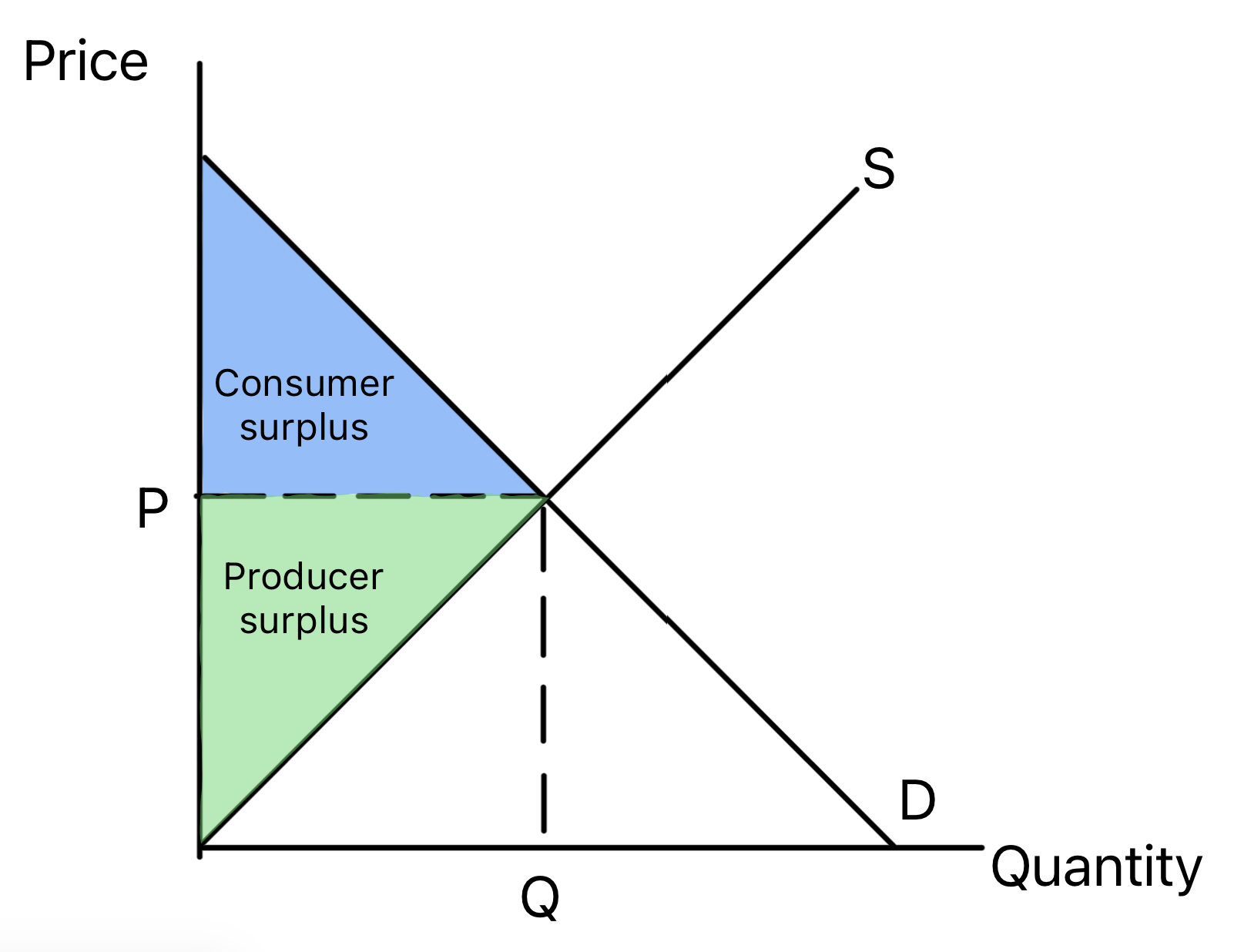
Consumer and Producer Surplus
Shows consumer surplus above the market price and producer
surplus below it.
Consumer surplus is the extra welfare buyers gain when they
pay less than they were willing to pay. Producer surplus is
the extra welfare sellers gain when they receive more than
the minimum they were willing to accept.
Use in exams: Use it to analyse welfare
changes, allocative efficiency and the impact of market
interventions.
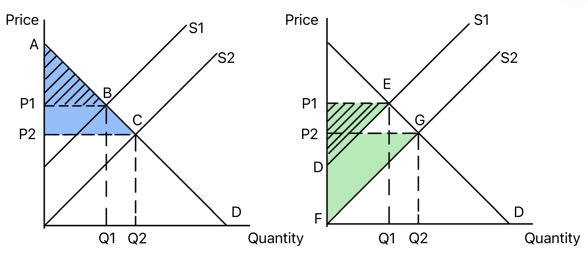
Shows how an outward shift of supply changes consumer and
producer surplus.
Higher supply lowers price and raises quantity. Consumer
surplus usually increases because consumers pay less and buy
more, while producer surplus changes depending on the size
of the price fall and quantity rise.
Use in exams: Use it for subsidies,
productivity improvements, lower input costs and welfare
analysis.
Shows how an outward shift of demand changes consumer and
producer surplus.
Higher demand raises price and quantity. Producer surplus
usually increases because firms sell more at a higher price,
while consumer surplus changes depending on the new price
and quantity.
Use in exams: Use it when a demand shock
changes welfare, such as a rise in incomes or consumer
confidence.
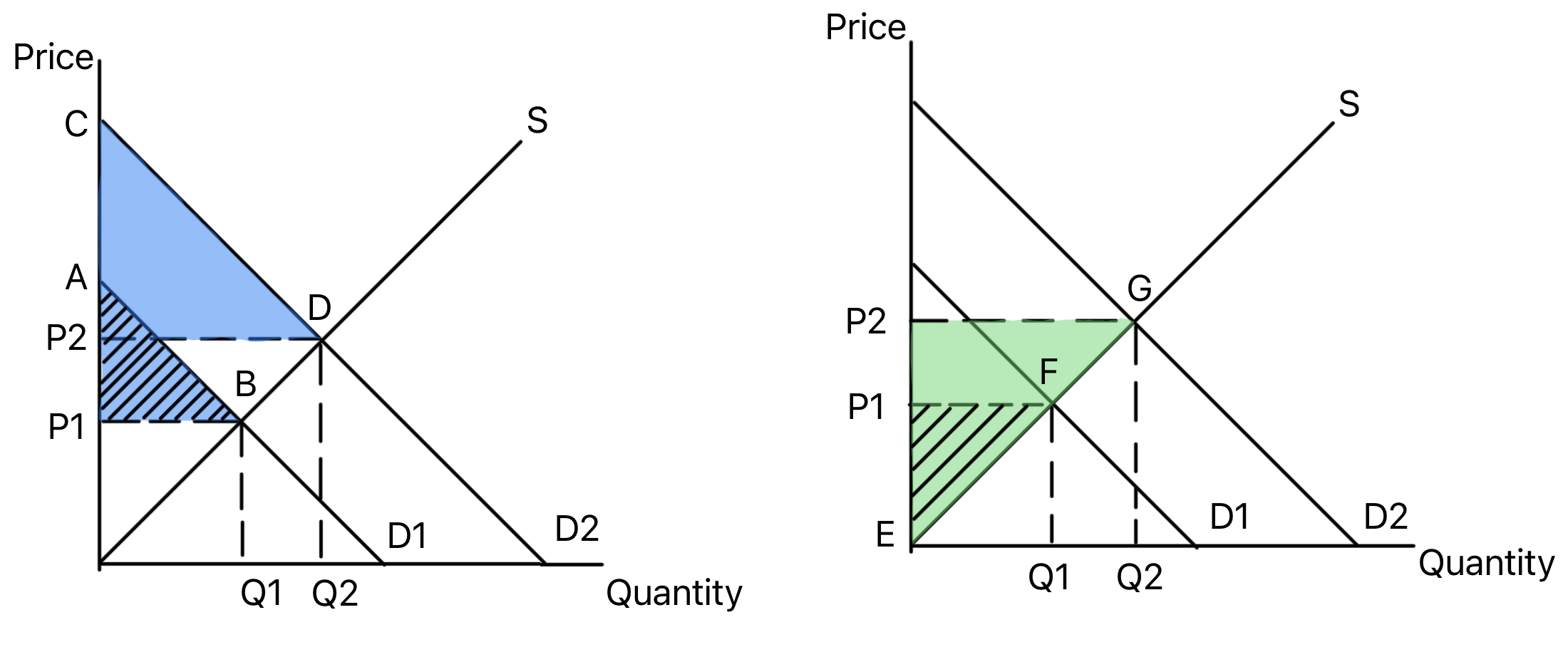
Shows a specific indirect tax shifting supply left and
raising the market price.
The vertical distance between the old and new supply curves
is the tax per unit. The tax burden is shared between
consumers and producers depending on the relative elasticities
of demand and supply.
Use in exams: Use it for taxes on goods
with external costs, demerit goods and government revenue.
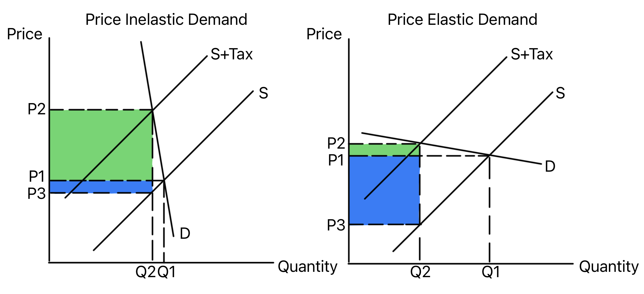
Compares the effect of an indirect tax when demand is
price inelastic and price elastic.
When demand is price inelastic, consumers bear more of the
tax and quantity falls by less. When demand is price elastic,
producers bear more of the tax and quantity falls by more.
Use in exams: Use it to evaluate whether a
tax will reduce consumption or mainly raise revenue.
Shows a subsidy shifting supply right and lowering the
market price.
A subsidy reduces firms' costs, increasing supply. The
benefit is shared between consumers and producers depending
on relative elasticities, while government spending covers
the subsidy cost.
Use in exams: Use it for merit goods,
positive externalities and policies designed to increase
output.
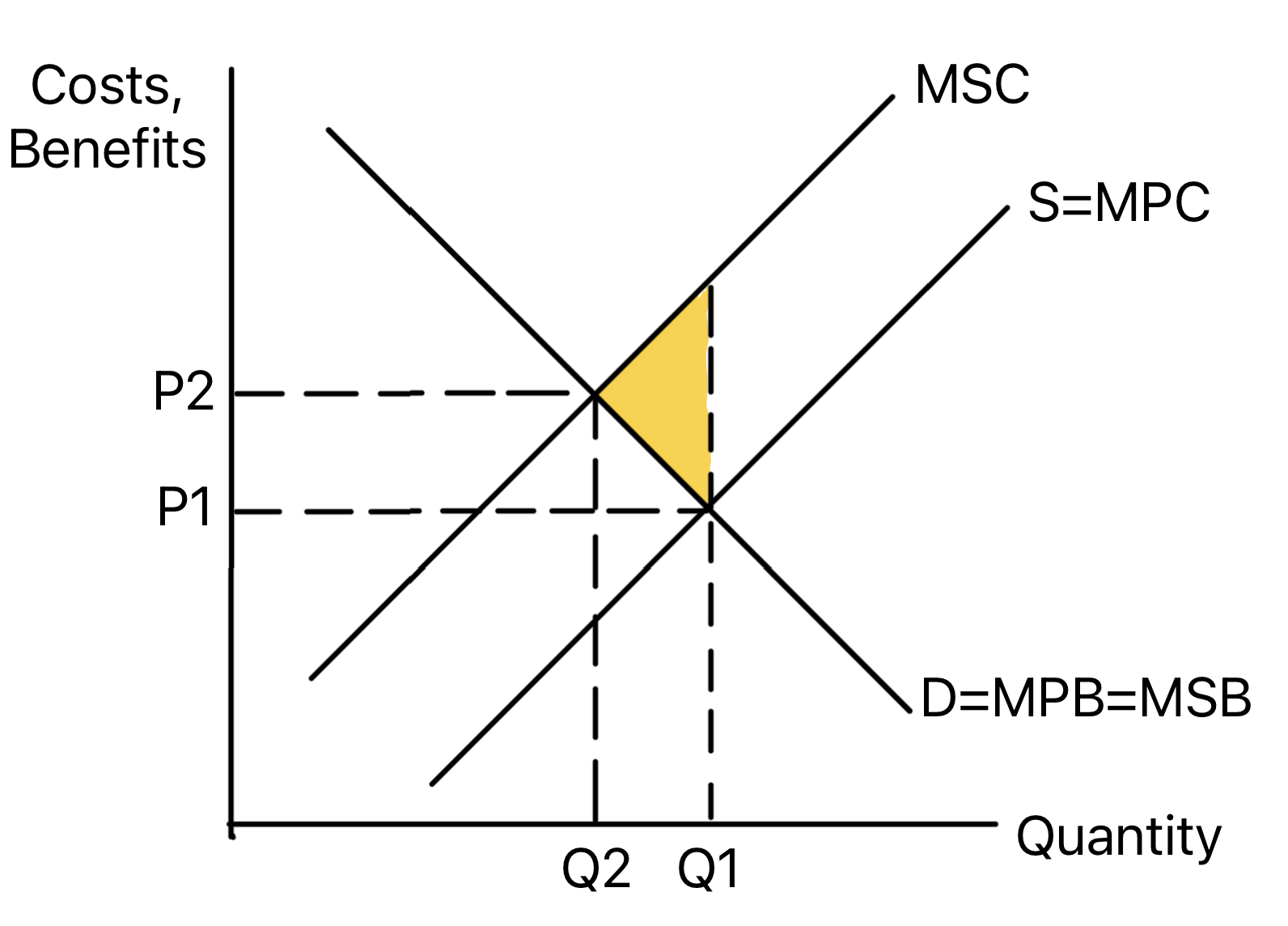
Consumers only consider private benefits, so marginal
private benefit is below marginal social benefit. The market
under-consumes the good relative to the social optimum.
Use in exams: Use it for merit goods,
education, healthcare, vaccination and subsidy arguments.
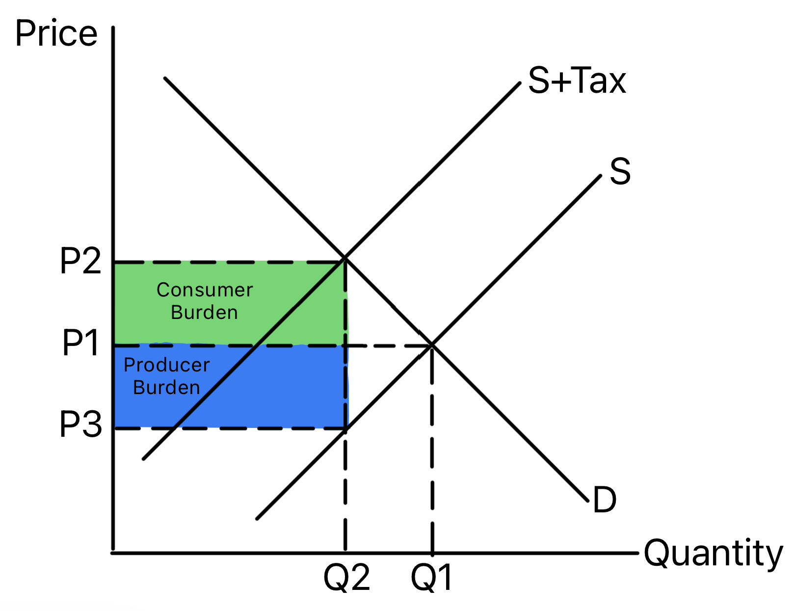
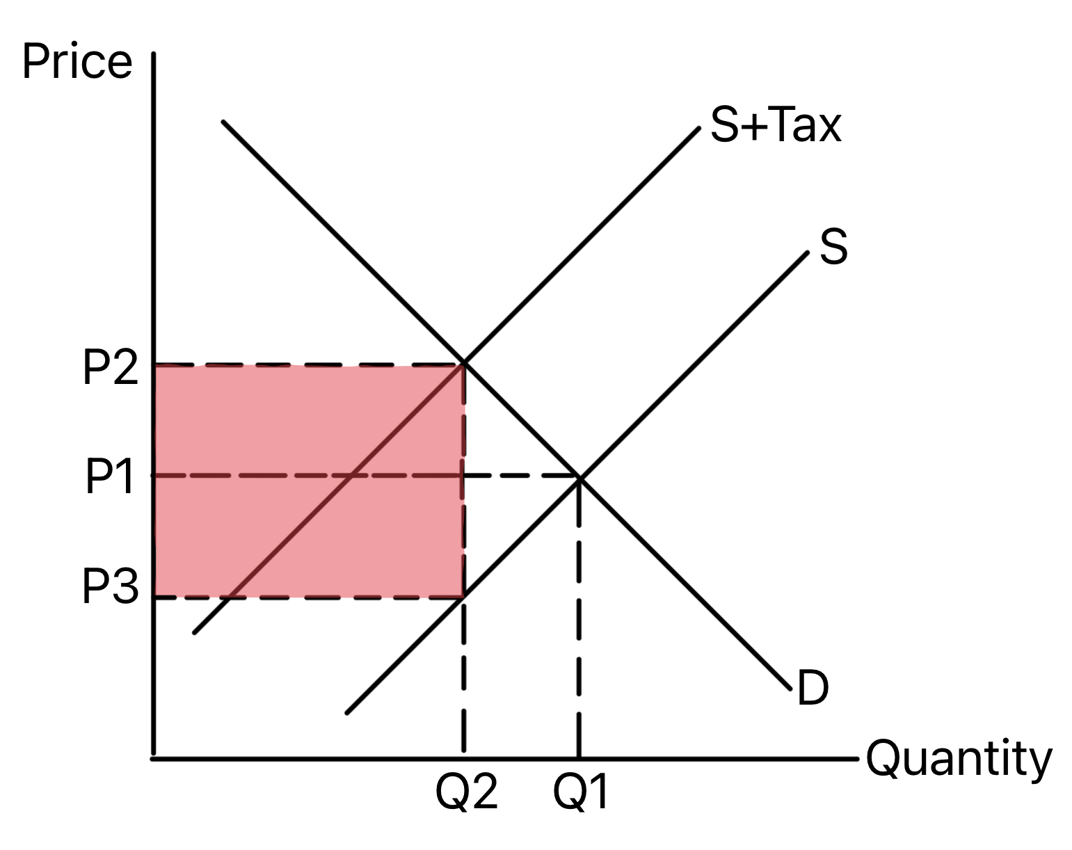
Shows how an indirect tax raises price, reduces quantity
and creates government revenue.
The tax shifts supply left and creates a gap between the
price consumers pay and the price producers receive. The tax
per unit multiplied by the new quantity gives government
revenue.
Use in exams: Use it to analyse demerit
goods, external costs and the trade-off between revenue and
lower consumption.
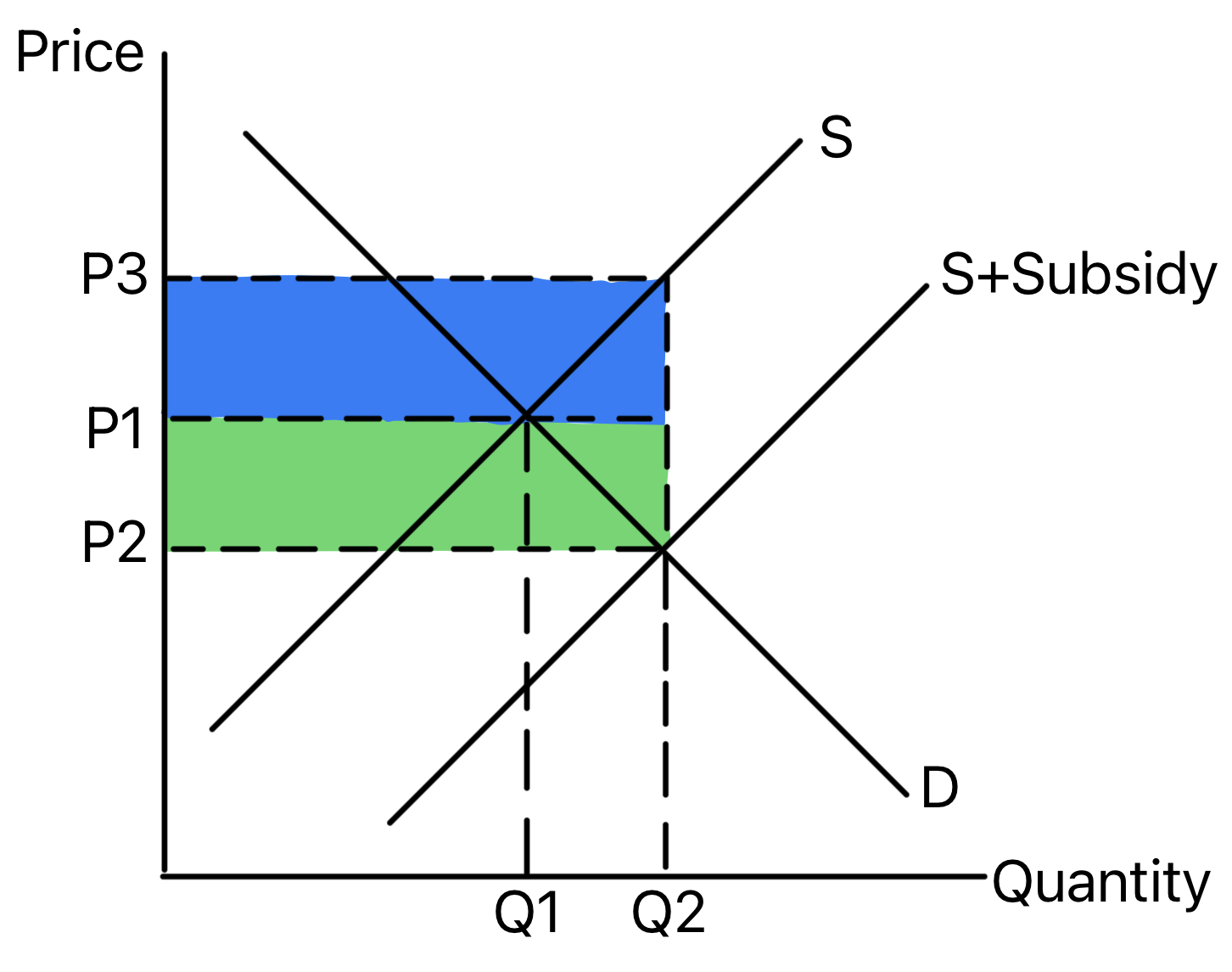
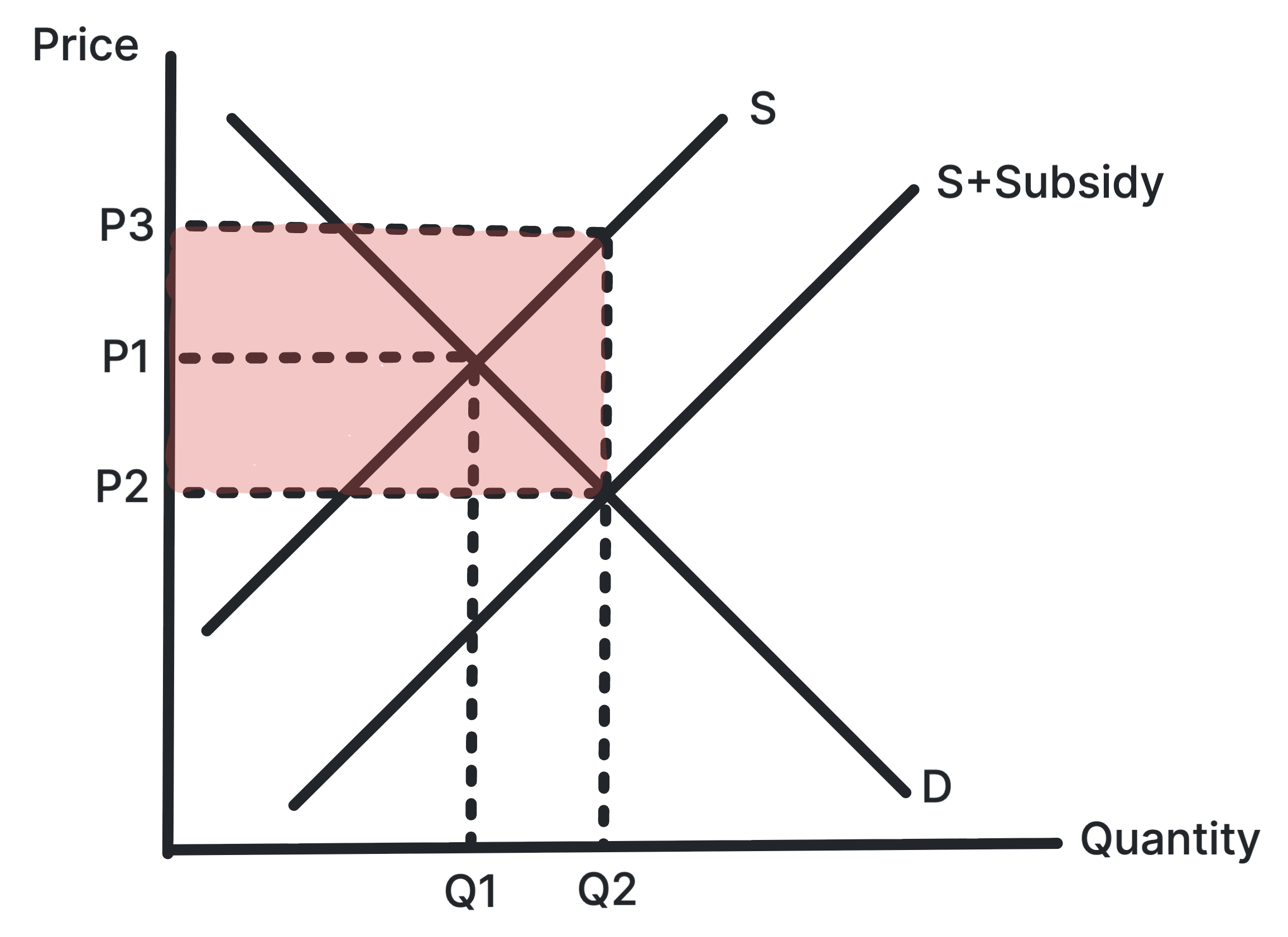
Shows how a subsidy lowers price, raises quantity and
creates a cost to government.
The subsidy shifts supply right and creates a gap between
the price consumers pay and the price producers receive. The
subsidy per unit multiplied by the new quantity gives total
government expenditure.
Use in exams: Use it for merit goods,
positive externalities, affordability and intervention costs.
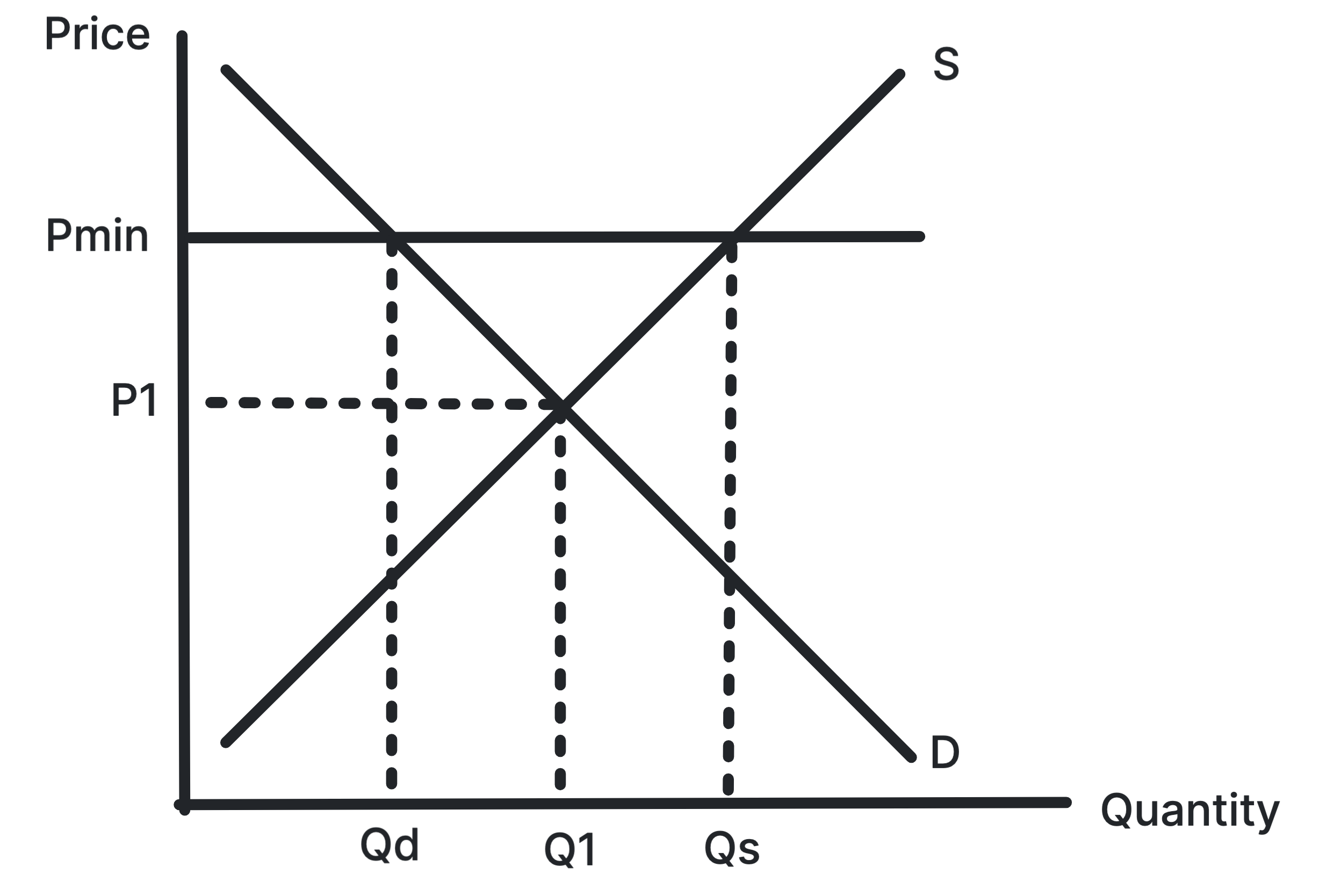
Shows a price floor above equilibrium creating excess
supply.
A minimum price is only effective if it is set above the
market equilibrium. It can raise producer incomes or reduce
consumption but creates a surplus.
Use in exams: Use it for agricultural
prices, alcohol pricing, labour markets and intervention
evaluation.
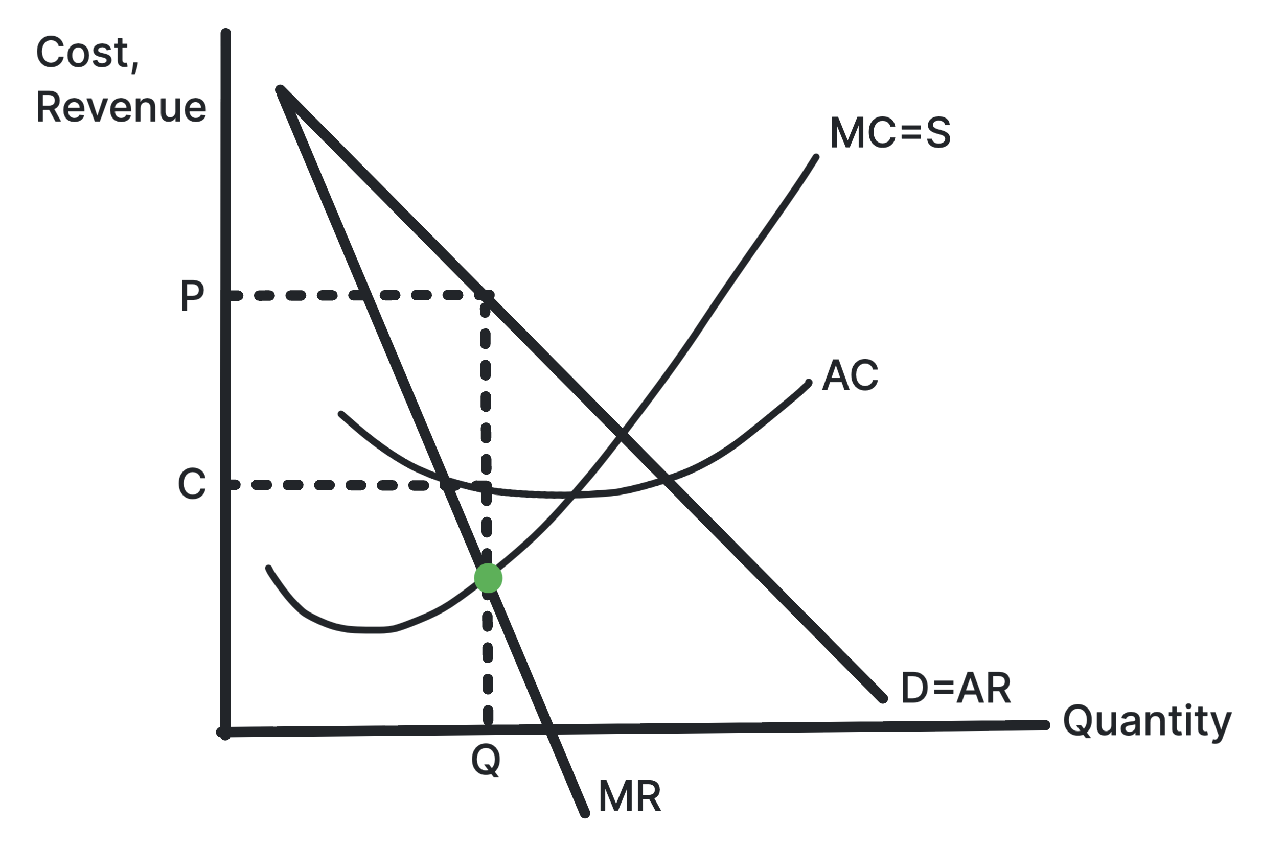
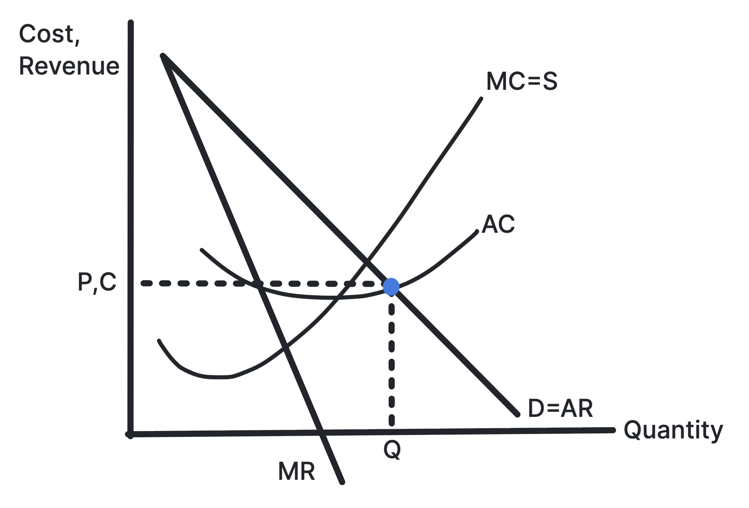
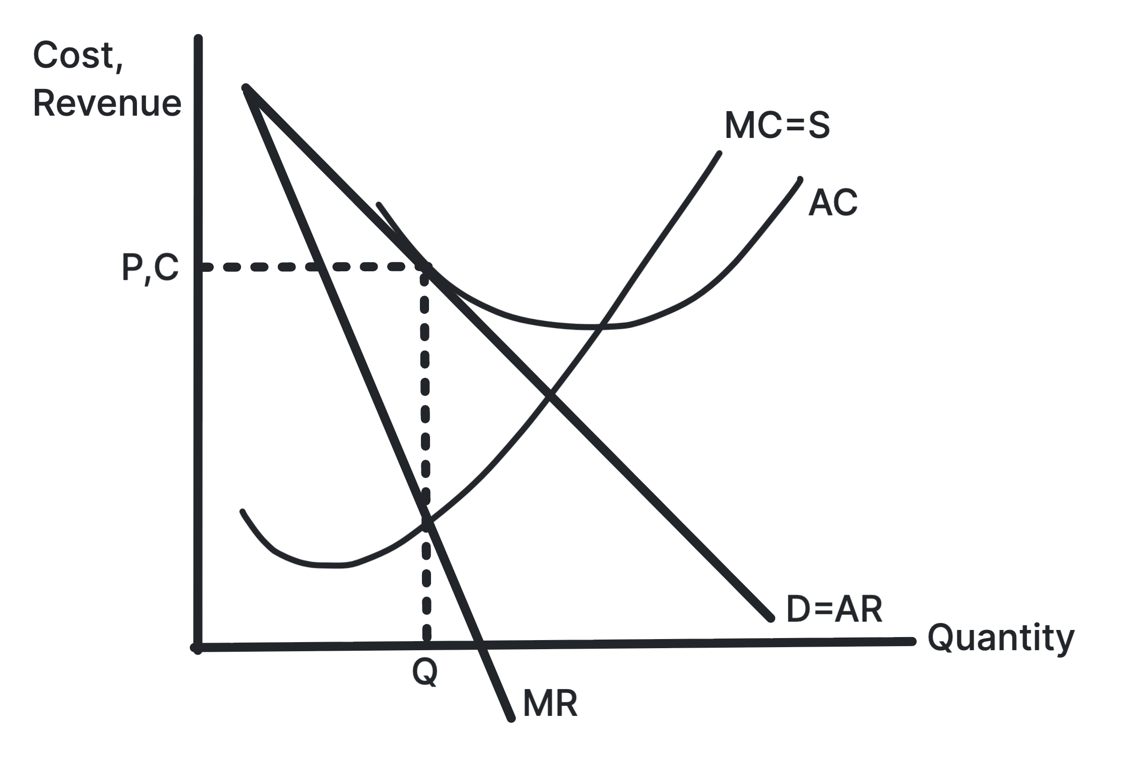
Profit is maximised at the output where the extra cost of
producing one more unit equals the extra revenue from selling
it. Price is then read from the AR curve.
Use in exams: Use it when comparing profit
maximisation with revenue maximisation, sales maximisation
or satisficing.
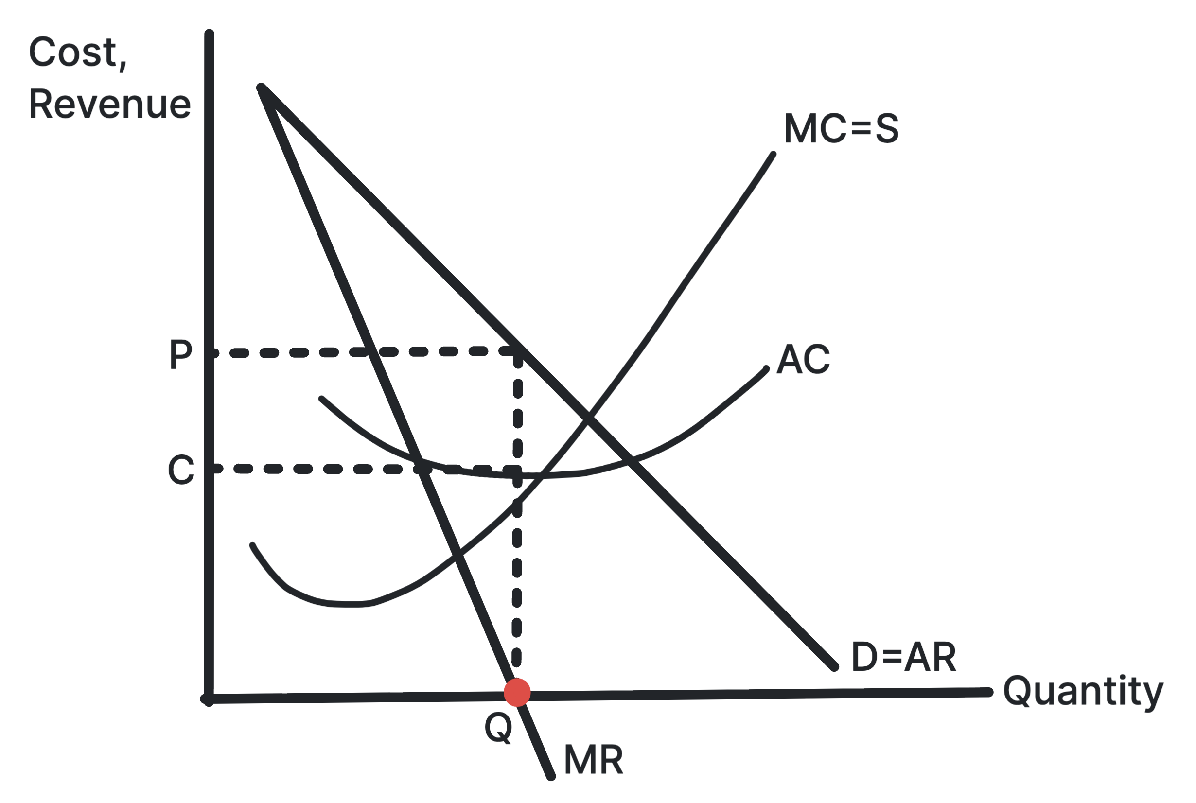
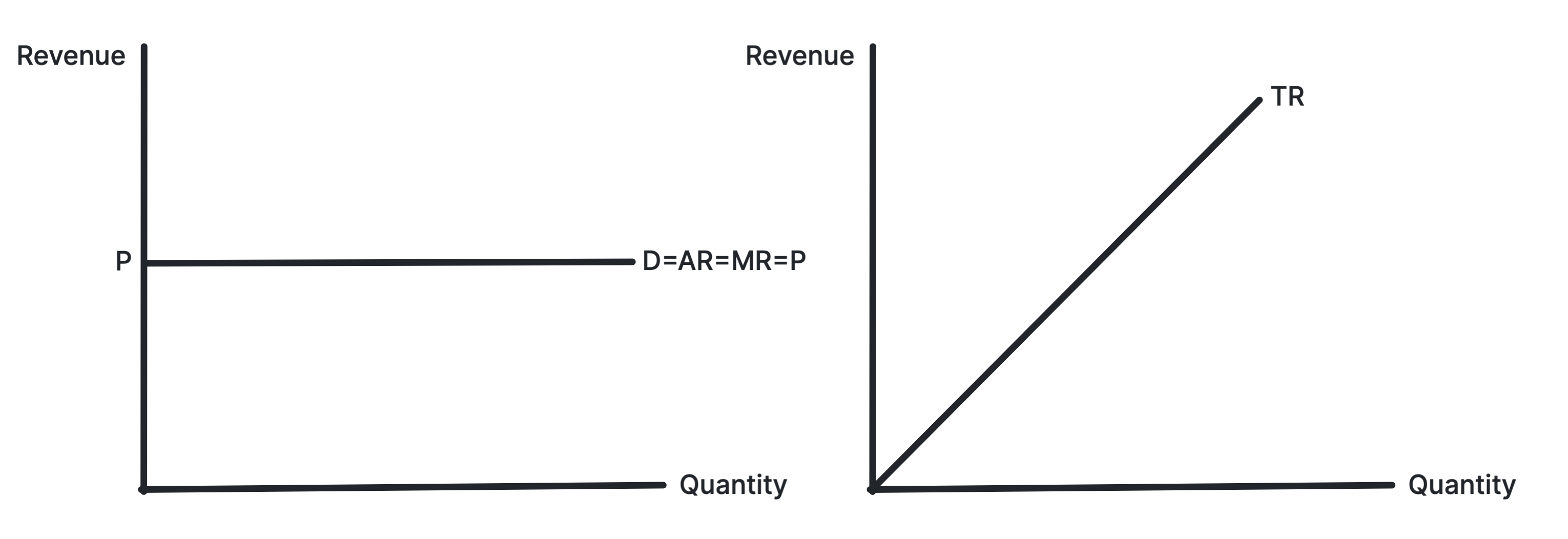
Shows AR and MR as horizontal at the market price.
A perfectly competitive firm is a price taker, so each extra
unit is sold at the same price. This makes AR equal to MR,
and total revenue rises at a constant rate.
Use in exams: Use it when explaining why
individual firms in perfect competition face perfectly
elastic demand.
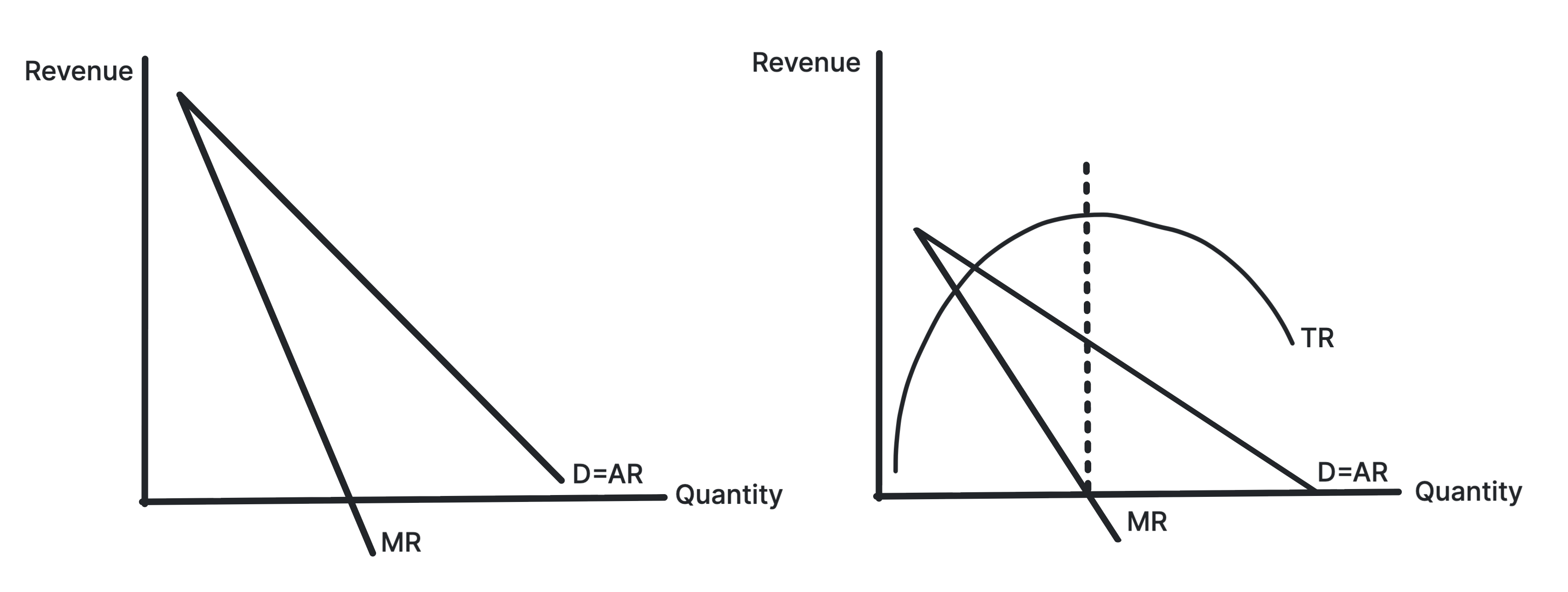
A firm with market power must lower price to sell more
output. Marginal revenue lies below average revenue because
extra sales reduce the price on previous units.
Use in exams: Use it for monopoly,
oligopoly and monopolistic competition diagrams.
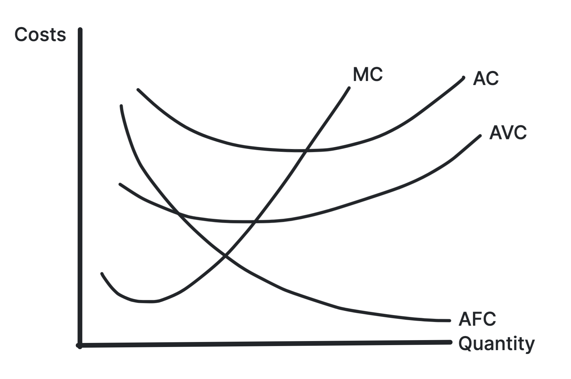
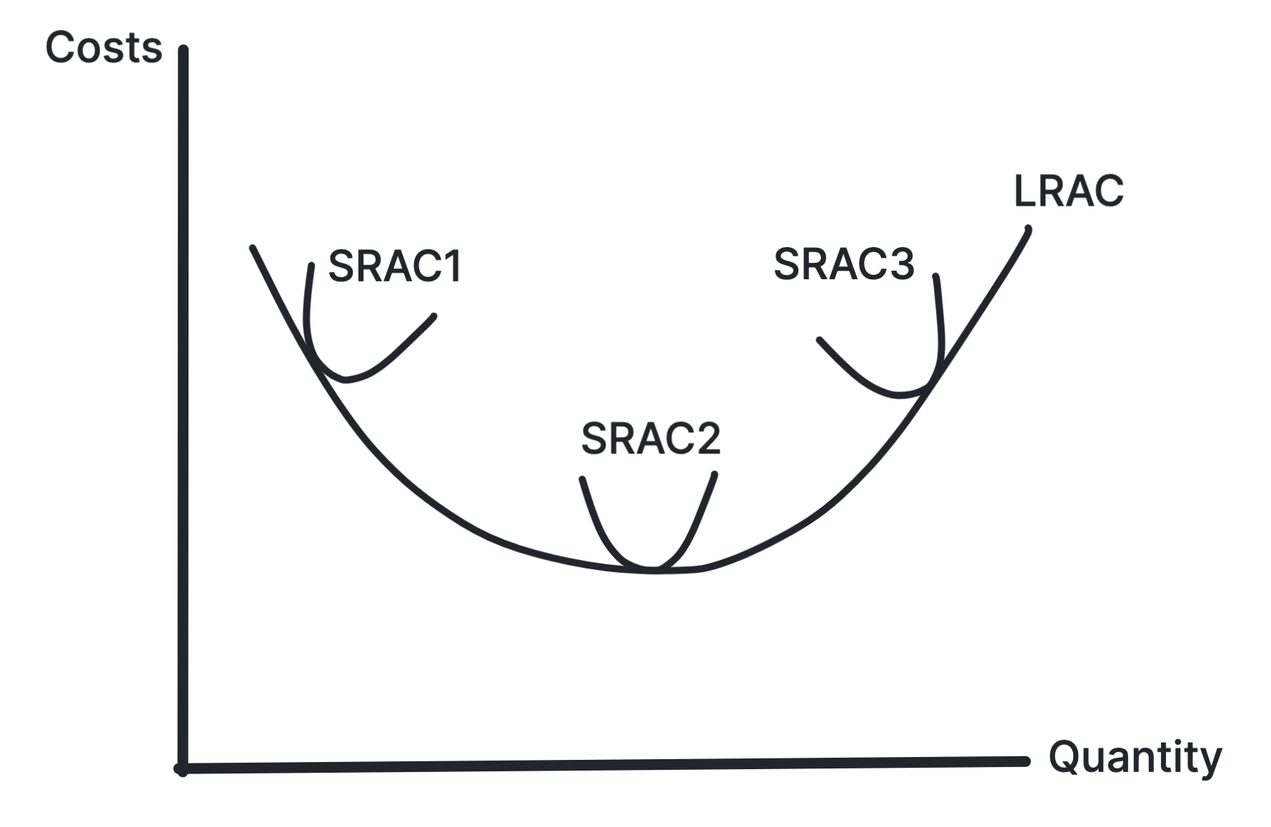
Shows how long-run average cost changes as the firm
expands its scale.
The LRAC curve falls when economies of scale dominate and
rises when diseconomies of scale dominate. The minimum point
shows the lowest average cost attainable in the long run.
Use in exams: Use it for economies of
scale, diseconomies of scale, natural monopoly and minimum
efficient scale.
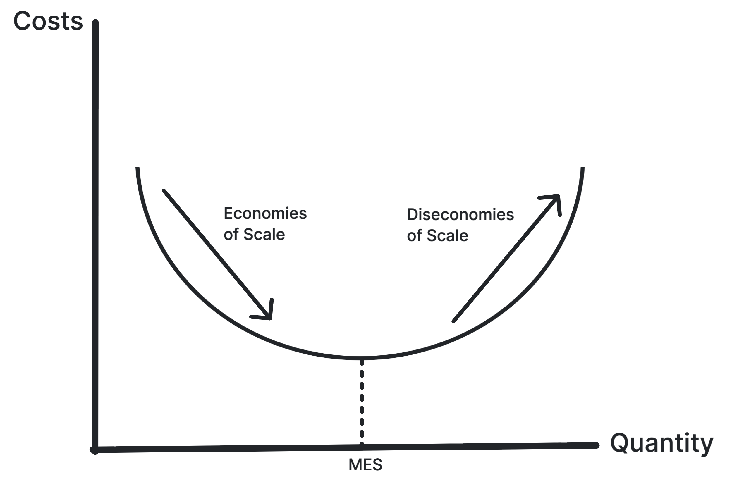
Shows the falling and rising sections of LRAC and the
minimum efficient scale.
As output expands, average costs may fall because of
purchasing, technical, financial, managerial, marketing or
risk-bearing economies. Beyond the efficient scale,
diseconomies can push LRAC upward.
Use in exams: Use it for business growth,
market concentration, barriers to entry and natural monopoly.
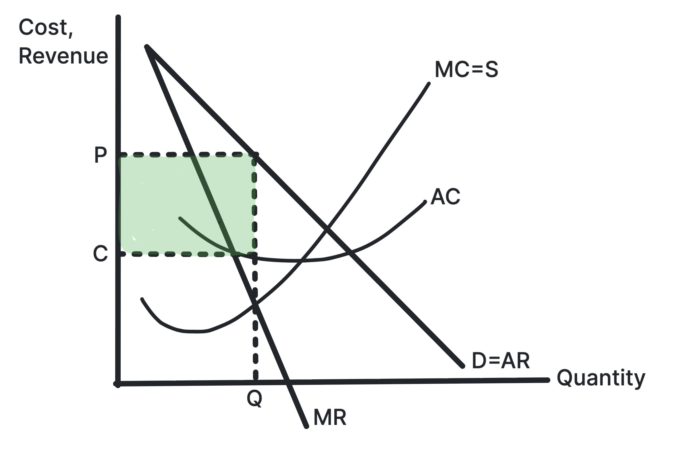
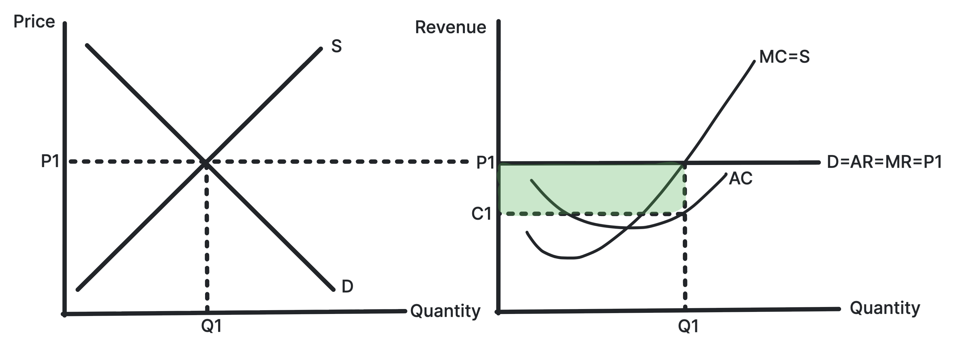
Shows profit where AR is above AC at the profit-maximising
output.
The firm produces where MC equals MR, then charges the price
on the AR curve. If price exceeds average cost at that
output, the shaded rectangle represents supernormal profit.
Use in exams: Use it for monopoly,
monopolistic competition, short-run perfect competition and
barriers to entry.
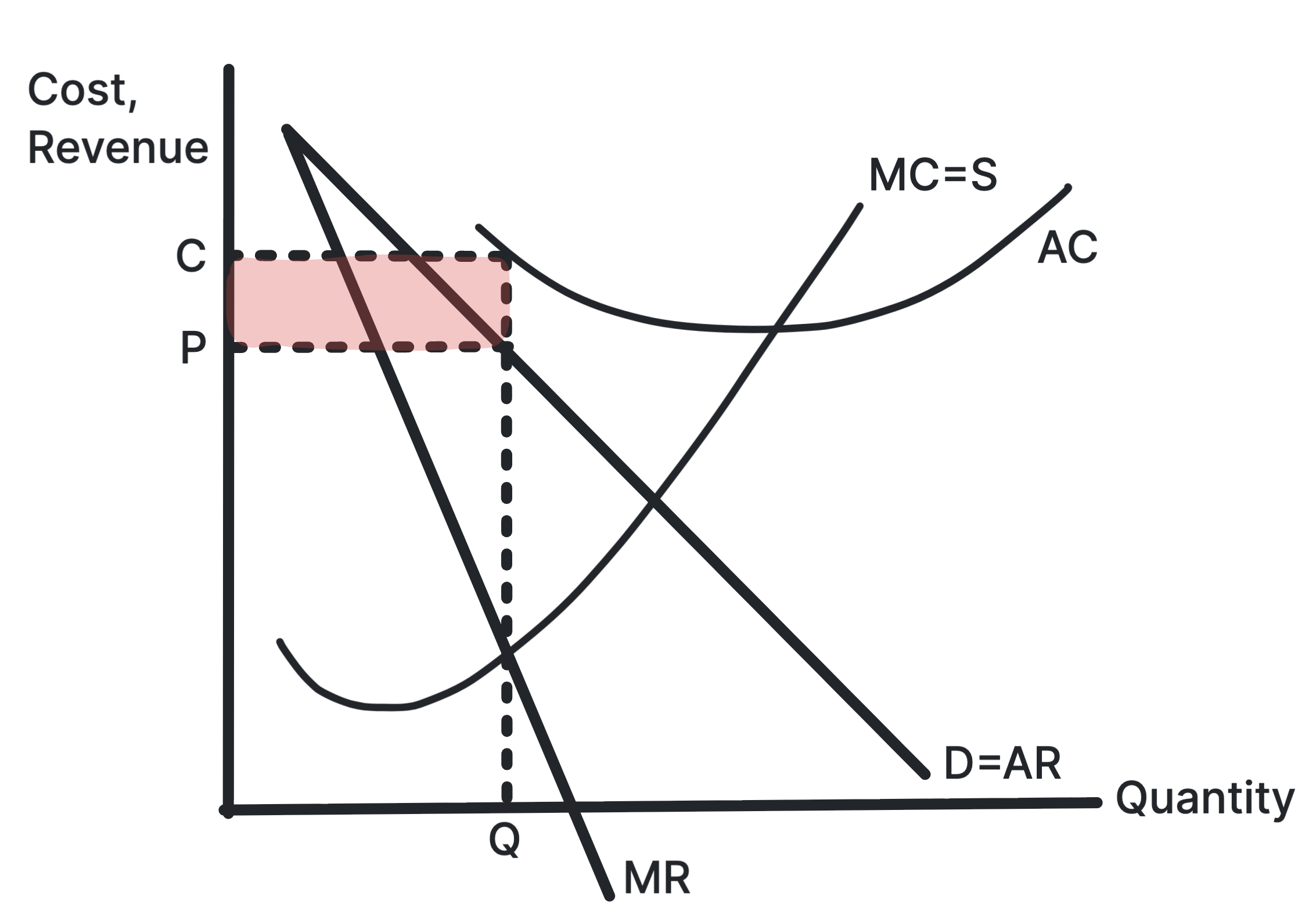
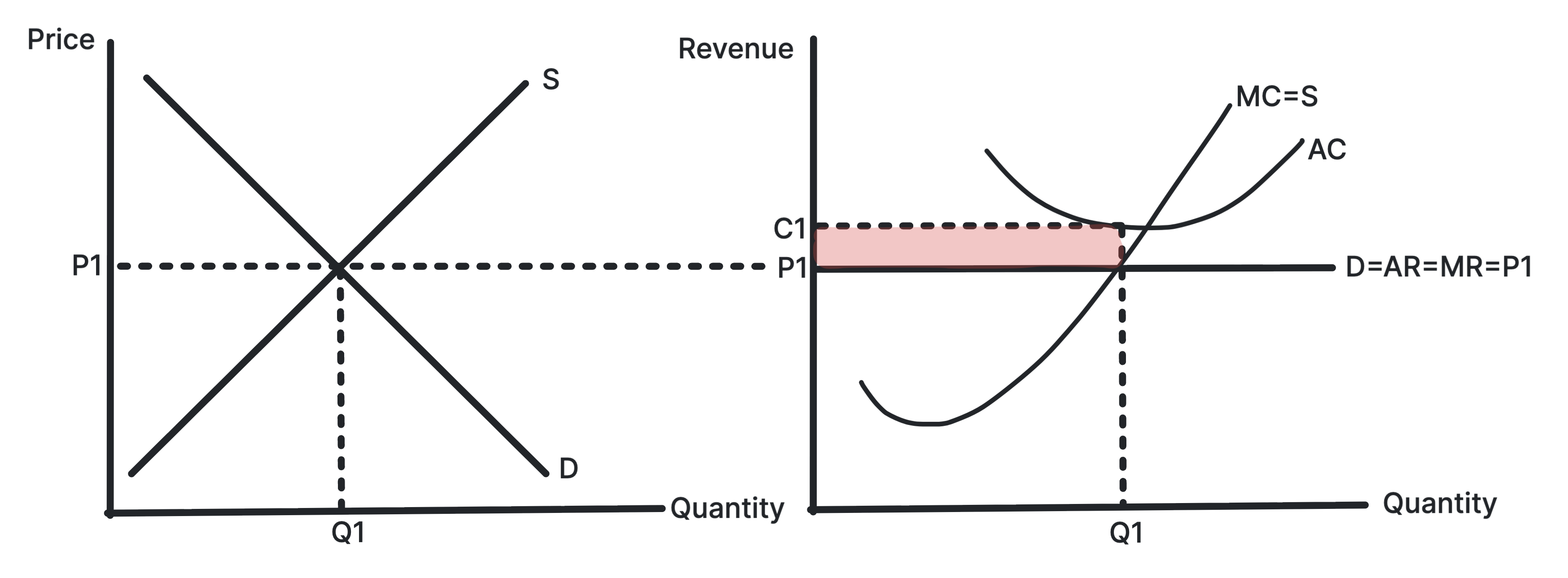
Shows a loss where AR is below AC at the profit-maximising
output.
The firm still produces where MC equals MR, but the price
from AR is below average cost. The shaded rectangle shows
the loss per unit multiplied by output.
Use in exams: Use it for short-run losses,
market exit and the adjustment process in perfect
competition.
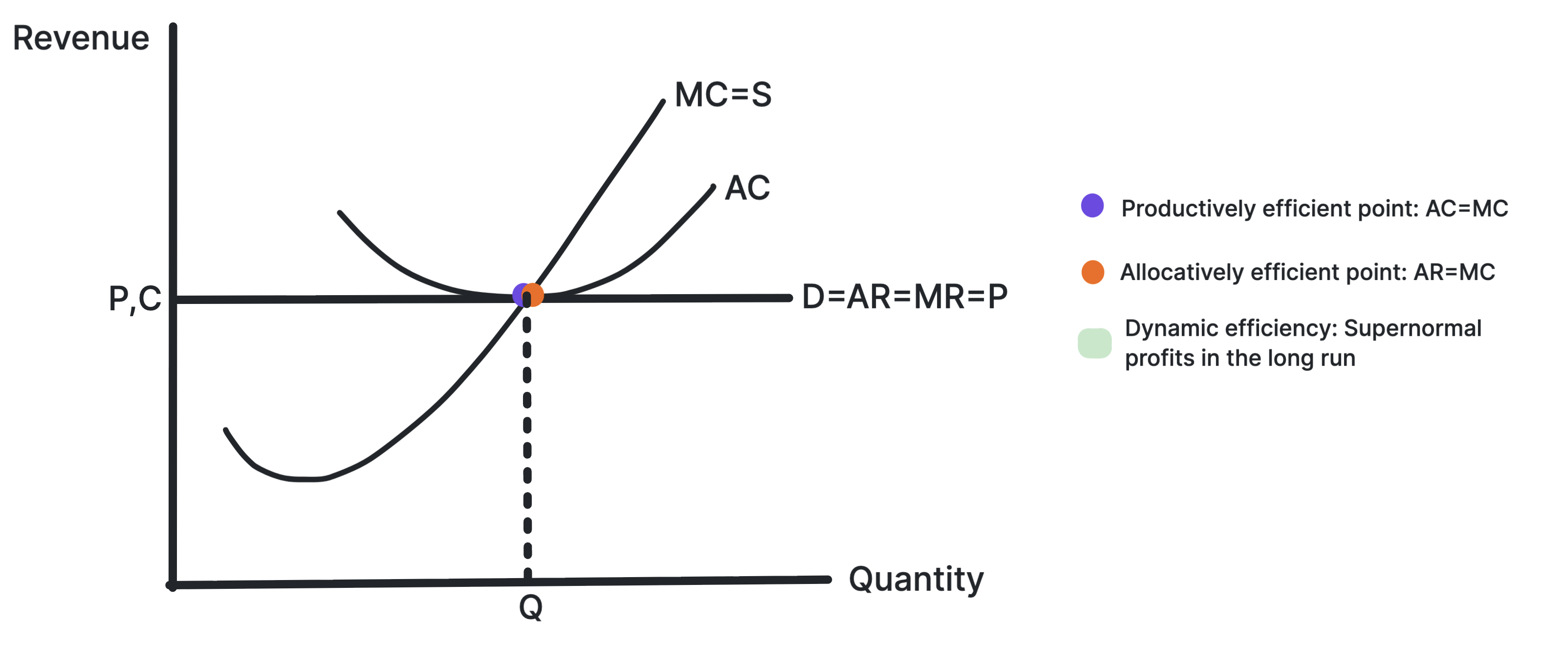
Shows P equals MC and production at the minimum point of
AC.
In long-run perfect competition, firms produce at the lowest
average cost and price equals marginal cost. This gives
productive and allocative efficiency, but not necessarily
dynamic efficiency.
Use in exams: Use it when comparing market
structures and judging whether consumers benefit.
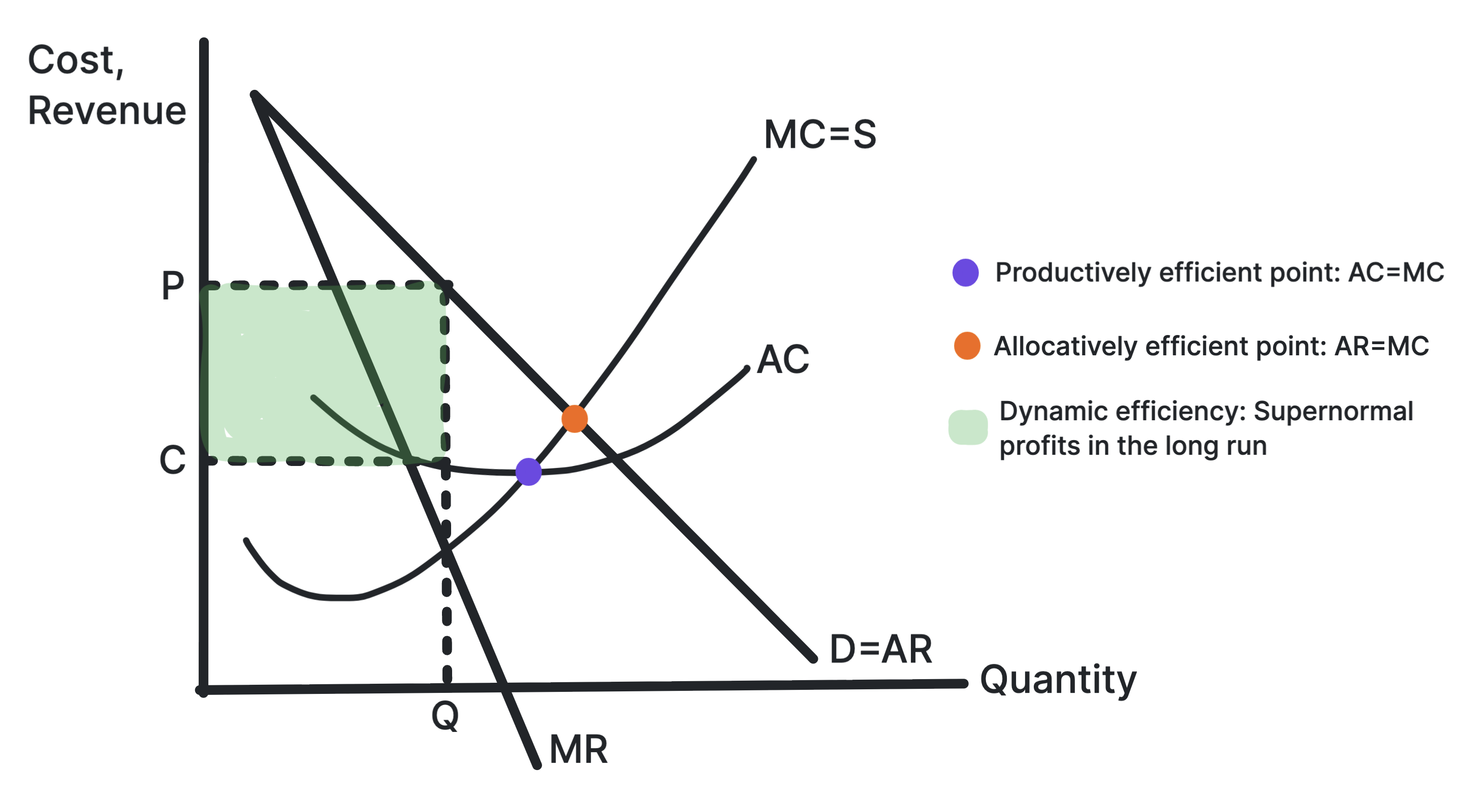
Shows allocative and productive inefficiency for a firm
with market power.
A firm with market power restricts output and charges a
price above marginal cost. It may also produce away from the
minimum point of AC, although supernormal profit can fund
dynamic efficiency.
Use in exams: Use it for monopoly,
oligopoly, regulation and comparisons with perfect
competition.
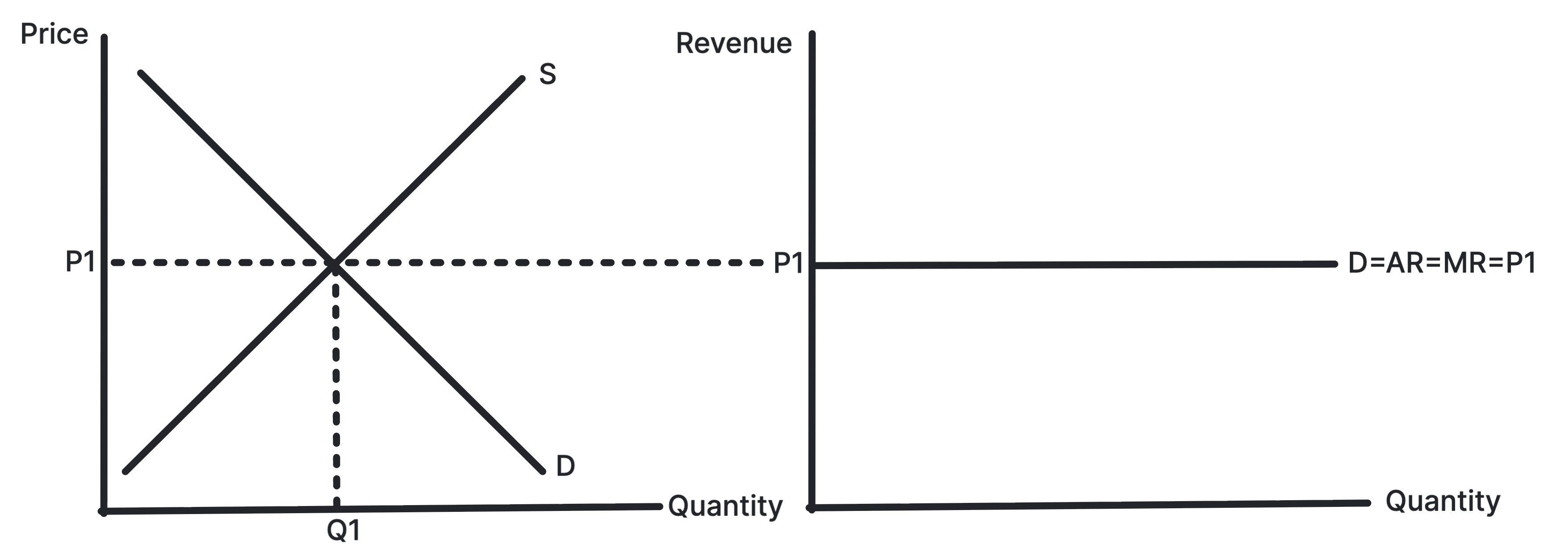
Shows industry supply and demand determining the market
price faced by the firm.
The industry sets the equilibrium price. Each individual
firm is too small to influence price, so it faces a
horizontal demand curve at the market price.
Use in exams: Use it to explain price
taking, perfectly elastic demand and the link between market
and firm diagrams.
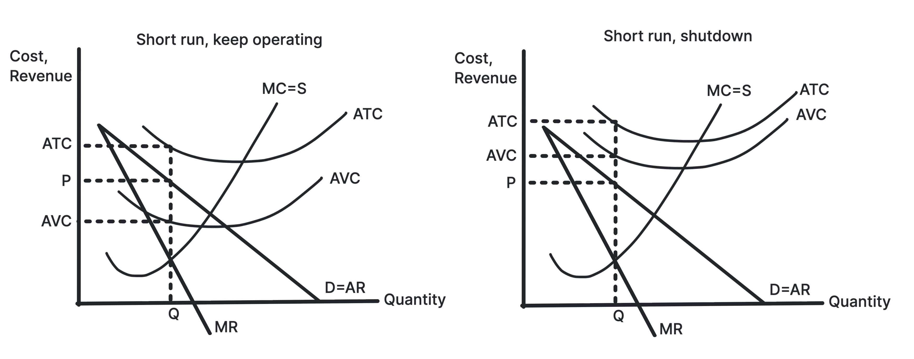
A perfectly competitive firm makes a loss if market price is
below average cost at the output where MC equals MR. It may
continue producing in the short run if it covers AVC.
Use in exams: Use it before explaining how
firms leave the market and losses are removed in the long
run.
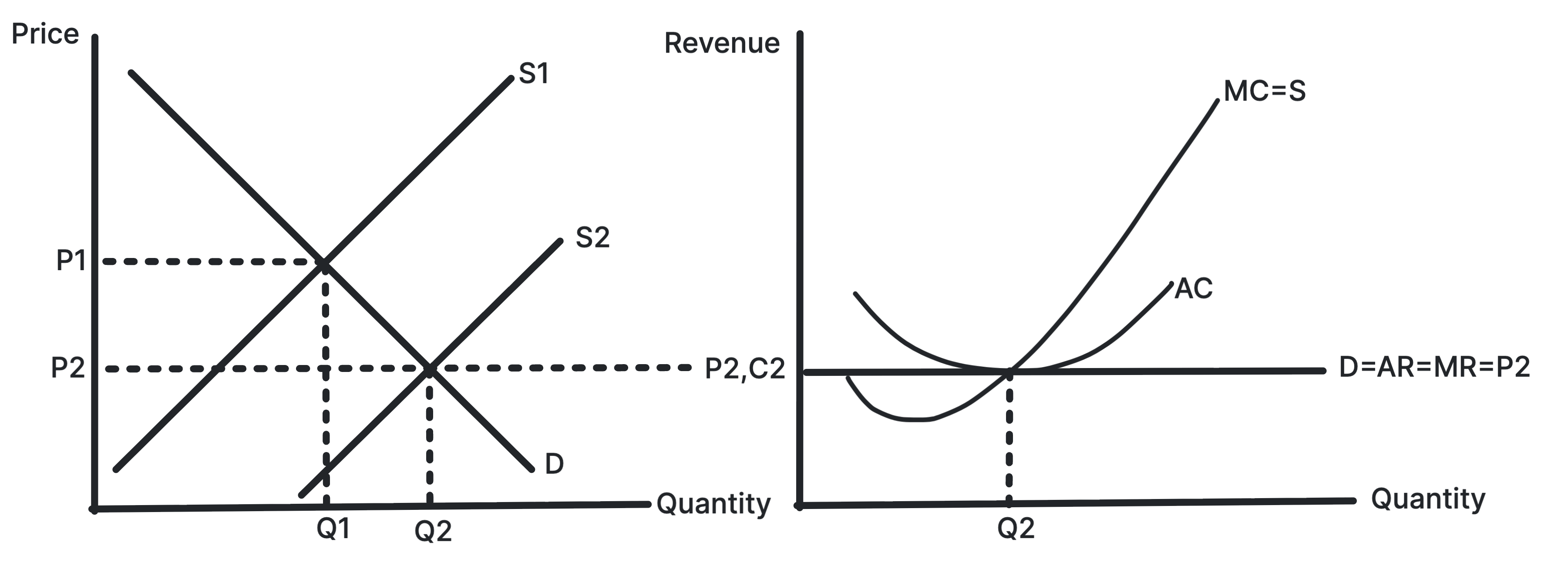
Perfect Competition: Profit to Long-Run Equilibrium
Shows entry shifting the firm's demand curve down until
only normal profit remains.
Supernormal profit attracts new firms into the industry.
Industry supply rises, market price falls, and each firm's
revenue curve shifts down until AR equals AC.
Use in exams: Use it for the long-run
adjustment process and the role of low barriers to entry.
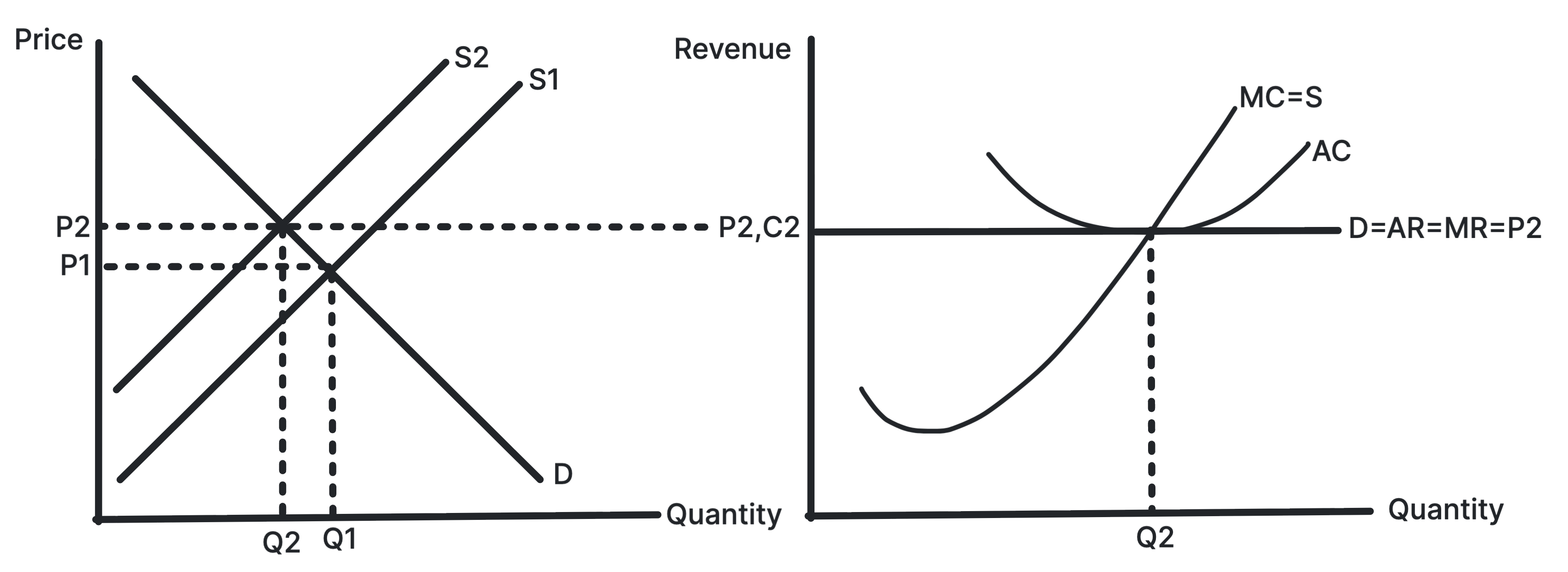
Shows exit shifting the firm's demand curve up until
normal profit returns.
Losses cause some firms to leave the industry. Industry
supply falls, market price rises, and each remaining firm's
revenue curve shifts up until AR equals AC.
Use in exams: Use it to show how perfect
competition removes losses in the long run.
Shows long-run normal profit where AR is tangent to AC.
In monopolistic competition, low barriers to entry mean
supernormal profits are competed away. Product
differentiation leaves the firm with downward-sloping demand.
Use in exams: Use it for long-run
monopolistic competition and excess capacity.
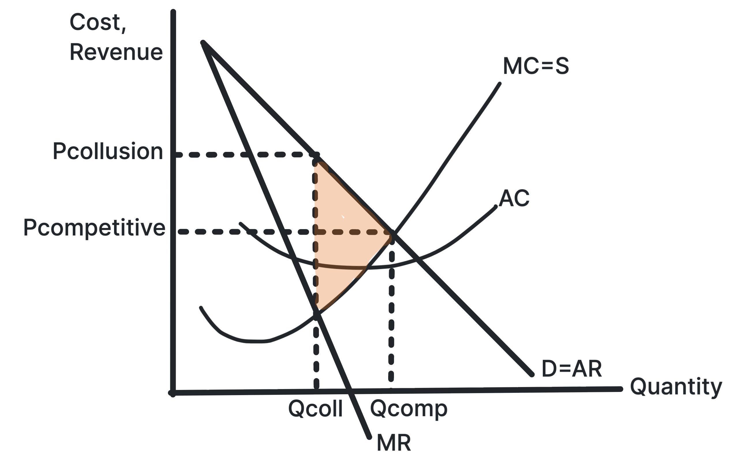
Colluding firms can act like a monopoly by restricting total
output and raising price. This can increase supernormal
profit but worsens consumer welfare.
Use in exams: Use it for cartels, price
fixing, market concentration and competition policy.
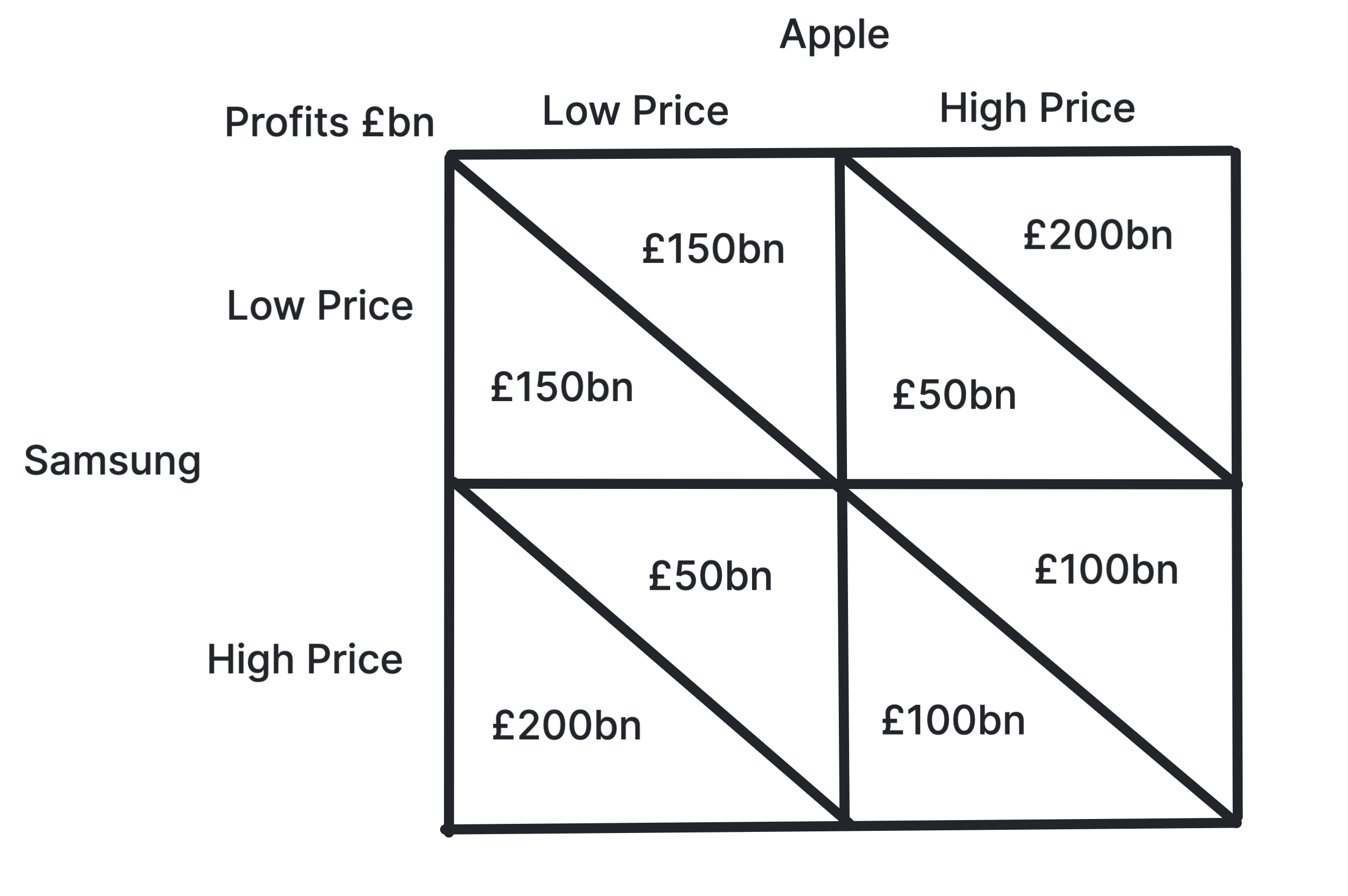
Shows why firms may compete even when joint collusion
would increase combined profits.
Each firm has an incentive to choose the dominant strategy
and compete, even if both firms would be better off if they
could trust each other to collude.
Use in exams: Use it for interdependence,
dominant strategy, Nash equilibrium and unstable collusion.
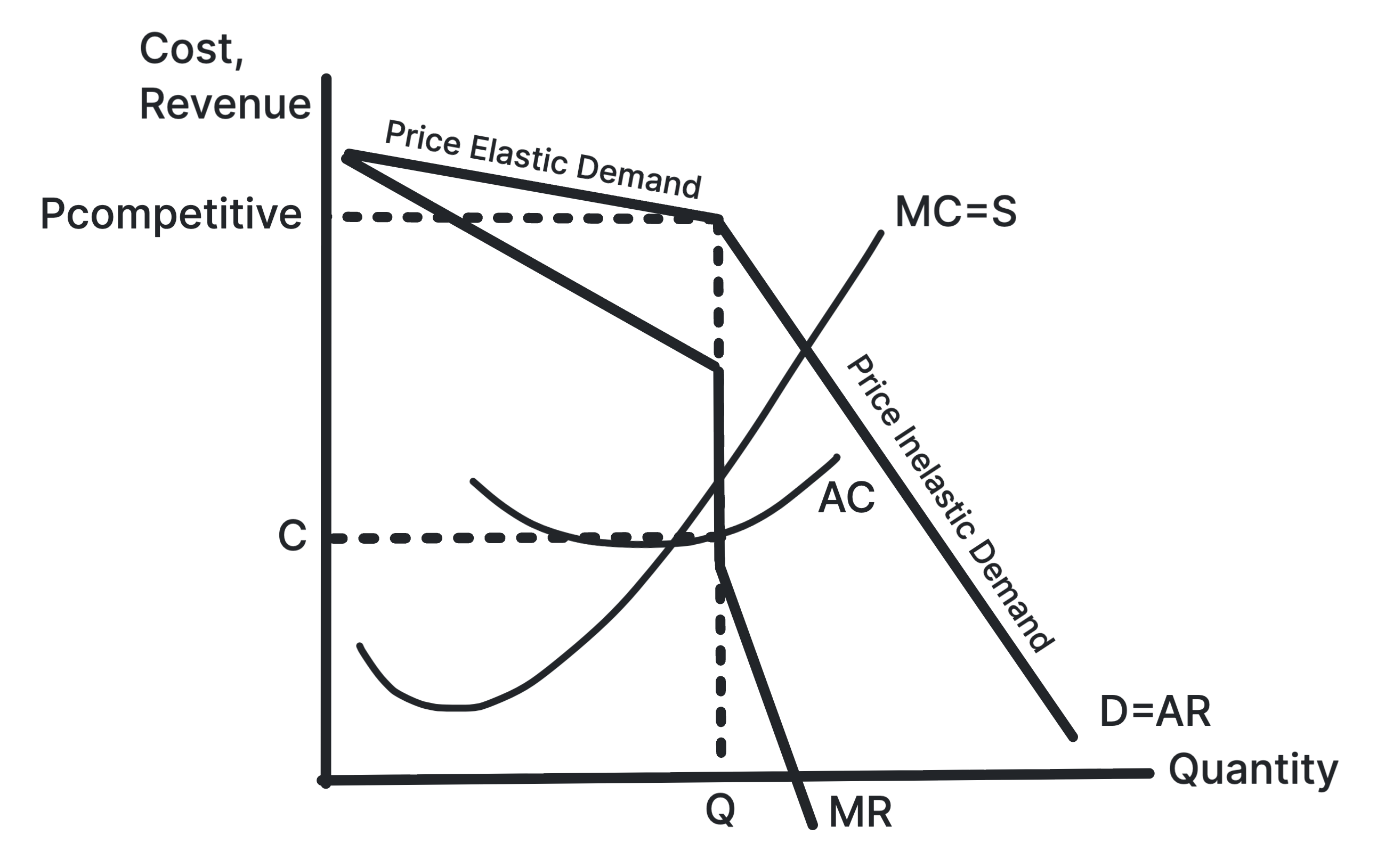
Demand is more elastic above the current price because
rivals may not follow a price rise, and more inelastic below
it because rivals may match a price cut. The gap in MR helps
explain stable prices.
Use in exams: Use it for non-price
competition, interdependence and price rigidity in
oligopoly.
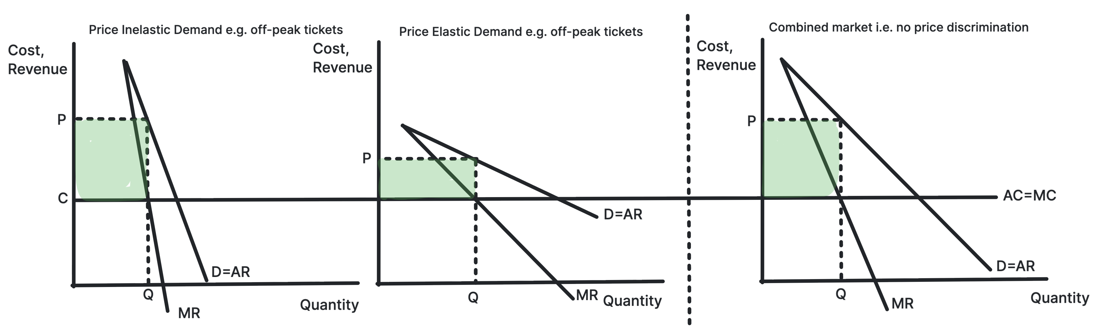
Shows a firm charging a higher price in the more inelastic
market.
A monopoly can split consumers into groups with different
elasticities of demand. It charges a higher price where
demand is more inelastic and a lower price where demand is
more elastic.
Use in exams: Use it for rail fares,
student discounts, peak pricing and welfare evaluation.
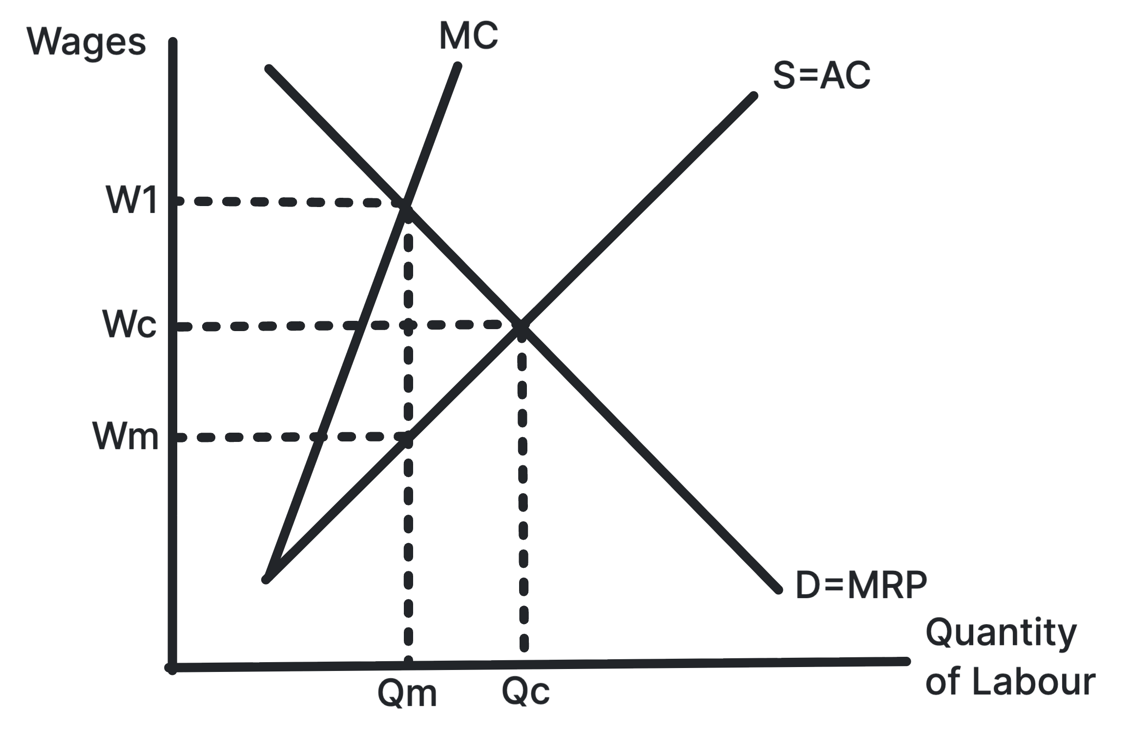
Shows a monopsonist paying a lower wage and employing
fewer workers than a competitive labour market.
A monopsonist faces the whole labour supply curve, so hiring
more workers requires raising the wage. MCL lies above ACL,
and the firm employs where MCL equals MRP.
Use in exams: Use it for employer power,
labour exploitation, minimum wages and public sector labour
markets.
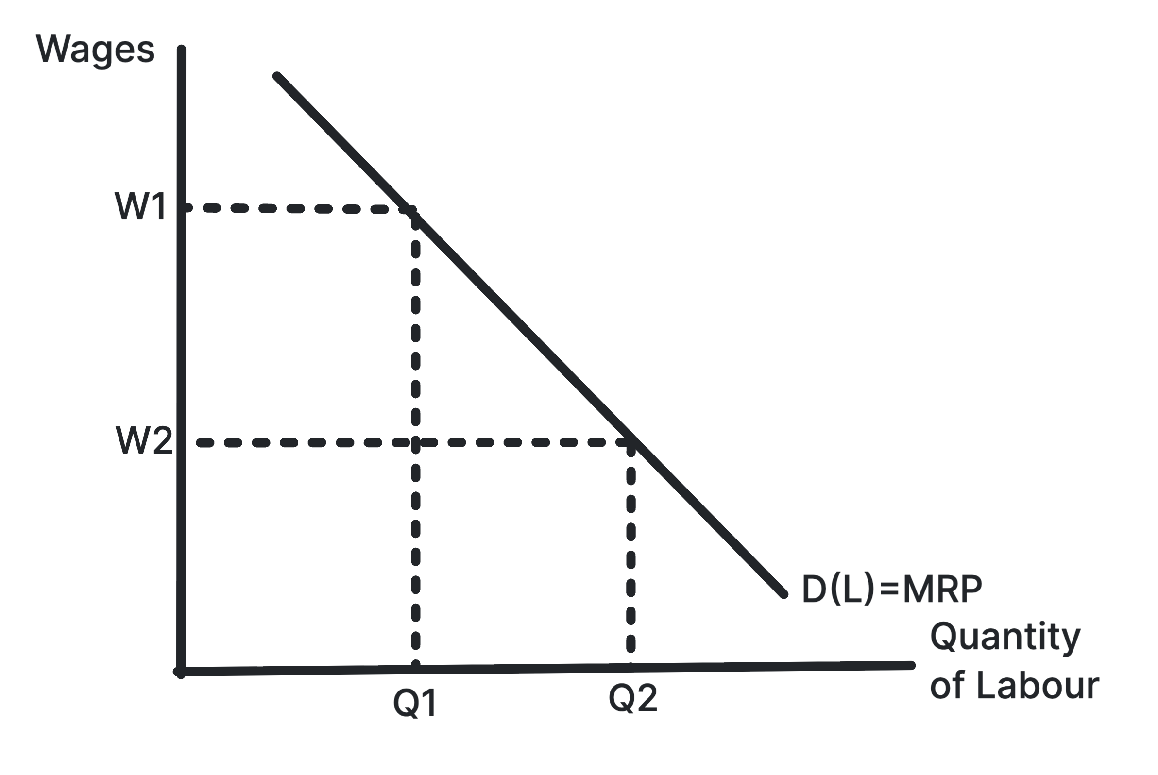
Shows the demand for labour as the marginal revenue
product of labour.
Firms hire workers because labour helps produce output and
revenue. The labour demand curve slopes downward because
marginal physical product often falls as more workers are
added.
Use in exams: Use it for derived demand,
productivity changes, output price changes and labour demand
shifts.
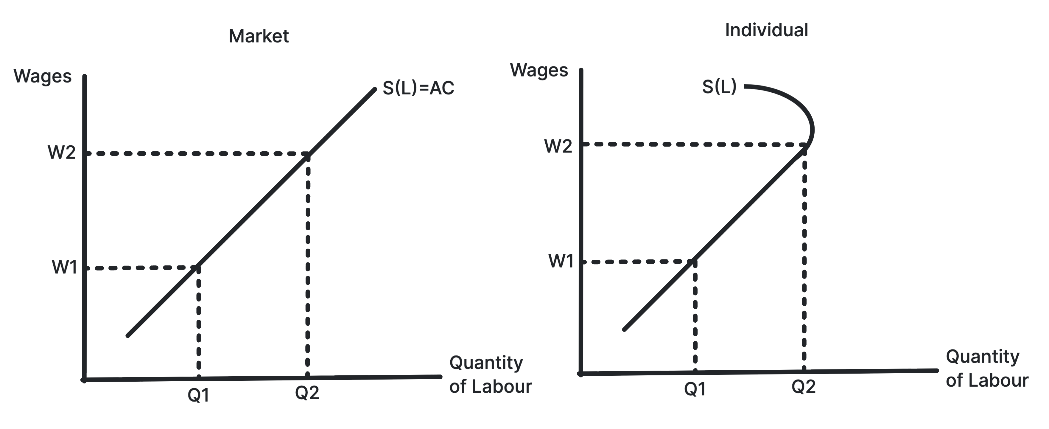
Shows market labour supply and the backward-bending
individual labour supply curve.
Higher wages usually encourage more labour supply, but for
some individuals very high wages may increase the desire for
leisure, creating a backward-bending supply curve.
Use in exams: Use it for substitution and
income effects, occupational labour supply and wage
incentives.
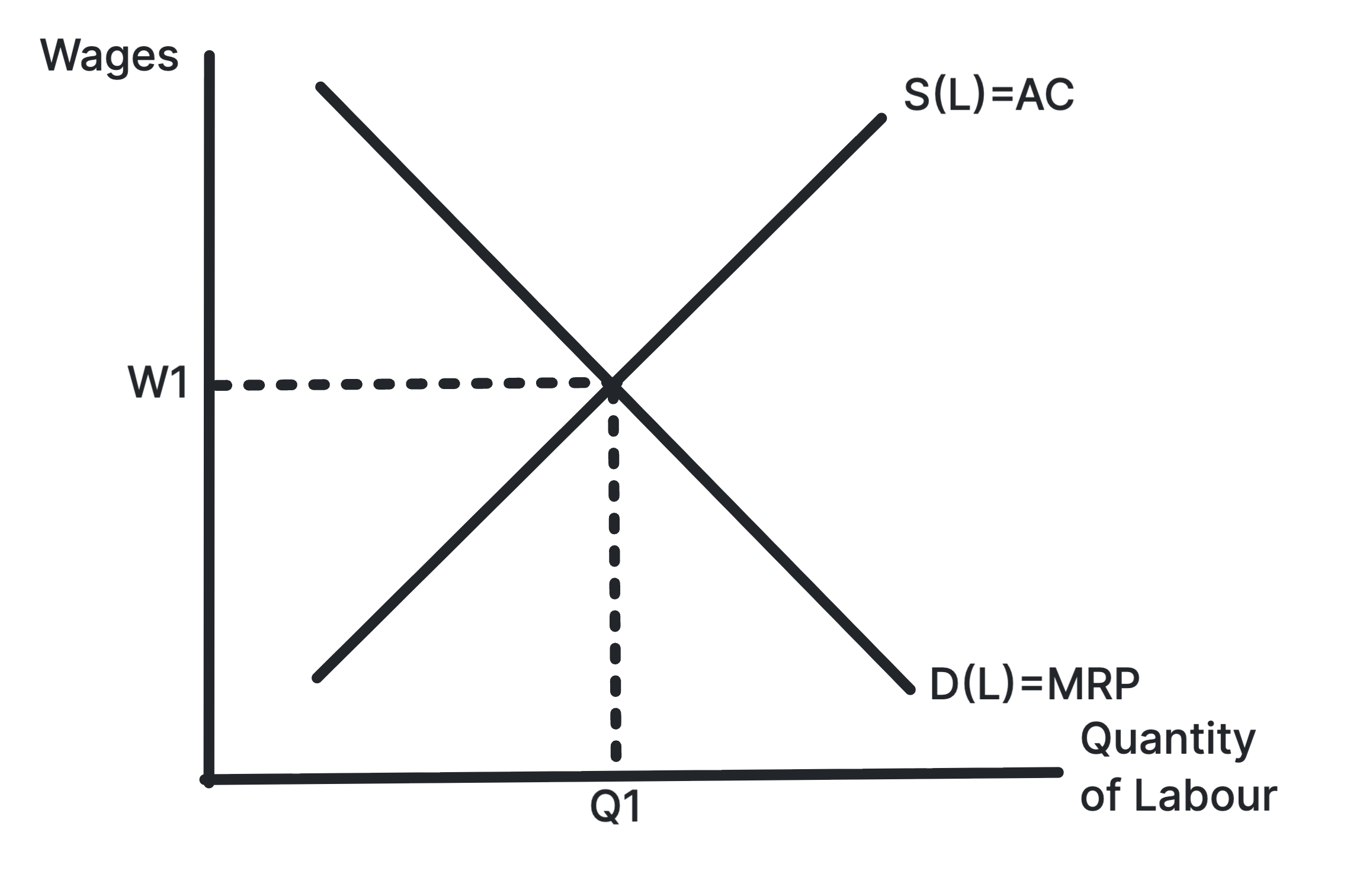
Shows the equilibrium wage and employment level where
labour demand equals labour supply.
In a competitive labour market, the wage rate is determined
by the interaction of labour demand and labour supply.
Changes in either curve change both wages and employment.
Use in exams: Use it for wage differences,
labour shortages, migration, skills and occupational labour
markets.
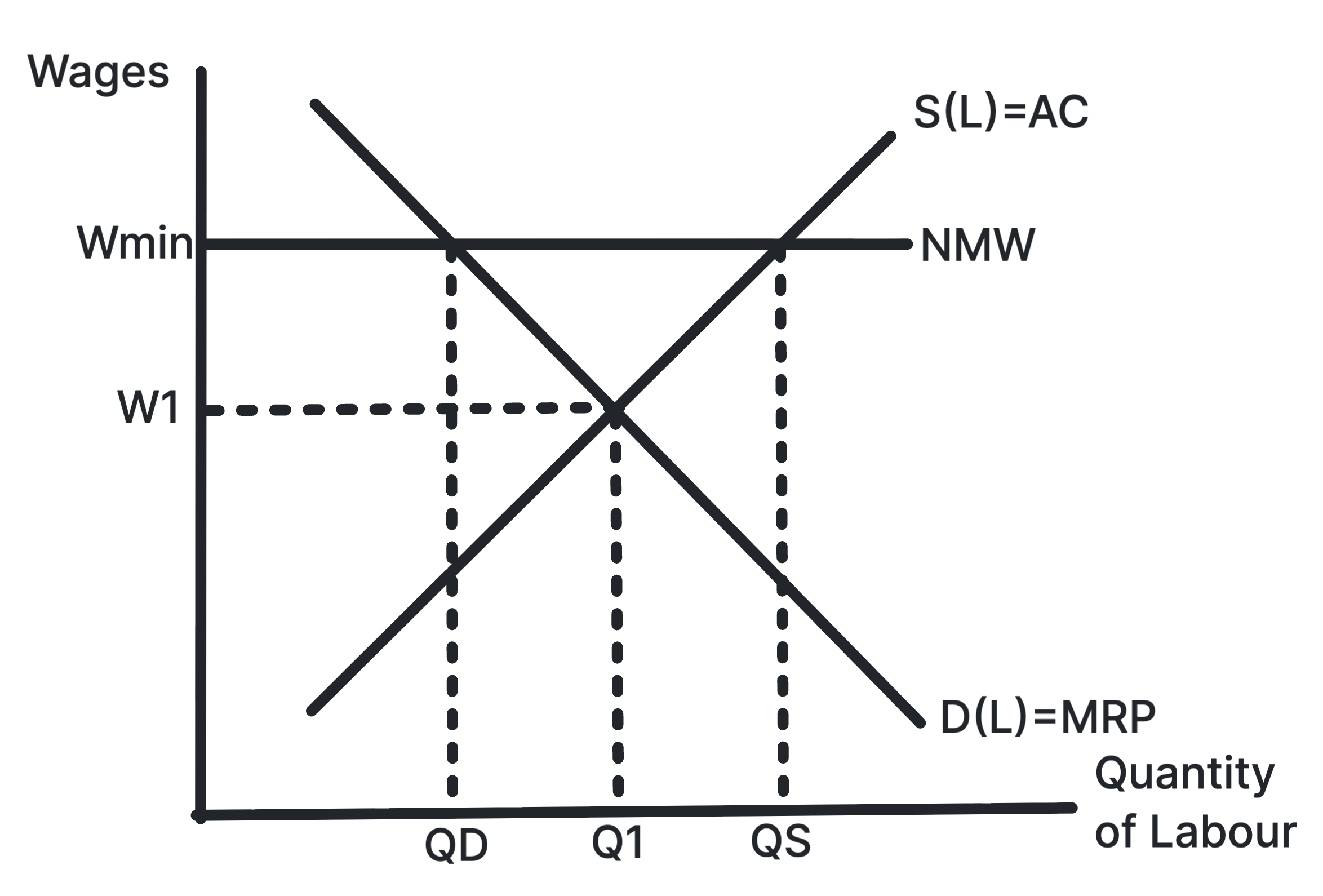
Shows a minimum wage above equilibrium creating excess
supply of labour.
If the legal minimum wage is above the competitive
equilibrium, more workers want jobs than firms want to hire.
This may create unemployment, though outcomes depend on
labour market conditions.
Use in exams: Use it for wage inequality,
unemployment risk, monopsony evaluation and labour market
intervention.
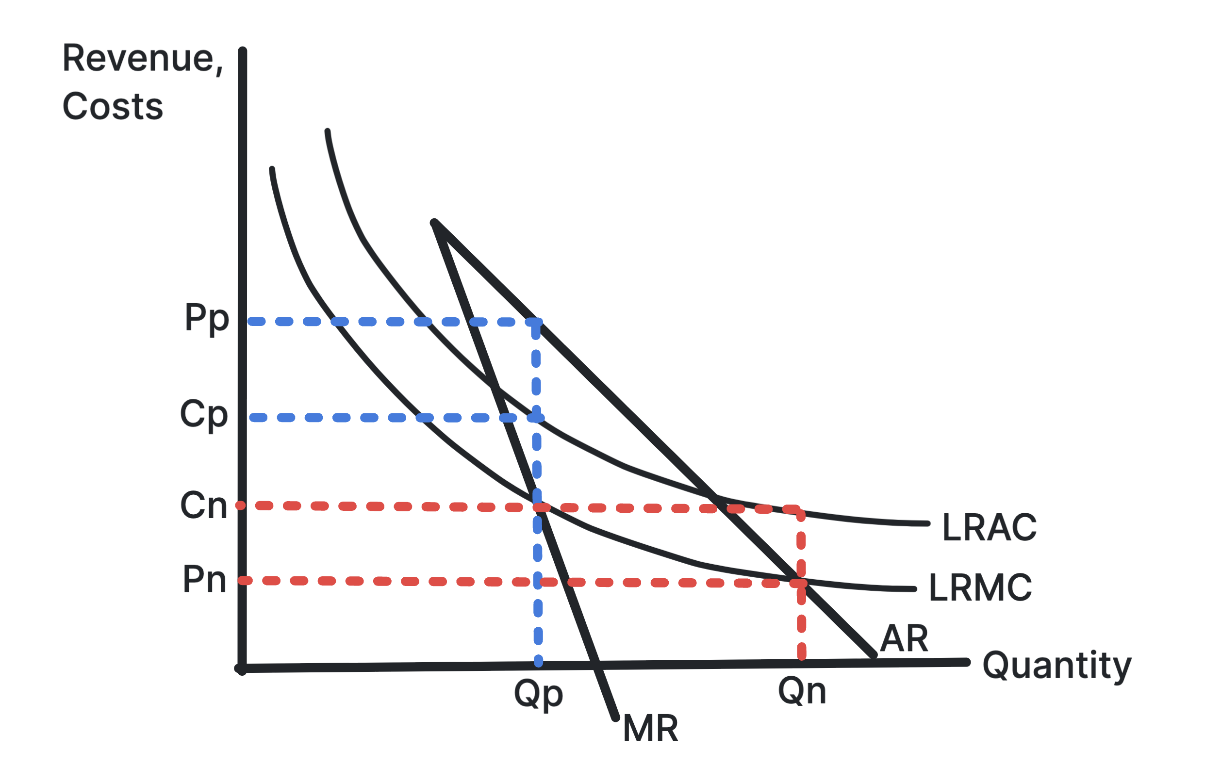
Shows how ownership and pricing objectives can affect
price and output in a natural monopoly.
In a natural monopoly, average costs fall over the relevant
range of output. Public ownership may set a lower price and
higher output than a private monopoly, though incentives may
differ.
Use in exams: Use it for natural monopoly,
state ownership, privatisation, regulation and efficiency
evaluation.