Edexcel A-Level Economics (9EC0) | Theme 2 and Theme 4
A single revision page for the macroeconomics diagrams used across
the Edexcel Theme 2 and Theme 4 notes. Each card keeps the original
diagram image and adds a quick explanation of what to show in an
exam answer.
Diagram collection: This page includes the
diagrams currently referenced in the Edexcel Theme 2 and Theme 4
revision notes, with exact duplicate image files included once.
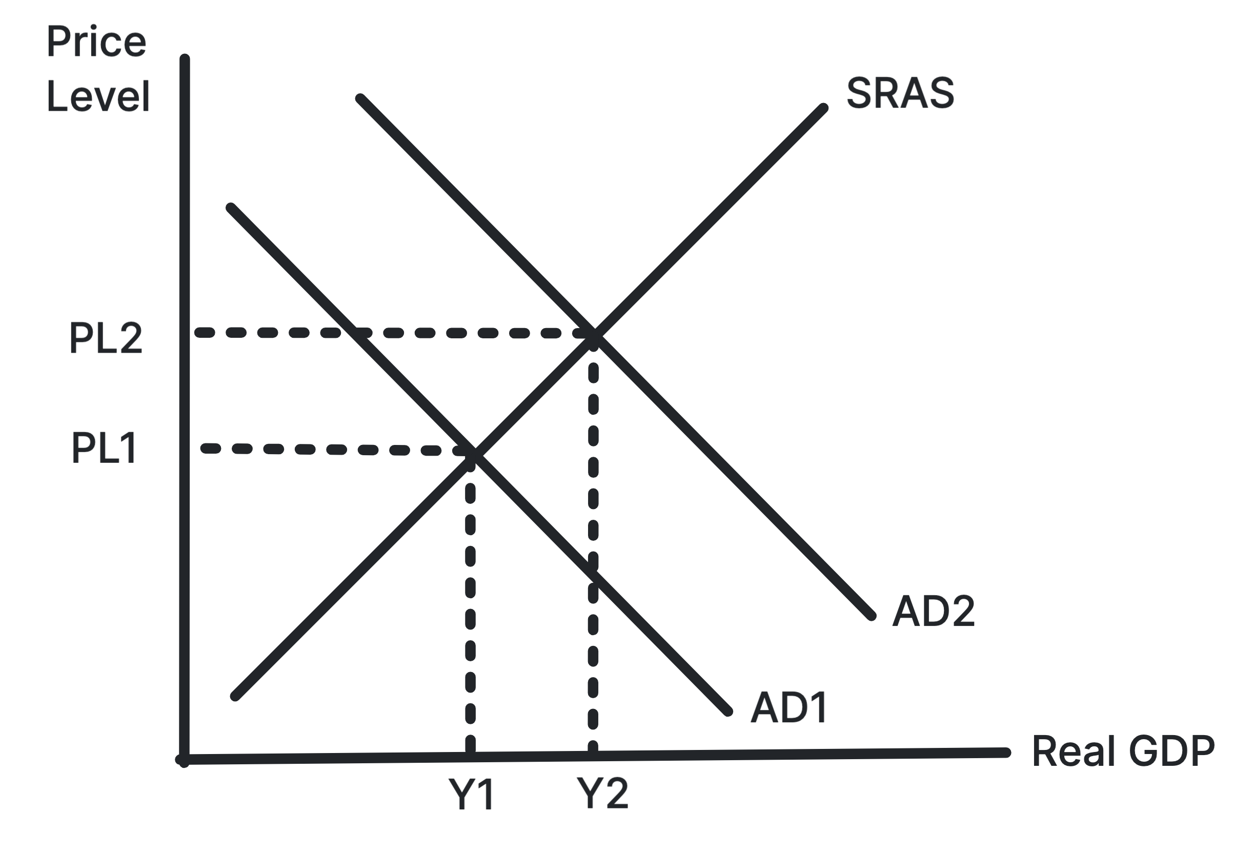
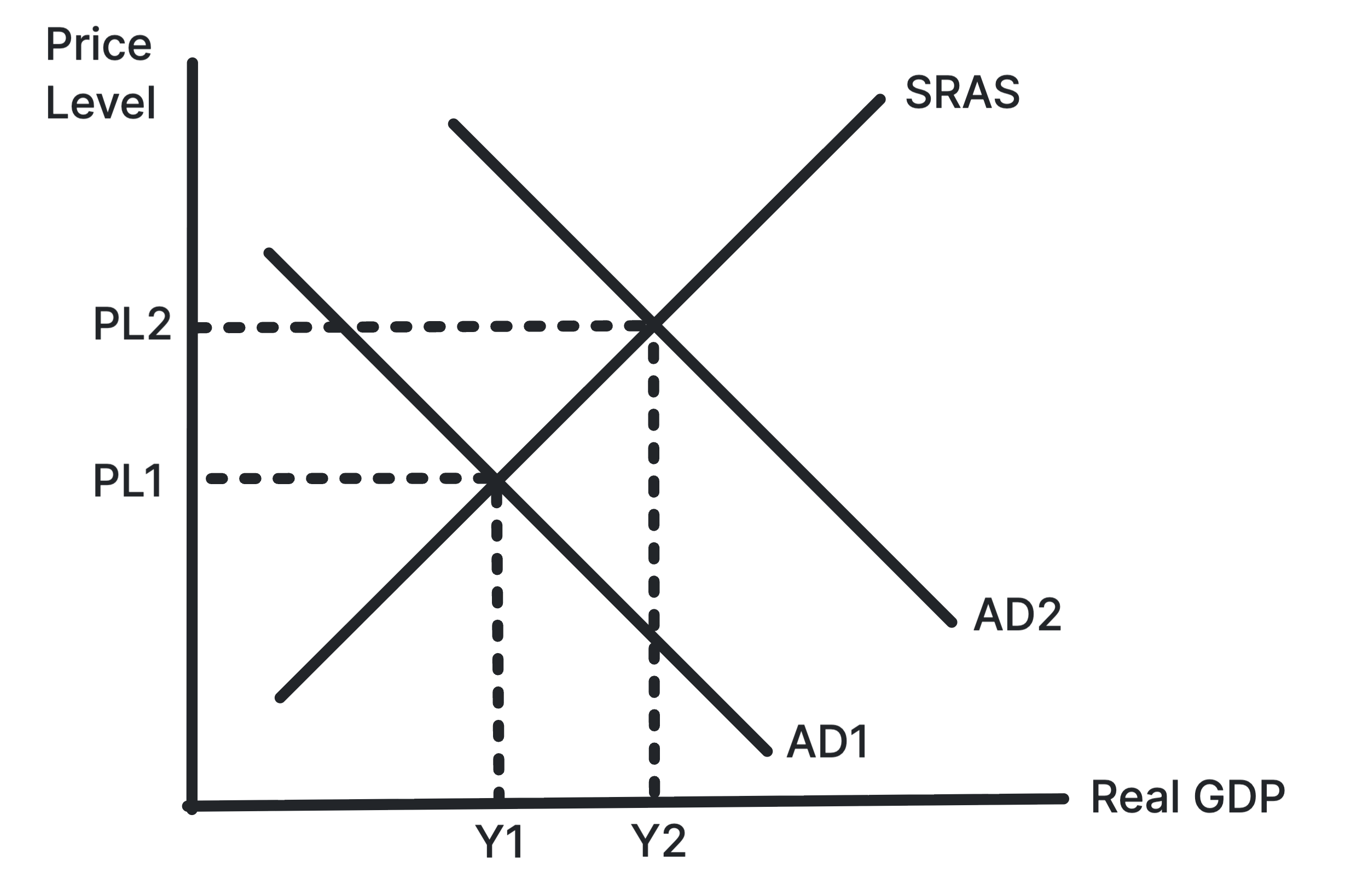
Shows aggregate demand increasing from AD1 to AD2,
raising the price level and real output.
Demand-pull inflation occurs when higher aggregate demand
puts upward pressure on the average price level. Output may
rise in the short run if the economy has spare capacity.
Use in exams: Use it for expansionary
fiscal policy, loose monetary policy, confidence shocks or
rising exports.
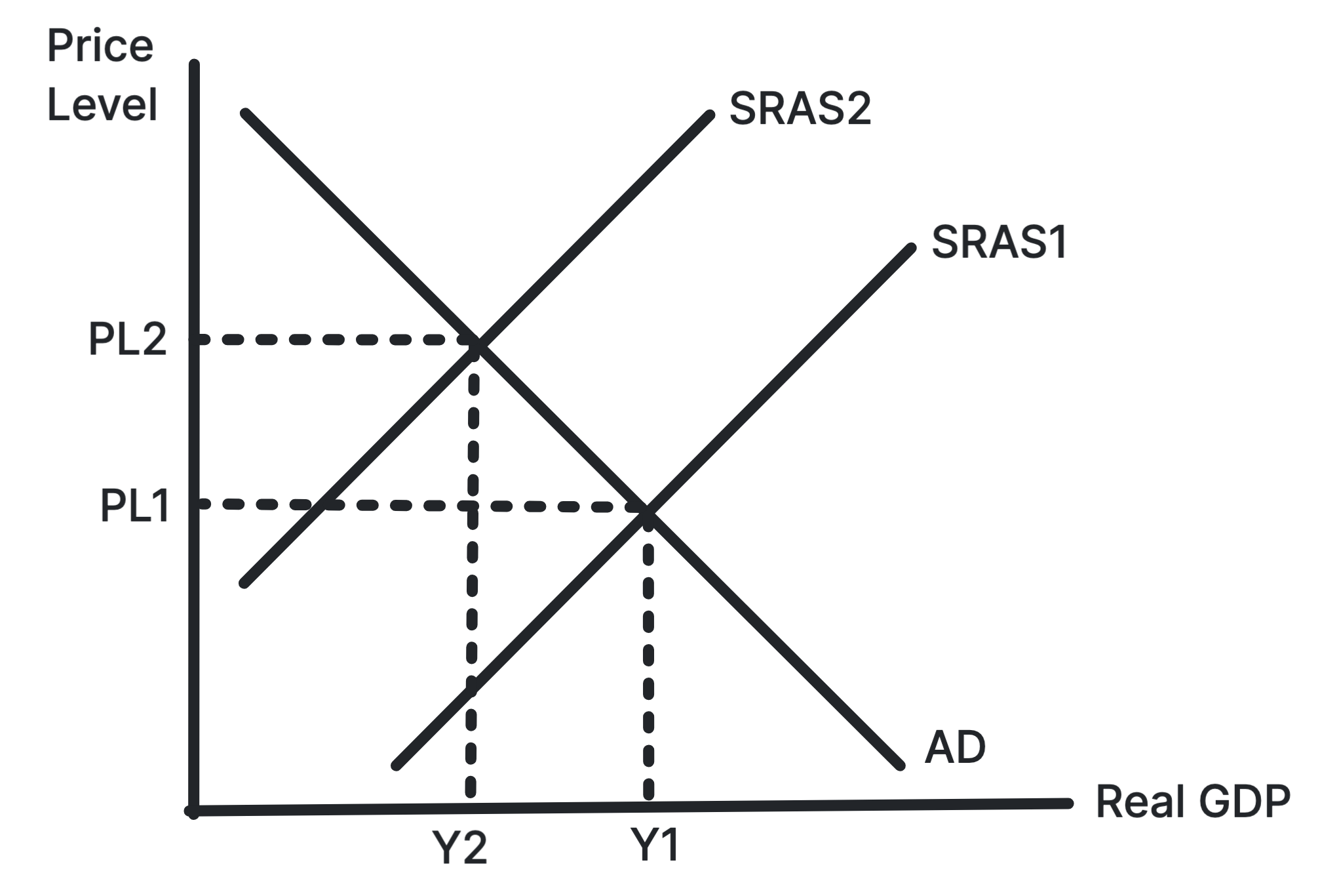
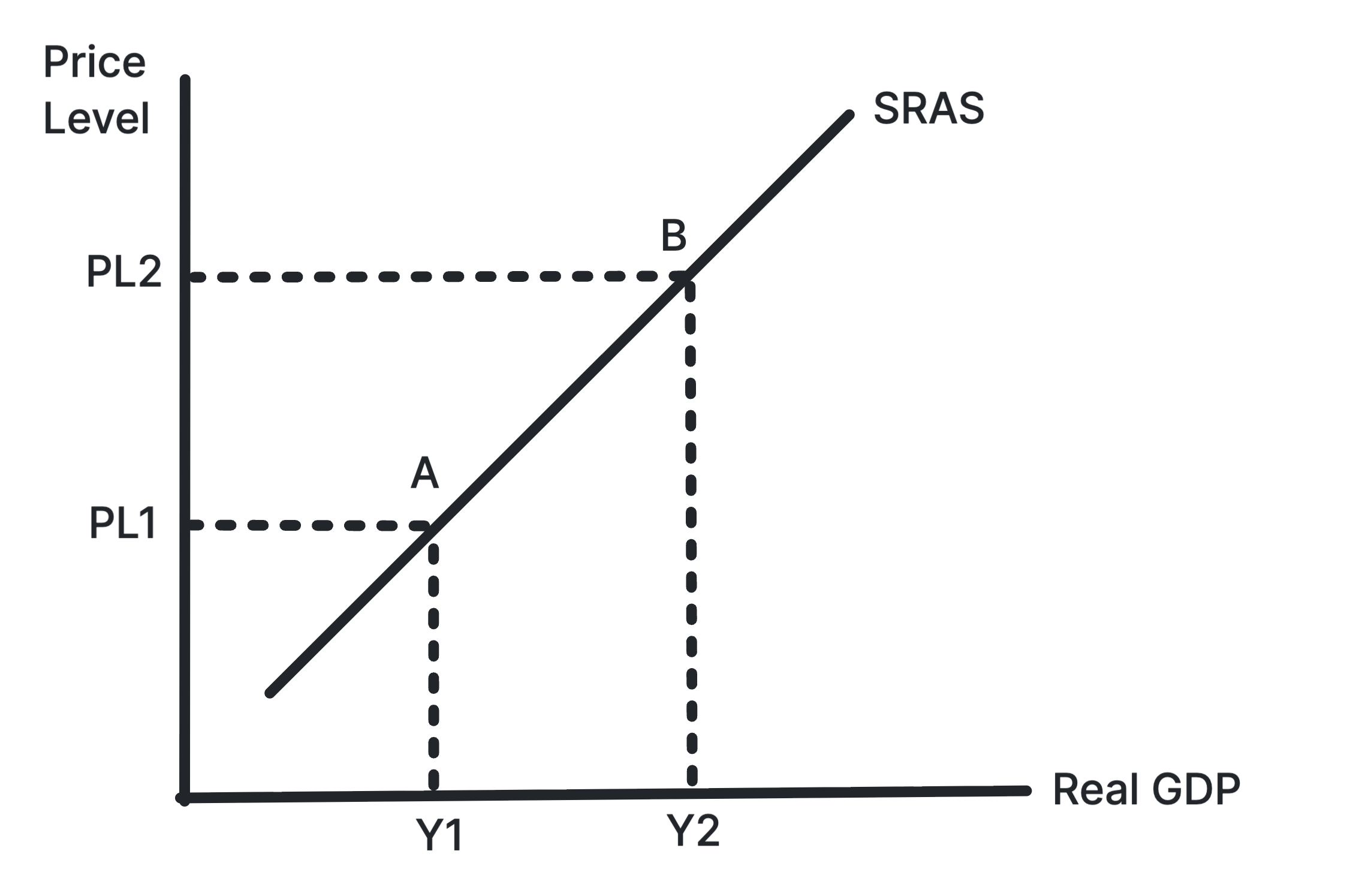
Shows SRAS shifting left, raising the price level and
reducing real output.
Cost-push inflation occurs when firms' costs rise and SRAS
falls. The economy faces a higher price level and lower real
GDP, creating a difficult trade-off for policymakers.
Use in exams: Use it for oil price shocks,
wage rises, imported inflation and exchange rate
depreciation.
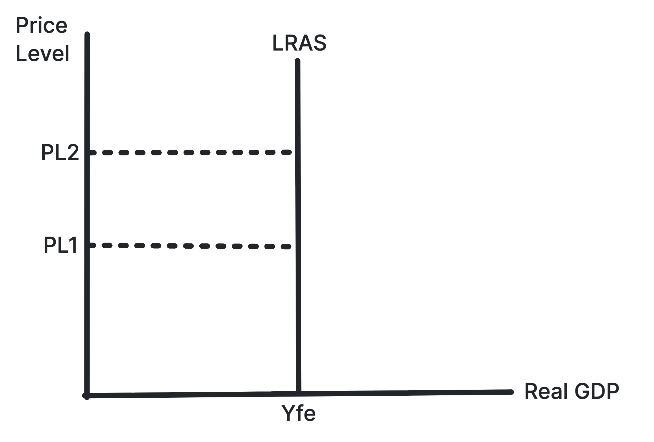
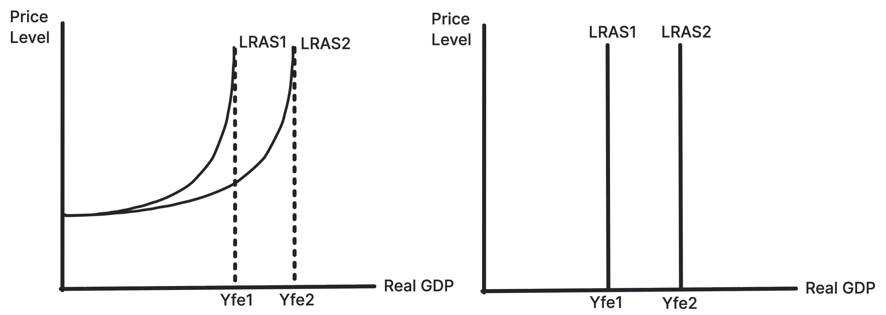
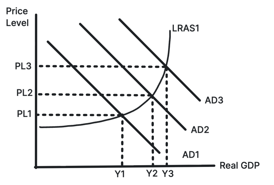
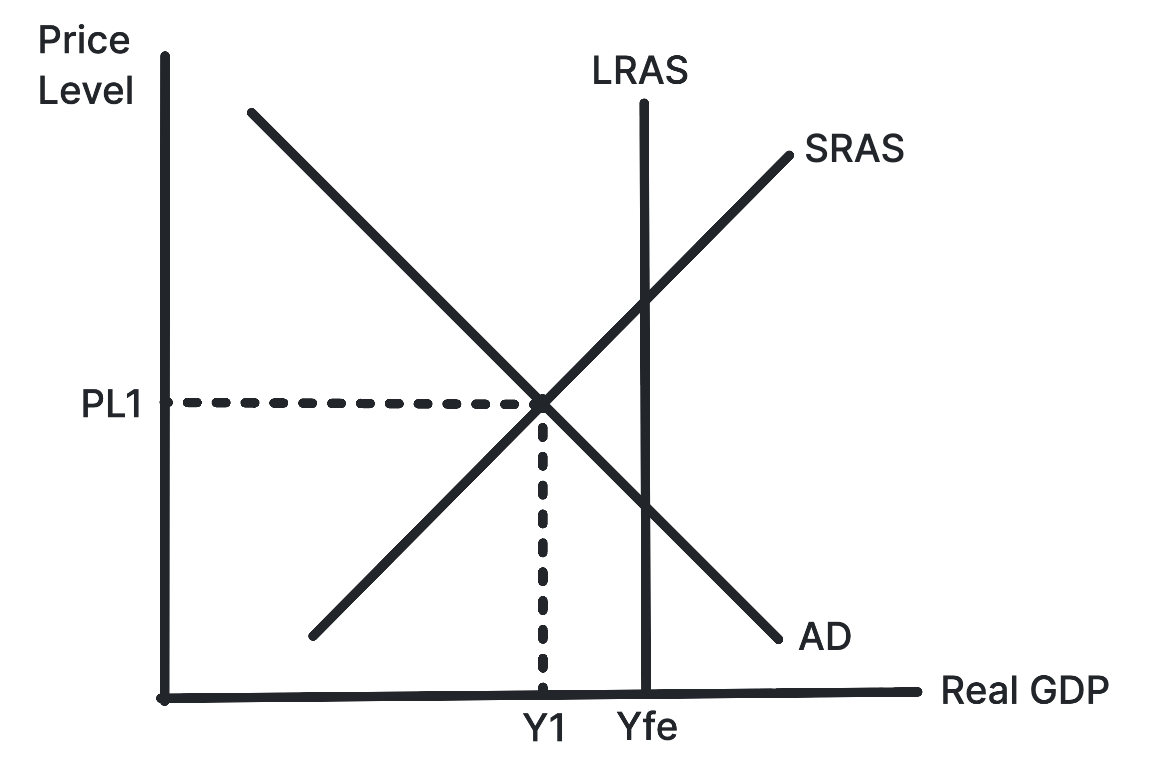
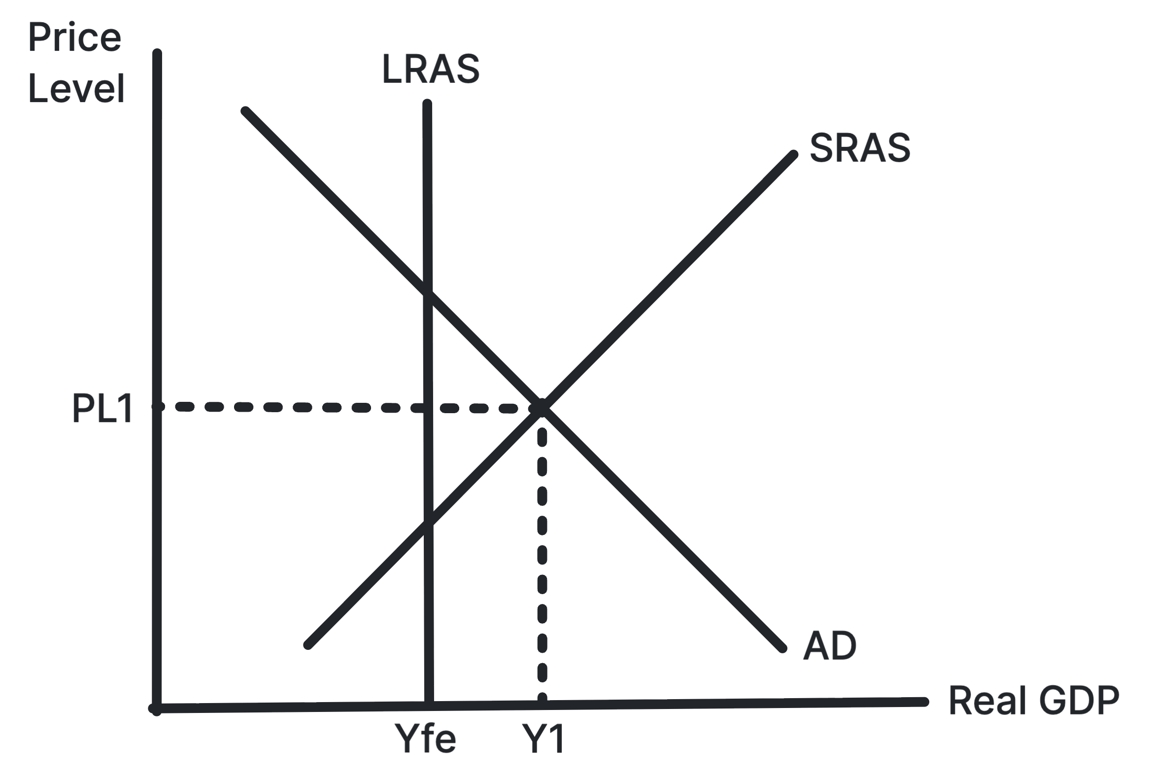
Shows long-run output fixed at full employment, regardless
of the price level.
The Classical LRAS curve is vertical because the long-run
productive capacity of the economy depends on factor
quantity, factor quality and technology, not the price level.
Use in exams: Use it when arguing that AD
increases raise prices rather than long-run real output.
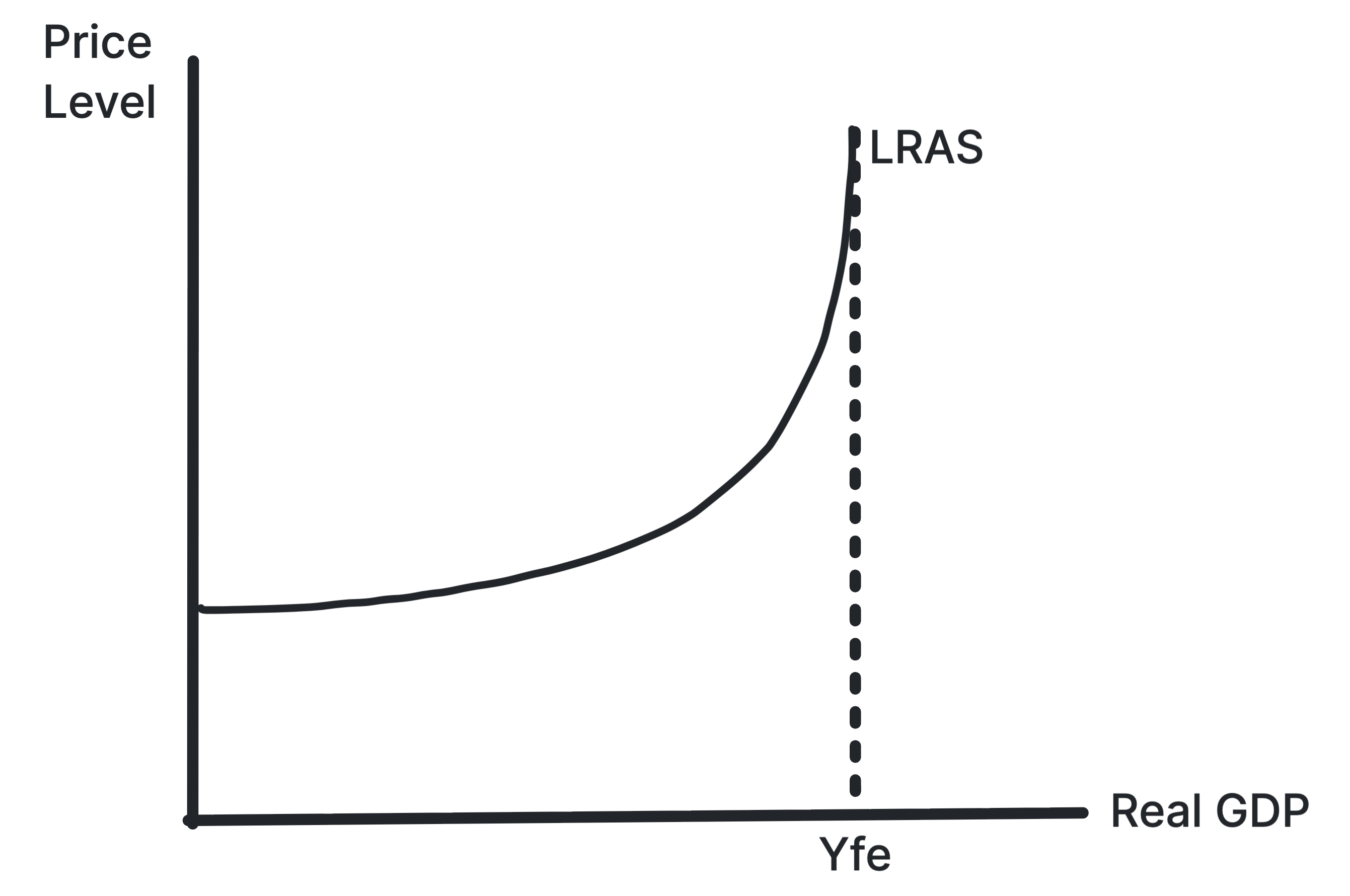
Shows spare capacity at low output and inflationary
pressure near full capacity.
The Keynesian LRAS curve suggests output can be below full
employment for a long time. Extra AD may raise output with
little inflation when spare capacity is high.
Use in exams: Use it when evaluating
demand-side policy in recessions and the importance of spare
capacity.
Shows the economy's productive potential increasing as
LRAS shifts right.
LRAS shifts right when the economy can produce more at full
capacity. This can come from more labour, better skills,
improved technology, infrastructure or capital investment.
Use in exams: Use it for supply-side
improvements, long-run growth and reduced inflationary
pressure.
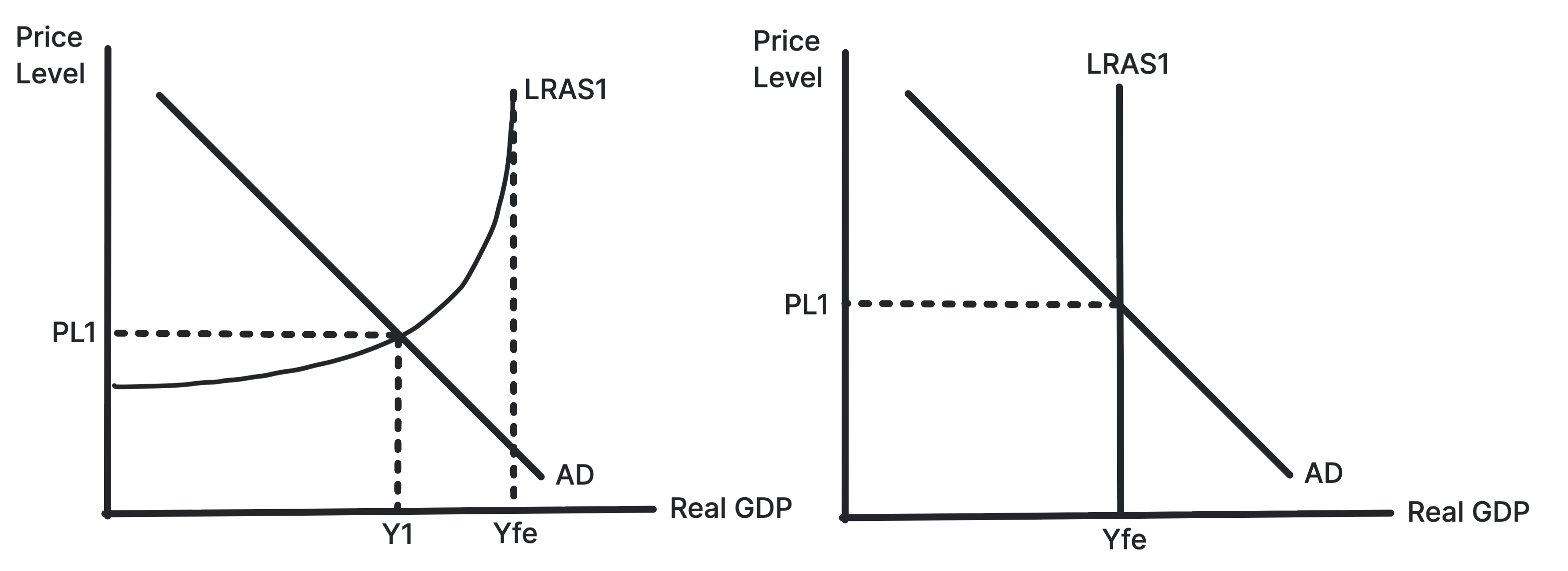
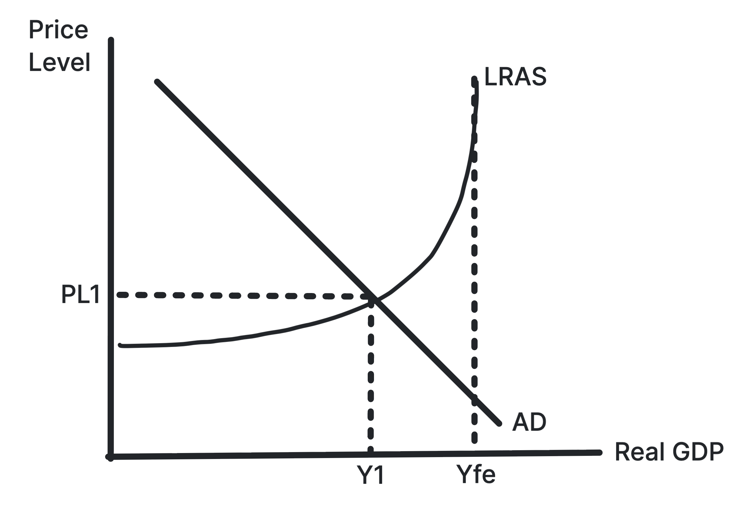
Shows equilibrium where AD intersects LRAS in Classical
and Keynesian models.
Equilibrium real national output is found where AD meets
aggregate supply. The Classical and Keynesian views differ
over whether the economy automatically returns to full
employment.
Use in exams: Use it as a starting point
before showing AD shifts, LRAS shifts or output gaps.
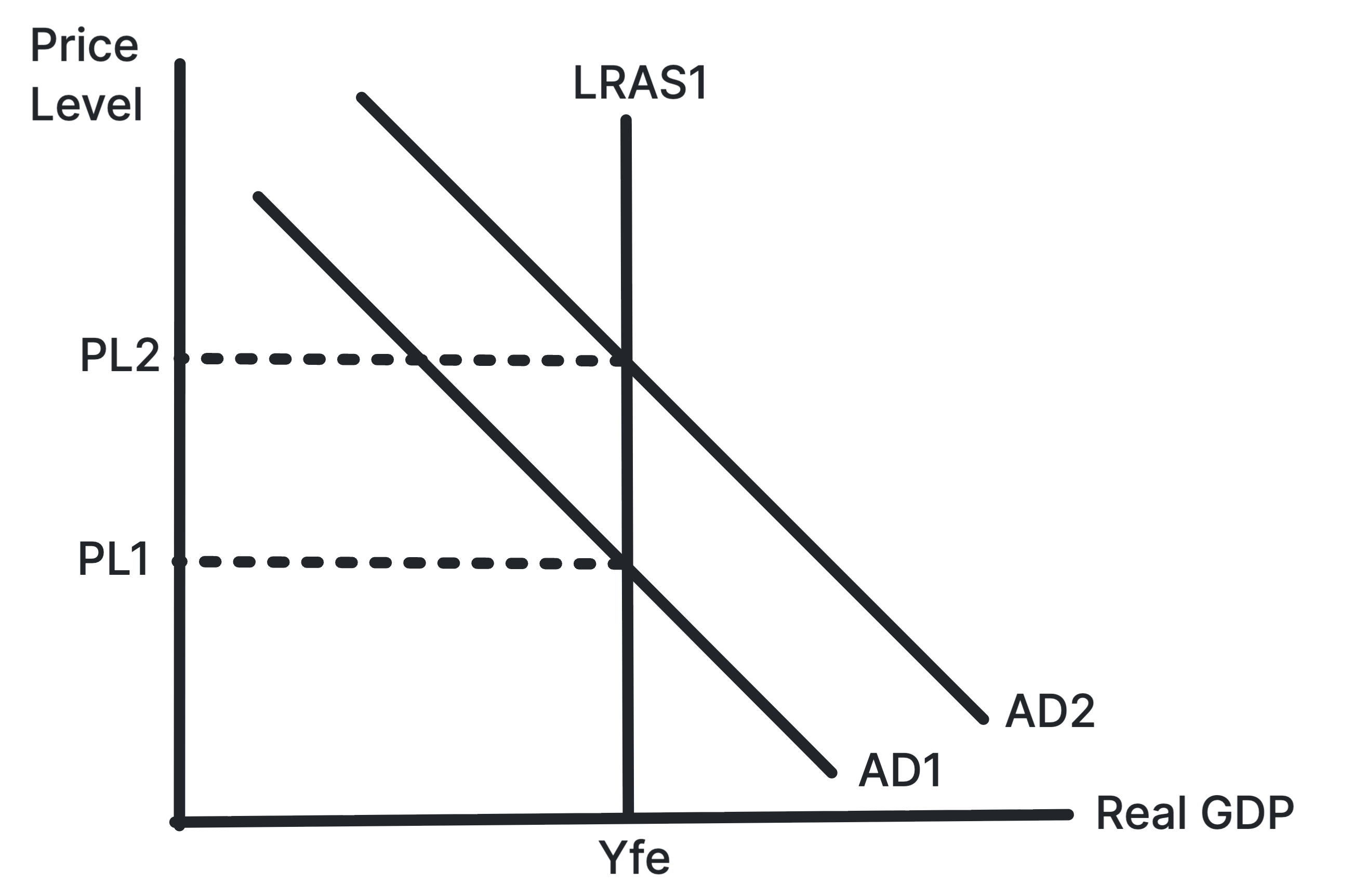
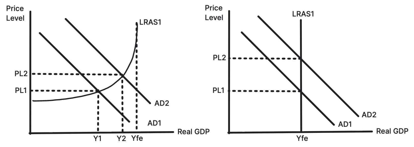
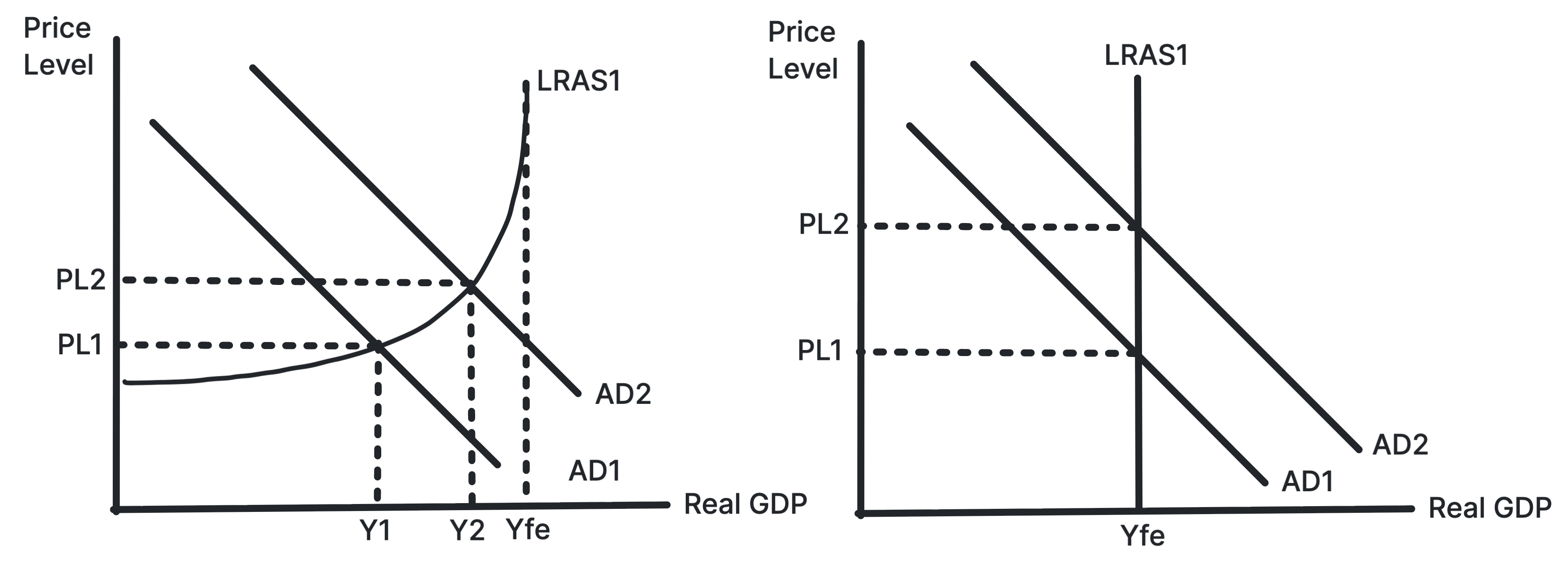
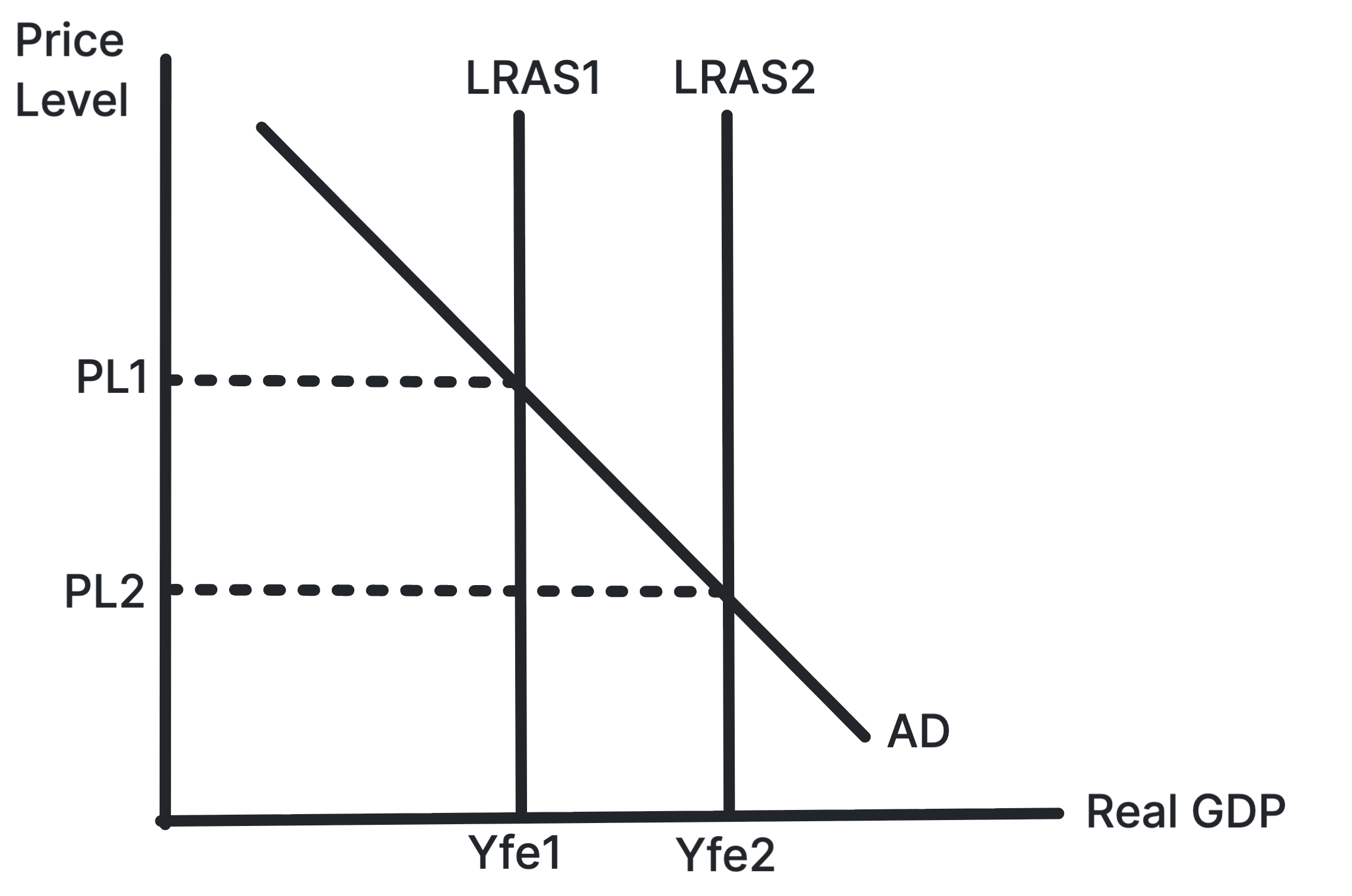
Shows AD shifting right in the Classical model, raising
the price level but not long-run output.
In the Classical model, the economy is assumed to return to
full employment output in the long run. A rise in AD
therefore mainly increases the price level rather than real
national output.
Use in exams: Use it when evaluating why
demand-side stimulus may become inflationary if the economy
is already near full capacity.
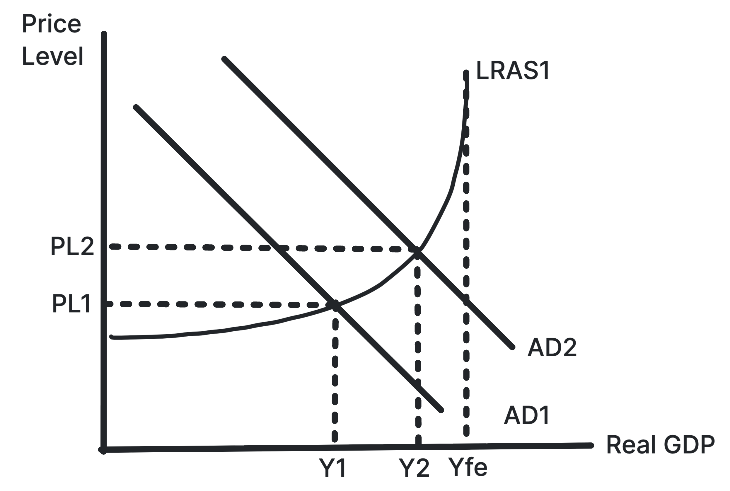
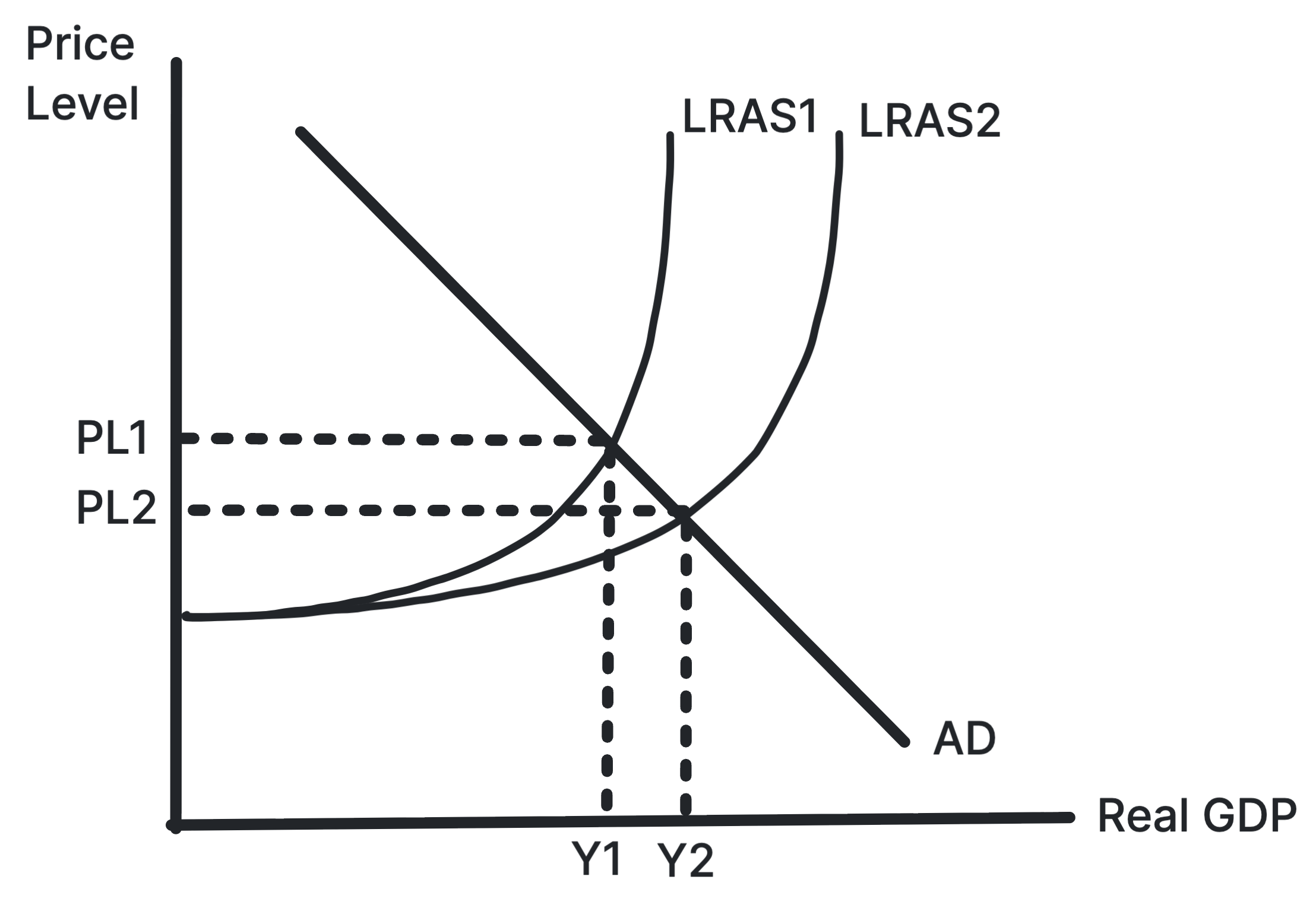
Shows AD shifting right on the horizontal section of
Keynesian LRAS, increasing output with little inflation.
In the Keynesian model, extra AD can raise output
significantly when there is spare capacity. The price level
may remain stable until the economy moves closer to full
capacity.
Use in exams: Use it for recession
stimulus, spare capacity and why demand-side policy may be
less inflationary in a downturn.
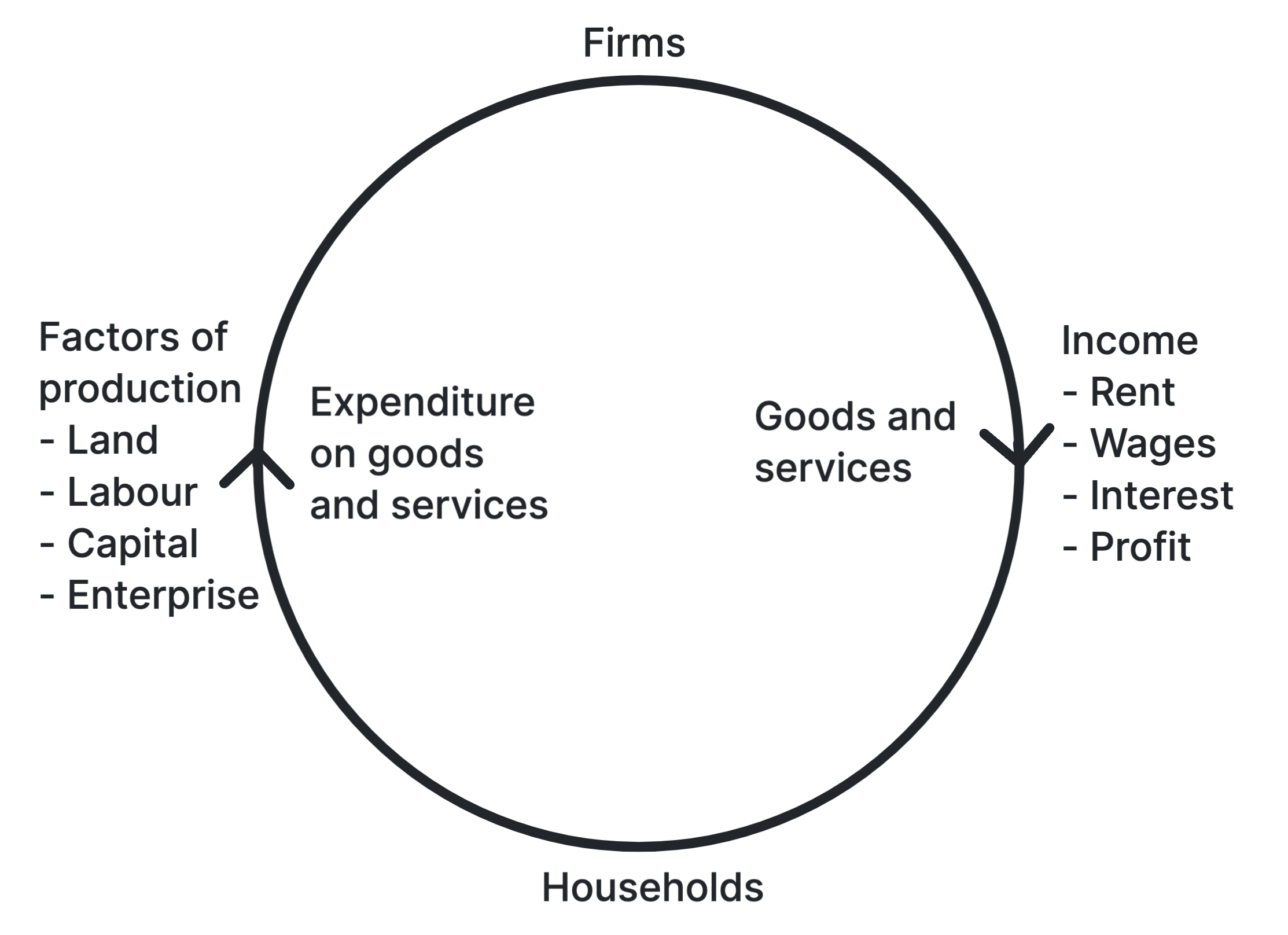
Shows the flow of money and resources between households
and firms.
Households provide factors of production and receive income.
Firms produce goods and services and receive expenditure,
creating a continuous circular flow.
Use in exams: Use it for national income,
income flows and the relationship between output, income and
expenditure.
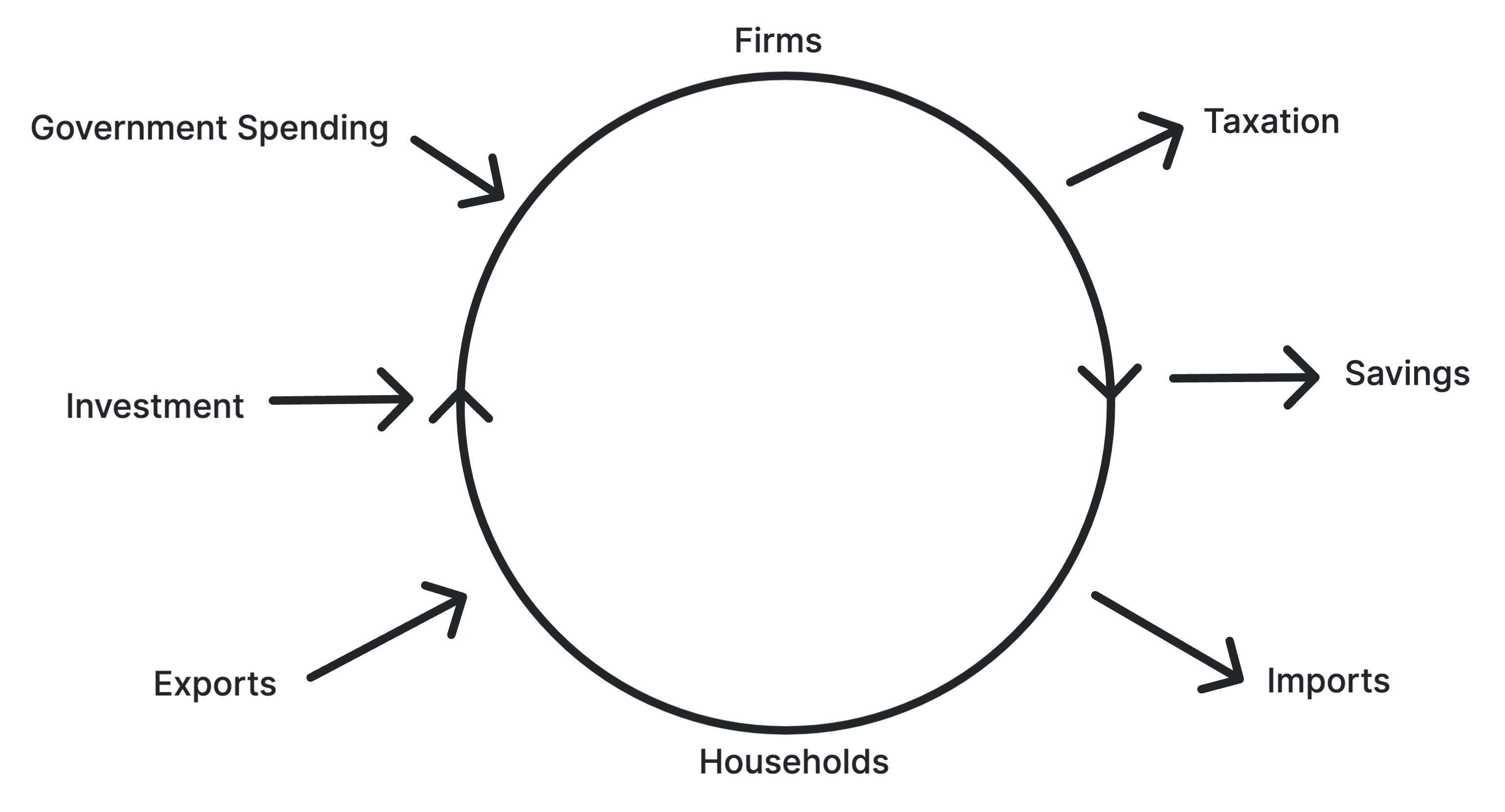
Shows injections of investment, government spending and
exports, and withdrawals of saving, tax and imports.
Injections add spending to the circular flow, while
withdrawals remove spending. National income is stable when
planned injections equal planned withdrawals.
Use in exams: Use it for multiplier
analysis, fiscal policy, trade changes and equilibrium
national income.
Shows an initial increase in AD leading to a larger final
increase in real GDP.
The multiplier occurs because one person's spending becomes
another person's income, creating further rounds of
consumption and output. The final effect depends on leakages.
Use in exams: Use it for fiscal stimulus,
investment projects and evaluating the size of the marginal
propensity to consume.
Shows AD increasing, raising real GDP and the price level
in the short run.
Higher AD can move the economy closer to its productive
potential, increasing actual growth. Because productive
capacity is unchanged, the price level also rises.
Use in exams: Use it for recoveries,
demand-side policies and actual growth caused by higher
spending.
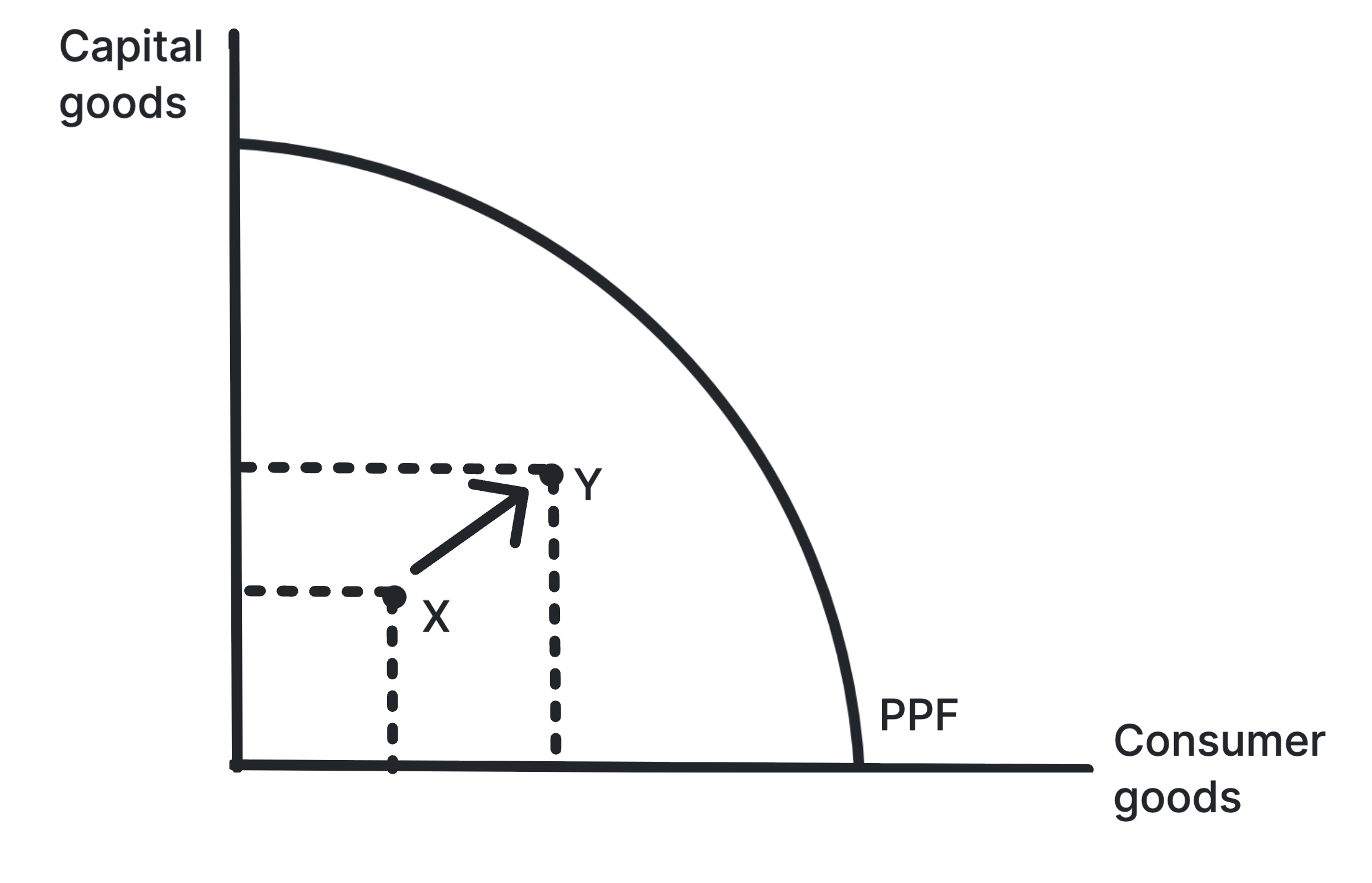
Shows actual growth as output moves closer to the existing
PPF.
Short-run growth can occur when idle resources are brought
back into use. The economy moves nearer to its frontier, but
the frontier itself does not shift.
Use in exams: Use it for recovery from
recession, falling unemployment and higher utilisation of
spare capacity.
Shows LRAS shifting right, increasing the economy's
productive potential.
Long-run growth means the economy can produce more goods and
services sustainably. A rightward LRAS shift can raise real
GDP without the same inflationary pressure as demand-led
growth.
Use in exams: Use it for productivity,
investment, innovation, education and infrastructure.
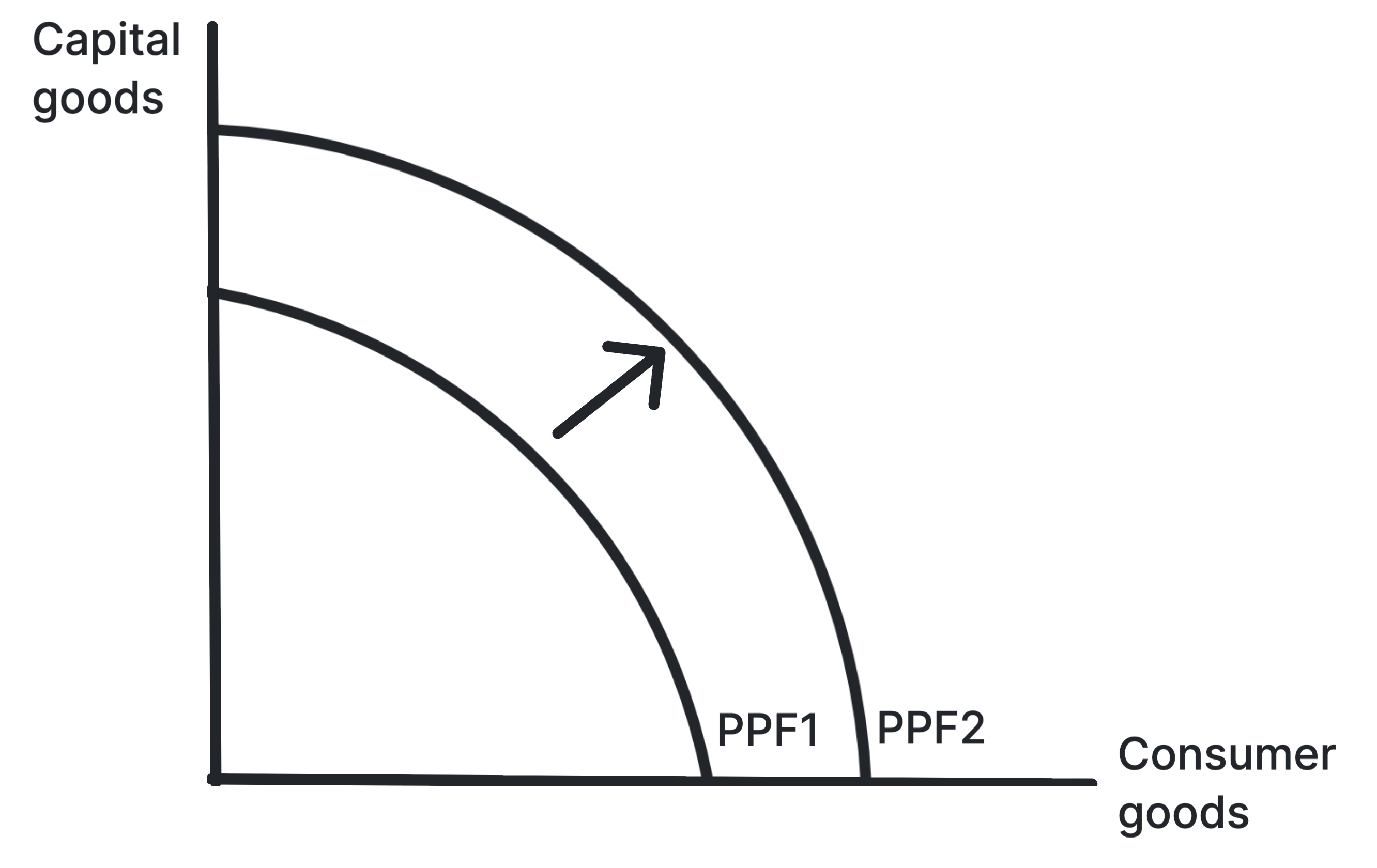
Shows the PPF shifting outward as productive potential
increases.
An outward PPF shift means the economy can produce more of
both goods. This reflects higher productive capacity rather
than simply using existing resources more fully.
Use in exams: Use it for sustainable
economic growth, capital accumulation and improvements in
labour quality.
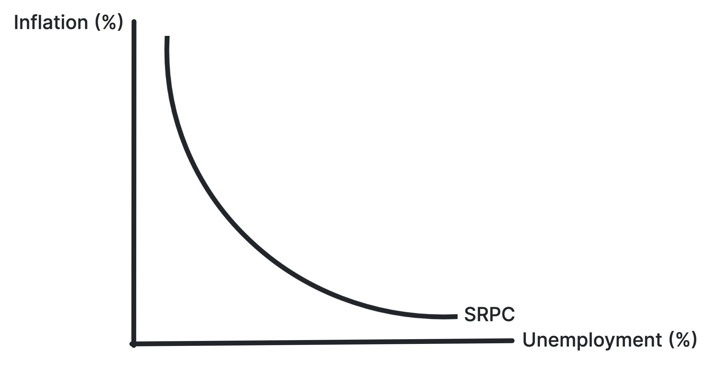
A negative output gap exists when actual GDP is below
potential GDP. This suggests spare capacity, cyclical
unemployment and downward pressure on inflation.
Use in exams: Use it for recessions,
unemployment, spare capacity and arguments for demand-side
stimulus.
Shows output below full employment on the Keynesian LRAS
curve.
In the Keynesian view, the economy can remain below full
employment because weak AD may not correct itself quickly.
Extra demand can raise output with limited inflation.
Use in exams: Use it when evaluating fiscal
or monetary stimulus during a recession.
A positive output gap exists when actual GDP is above
sustainable potential GDP. This usually creates inflationary
pressure as resources become stretched.
Use in exams: Use it for booms,
overheating, demand-pull inflation and contractionary policy.
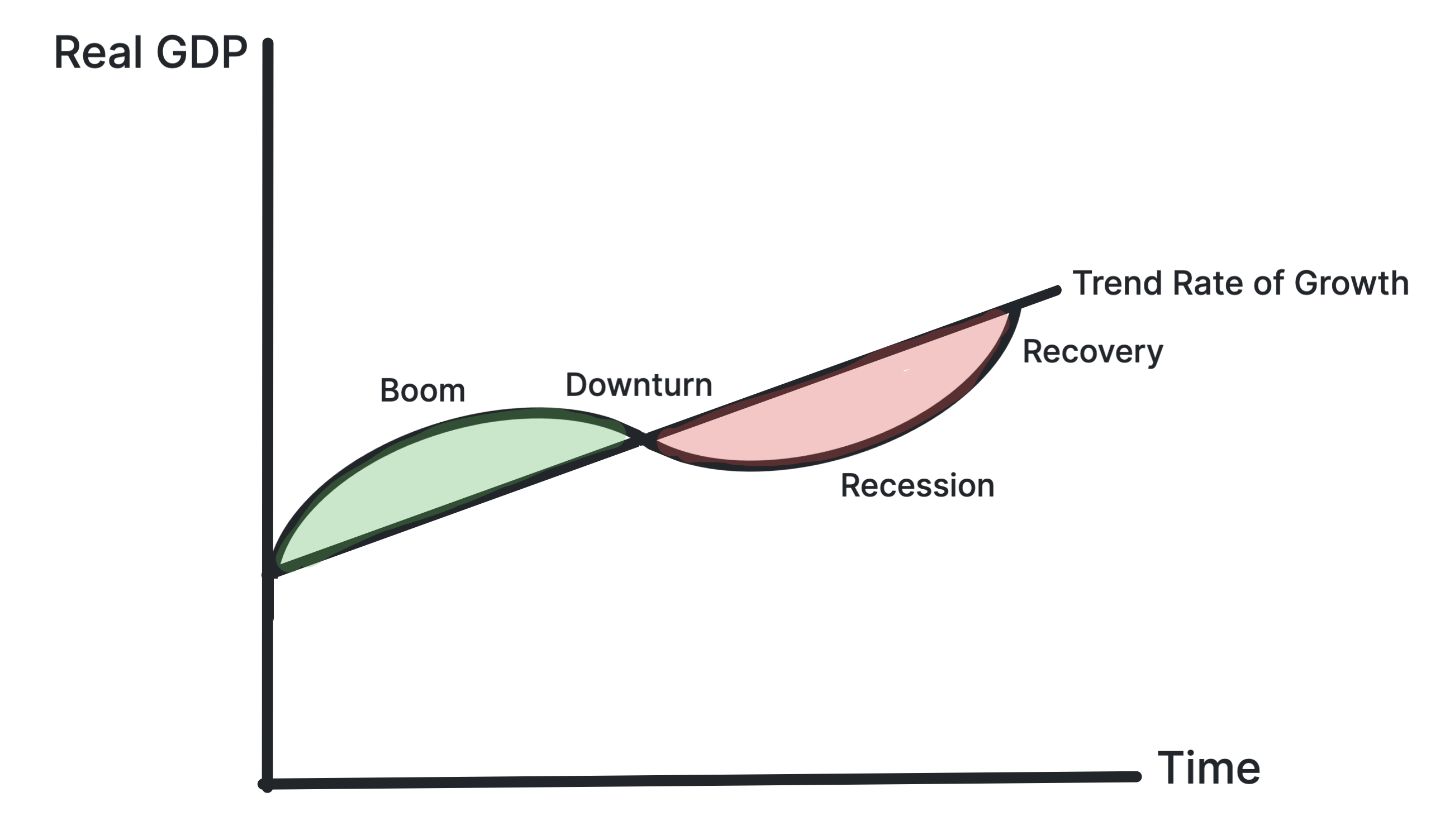
Shows boom and recession phases around a long-term trend
growth line.
The trade cycle shows fluctuations in actual growth around
the economy's long-run trend. Booms can create inflationary
pressure, while downturns can create unemployment.
Use in exams: Use it for cyclical
instability, output gaps and the timing of macroeconomic
policy.
Shows AD shifting right under expansionary fiscal or
monetary policy.
Expansionary demand-side policy increases aggregate demand.
Its impact on output and inflation depends on spare capacity
and the shape of aggregate supply.
Use in exams: Use it for tax cuts,
increased government spending, lower interest rates and QE.
Shows supply-side policy increasing full employment output
and lowering the price level.
In the Classical model, successful supply-side policy shifts
LRAS right. This increases productive potential and can
reduce inflationary pressure in the long run.
Use in exams: Use it for education,
infrastructure, deregulation, tax incentives and labour
market reforms.
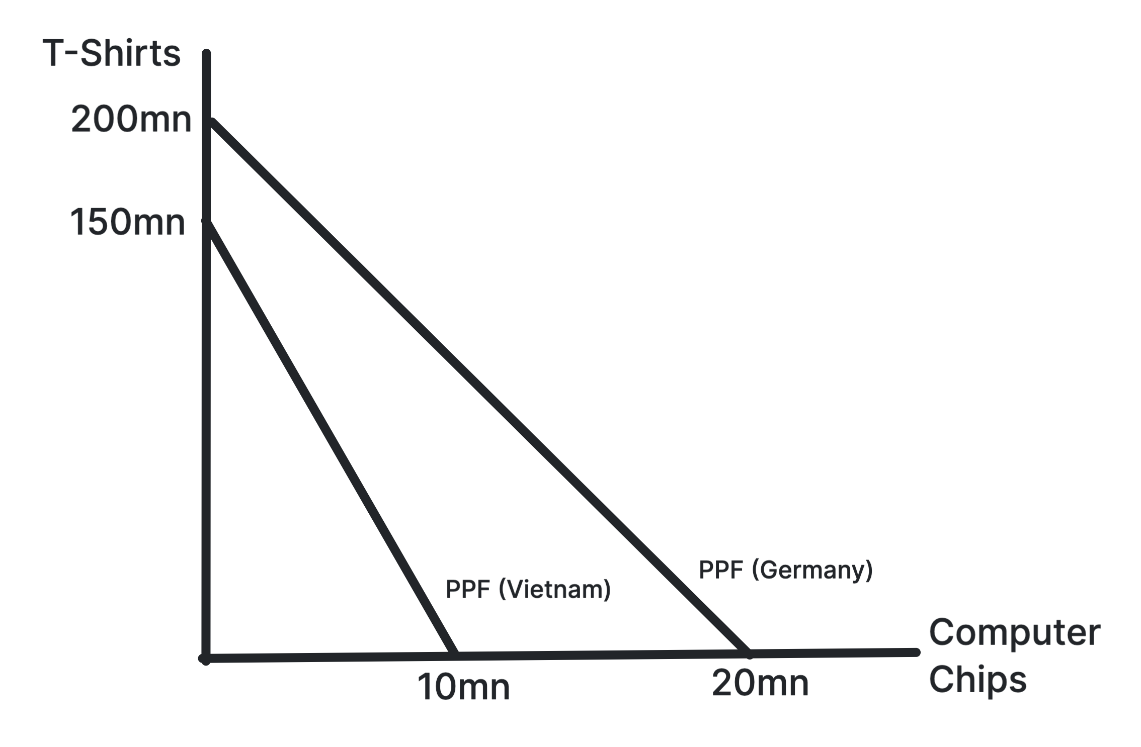
Shows how countries can specialise according to lower
opportunity cost and consume beyond their PPFs through
trade.
Comparative advantage exists when a country can produce a
good at a lower opportunity cost. Specialisation and trade
can increase total welfare even if one country has an
absolute advantage in both goods.
Use in exams: Use it for benefits of free
trade, specialisation, opportunity cost and trade patterns.
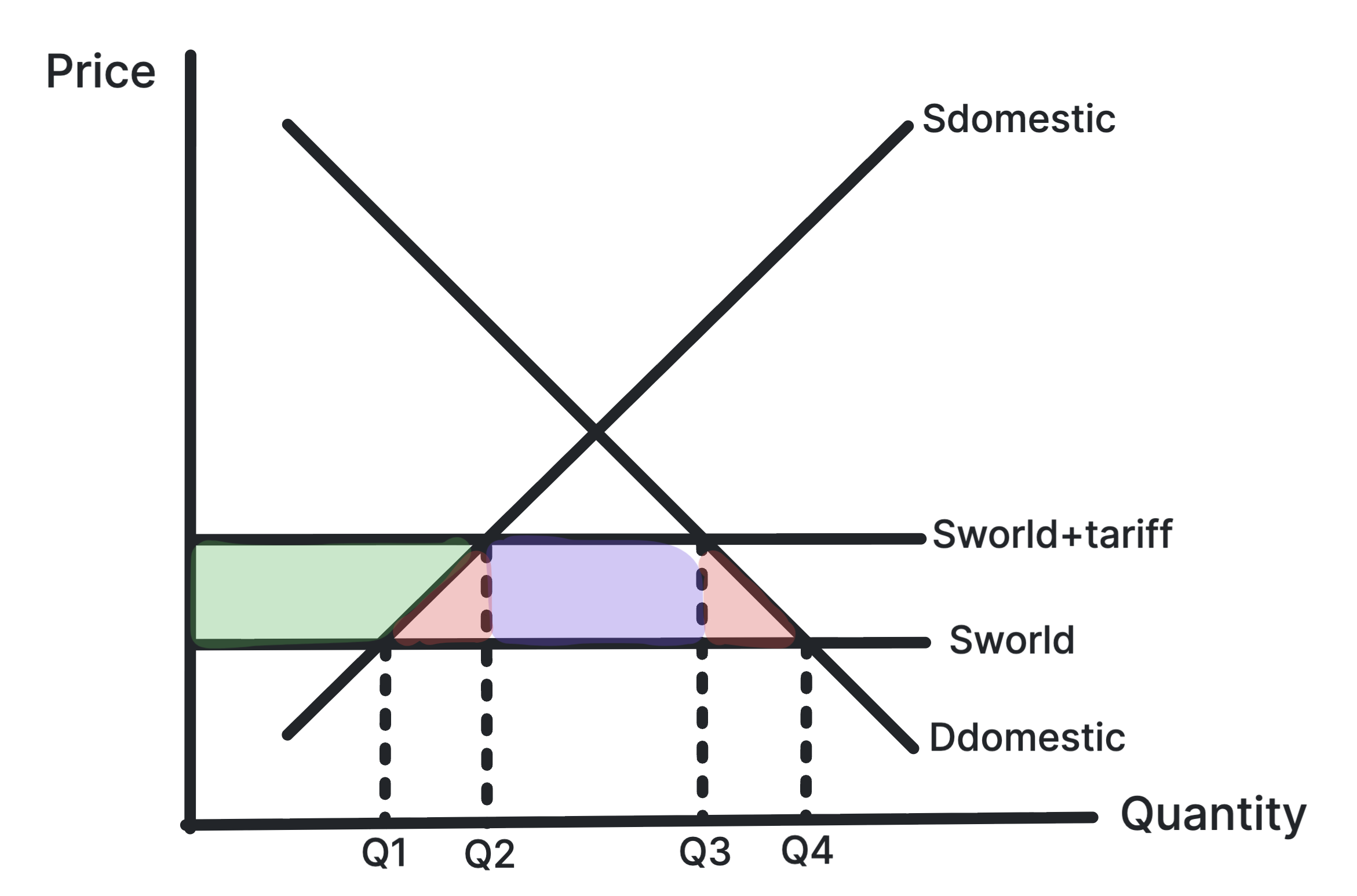
Shows a tariff raising the domestic price and reducing
imports.
A tariff raises the price of imported goods, reducing import
demand and protecting domestic producers. It can create
government revenue but also causes welfare losses.
Use in exams: Use it for protectionism,
infant industries, retaliation, consumer welfare and
government revenue.
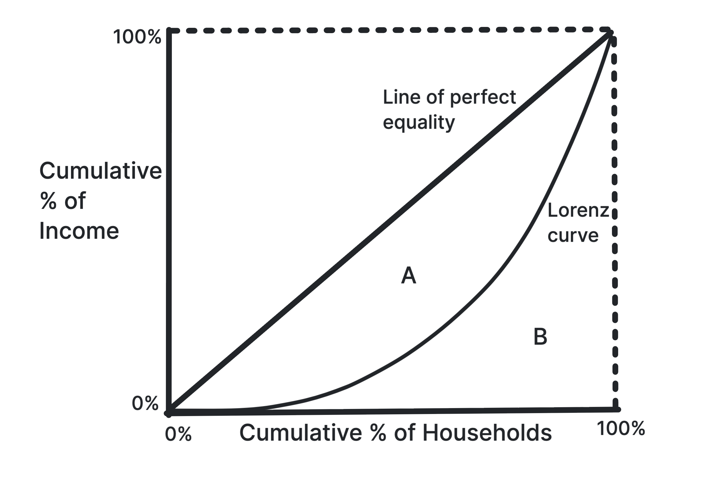
Shows inequality as the gap between the Lorenz curve and
the line of perfect equality.
The further the Lorenz curve is from the line of perfect
equality, the more unequal the distribution of income or
wealth. The Gini coefficient summarises this inequality.
Use in exams: Use it for measuring
inequality, comparing economies and evaluating redistribution
policies.
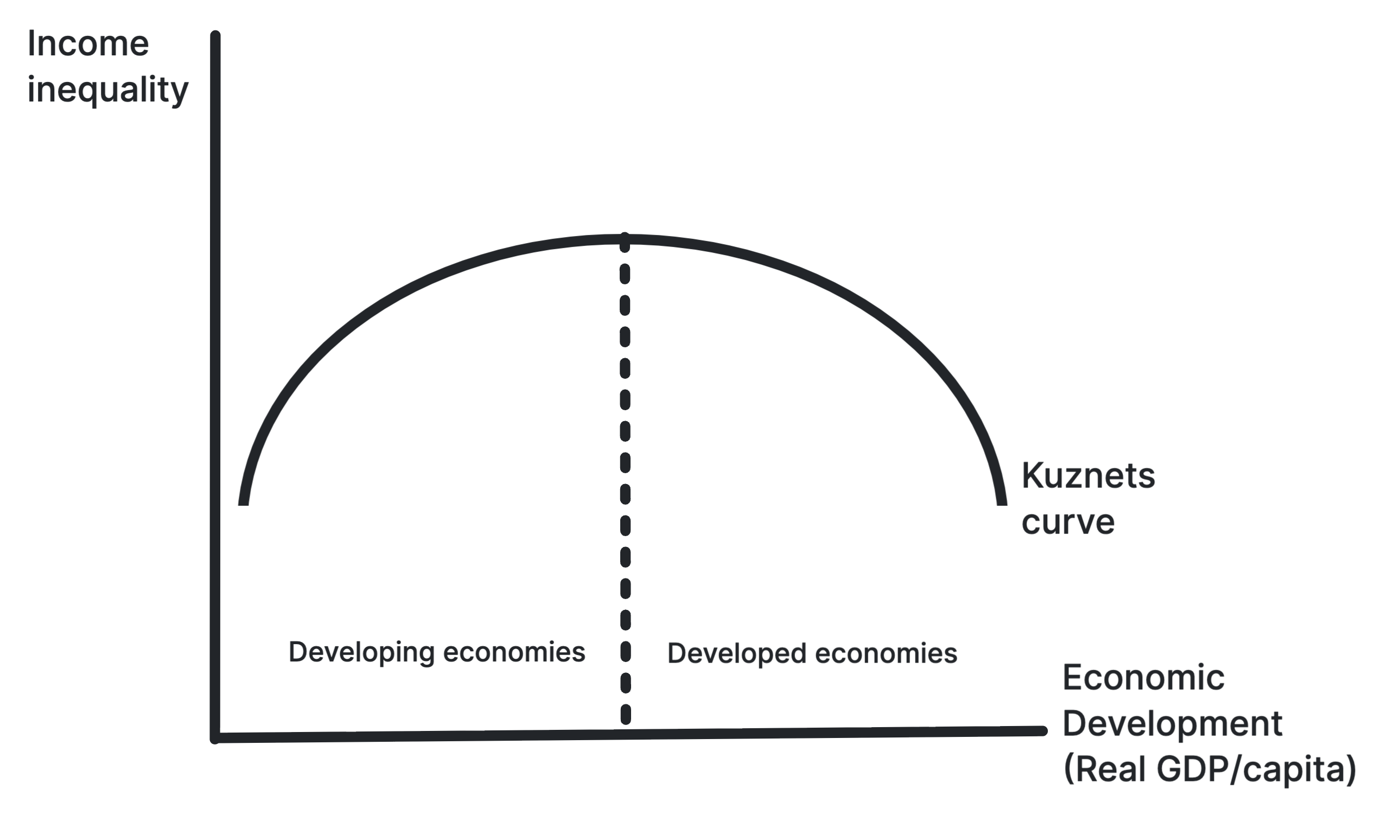
Shows the hypothesis that inequality may rise then fall as
an economy develops.
The Kuznets curve suggests early development can increase
inequality as workers move into higher-paid urban sectors,
but inequality may later fall as incomes spread and the state
redistributes more.
Use in exams: Use it for development,
structural change, urbanisation and evaluating whether growth
reduces inequality.
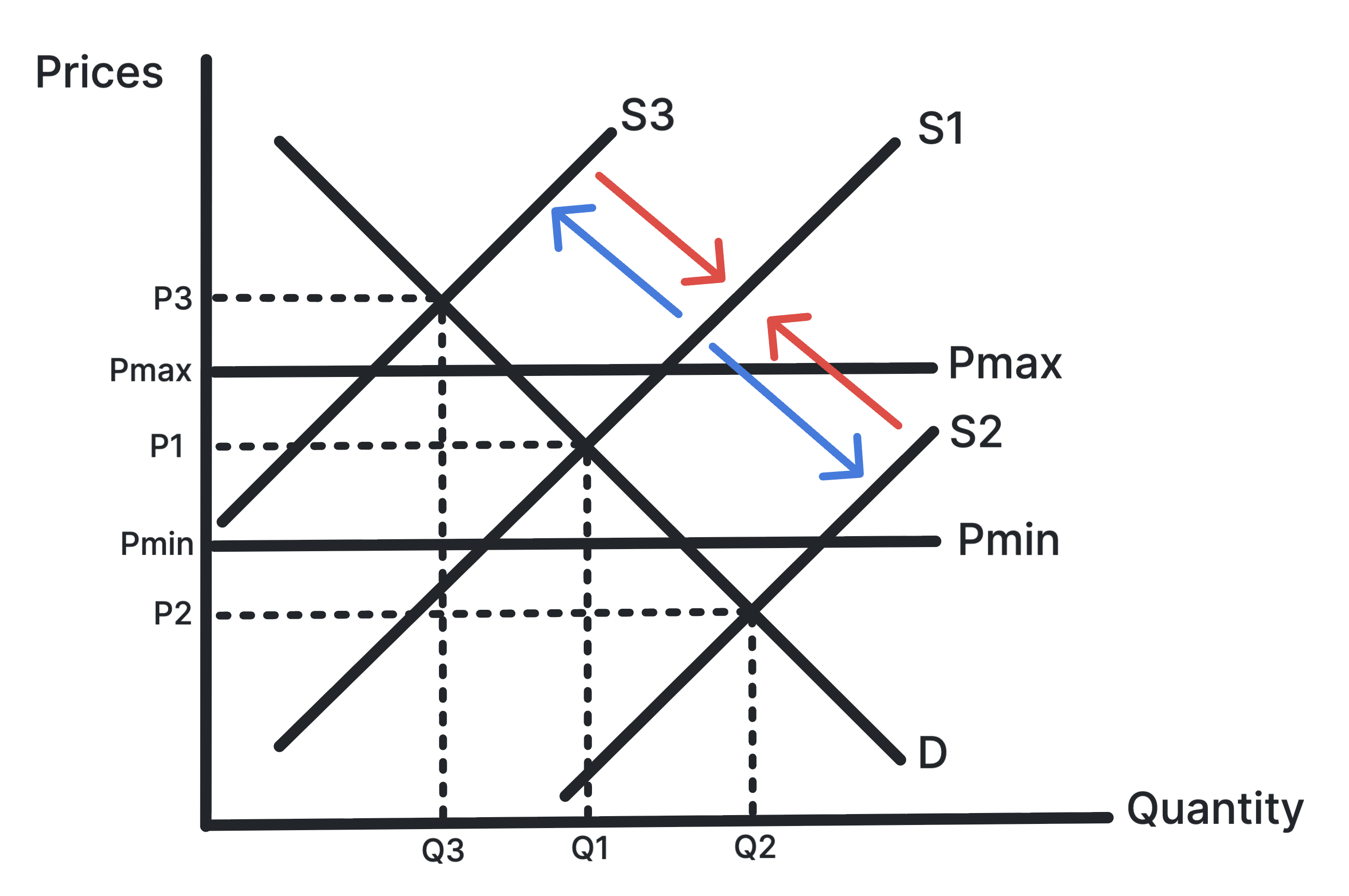
Shows stocks being bought when supply is high and released
when supply is low.
Buffer stock schemes aim to stabilise commodity prices and
producer incomes. The authority buys excess supply when
prices are low and sells stocks when prices are high.
Use in exams: Use it for primary product
dependency, price volatility and strategies for development.
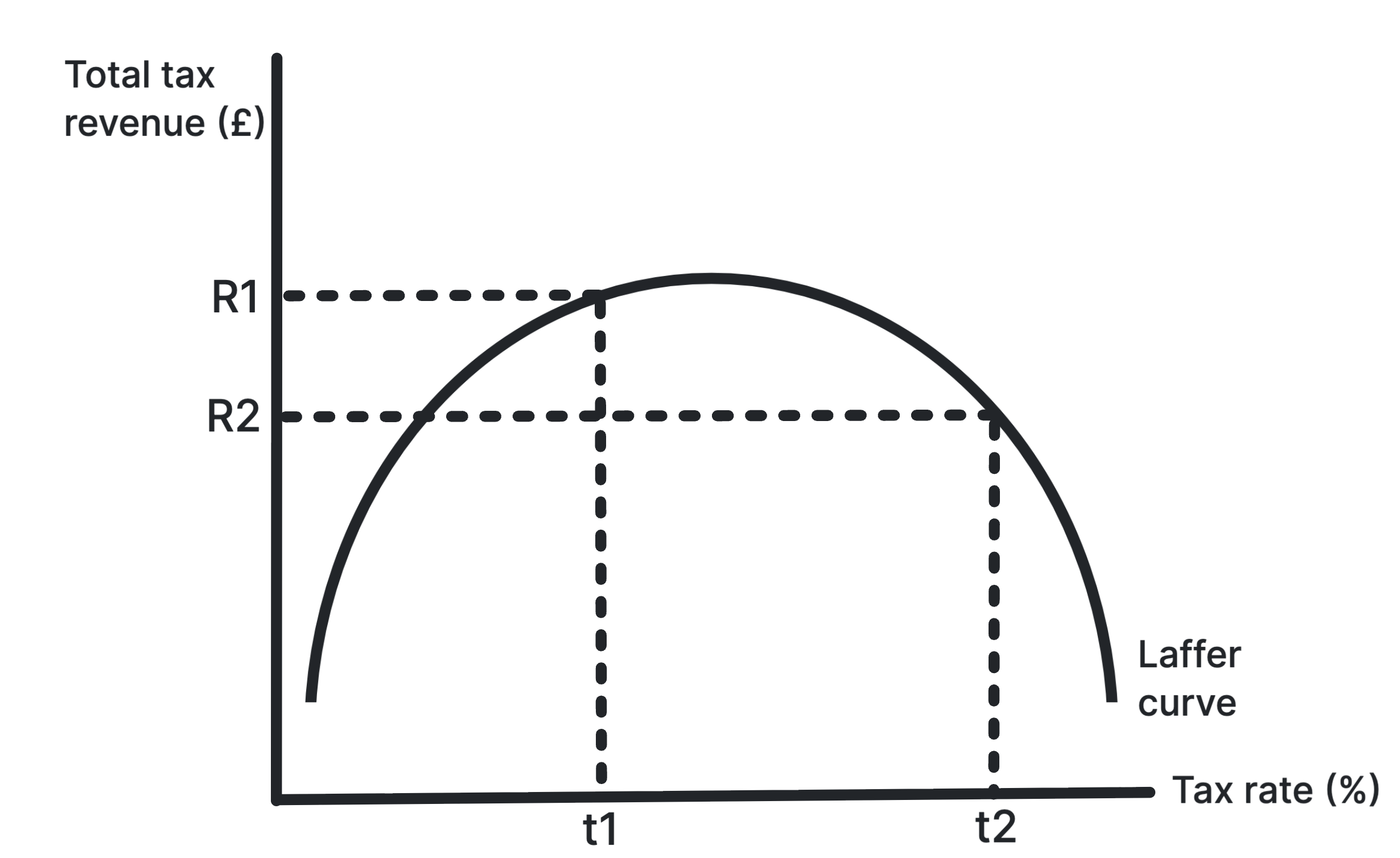
Shows tax revenue rising then falling as tax rates
increase.
The Laffer curve suggests that very high tax rates can reduce
incentives to work, invest or declare income, so total tax
revenue may fall beyond a certain rate.
Use in exams: Use it for taxation,
incentives, supply-side arguments and evaluating tax cuts.