Consumer and Producer Surplus
Definitions
Consumer Surplus: The difference between what a consumer is willing to pay (their valuation) and what they actually pay. It is a measure of consumer welfare/benefit.
Producer Surplus: The difference between the price a producer is willing to accept (their cost of supply) and the price they actually receive. It is a measure of producer welfare/profit.
Consumer & Producer Surplus at Market Equilibrium
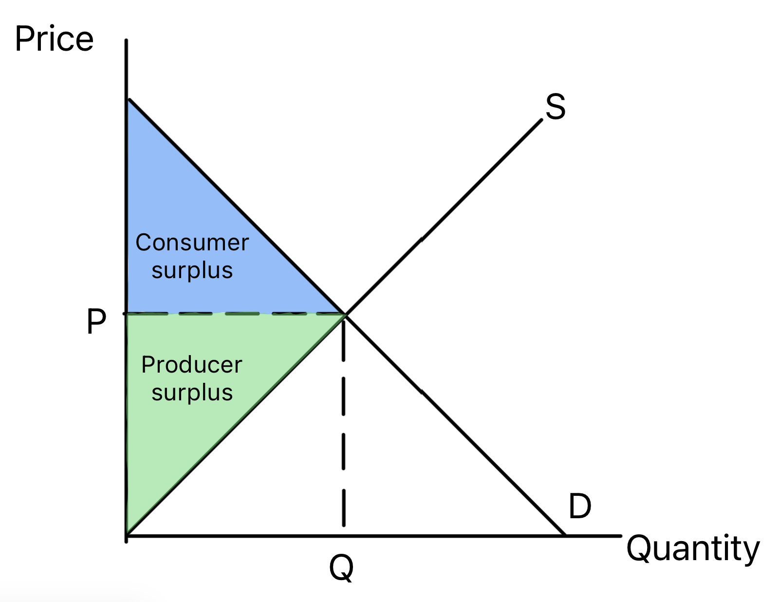
Consumer Surplus: represented by the blue area below the demand curve and above the equilibrium price line.
Producer Surplus: represented by the green area above the supply curve and above the equilibrium price line.
Social/Community Surplus: The sum of consumer and producer surplus (Triangle A + Triangle B). It represents the total welfare in the market.
Key Principle: At the free market equilibrium, social surplus is maximised. Any disequilibrium (e.g., price controls) will reduce it, creating a welfare loss.
How Changes in Market Conditions Affect Surplus
A shift in demand or supply changes the equilibrium price and quantity, thereby altering the size of the surplus areas.
Example 1: An Increase in Supply
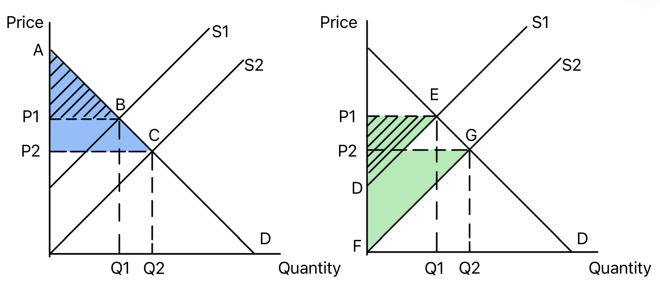
Cause: e.g., A fall in costs of production or a government subsidy.
Effect: S shifts right → Equilibrium price falls, quantity rises.
Impact on Surplus:
- Consumer Surplus ↑: Consumers pay a lower price and a larger quantity is consumed. The area of consumer surplus has increased from area ABP1 to area ACP2.
- Producer Surplus ↑: Producer surplus also increases as quantity sold rises, and producers' become more willing to supply at the lower price. The producer surplus has increased from area DEP1 to FGP2.
- Total social surplus increases
Example 2: An Increase in Demand
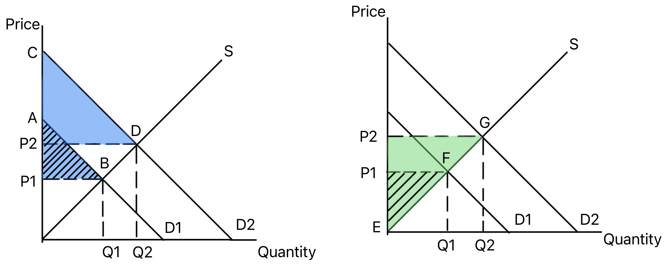
Cause: e.g., A rise in real incomes or successful advertising.
Effect: D shifts right → Equilibrium price rises, quantity rises.
Impact on Surplus:
- Consumer Surplus ↑: Consumers are willing to pay more for the good, and more is consumed. The consumer surplus increases from area ABP1 to area CDP2.
- Producer Surplus ↑: Producers receive a higher price and sell more. The producer surplus increases from area EFP1 to EFP2.
- Total social surplus increases
Monopoly Power
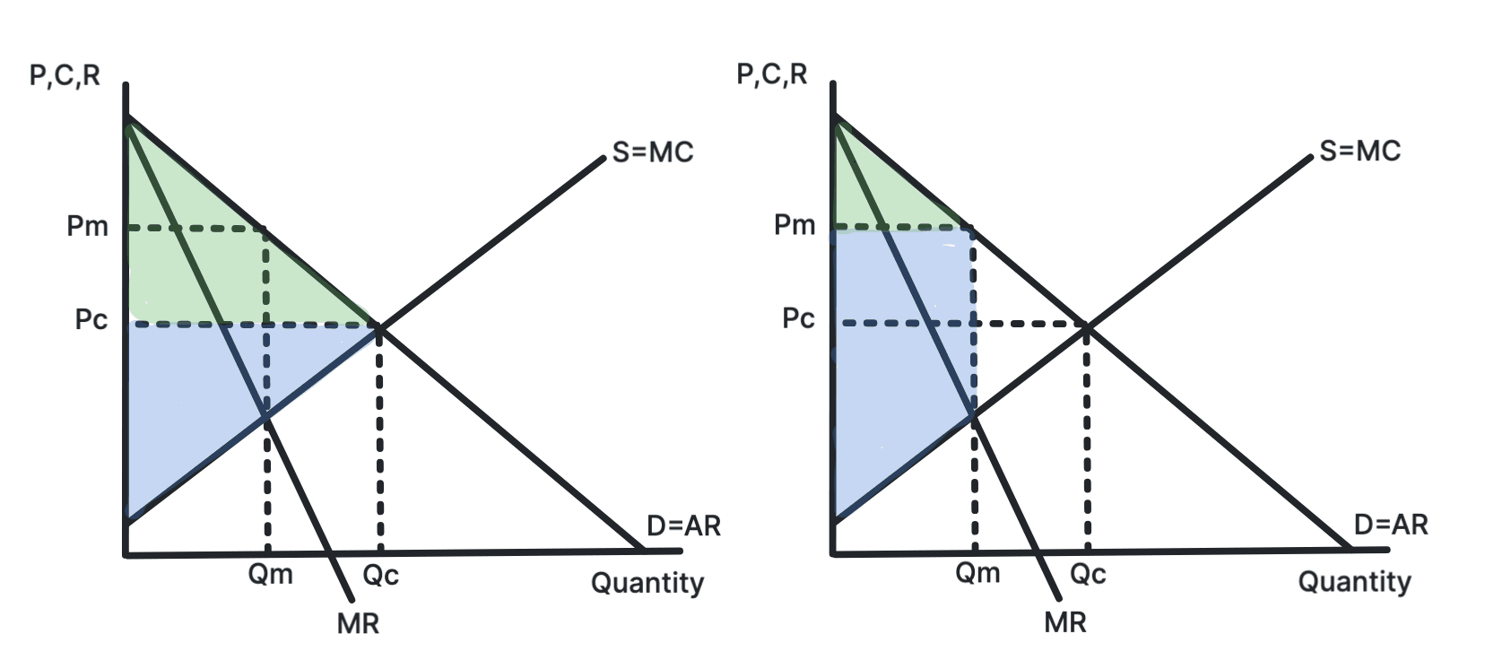
In a perfectly competitive market, consumer and producer surplus are maximised and represented in the left hand diagram by the green and blue areas respectively.
In a monopoly, consumer surplus is reduced and producer surplus is increased, as shown in the right hand diagram since the green area of consumer surplus has decreased, meanwhile the blue area of producer surplus has increased.
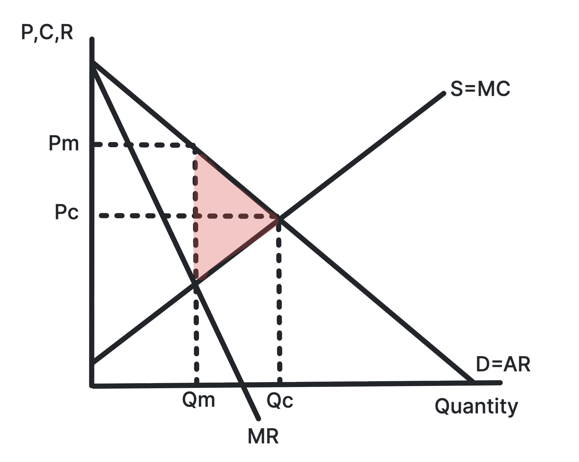
The net welfare loss in a monopoly is represented by the red triangle in Figure 5. This is the area of social surplus that is lost due to the monopoly's higher price and lower quantity compared to a perfectly competitive market.
Price Discrimination
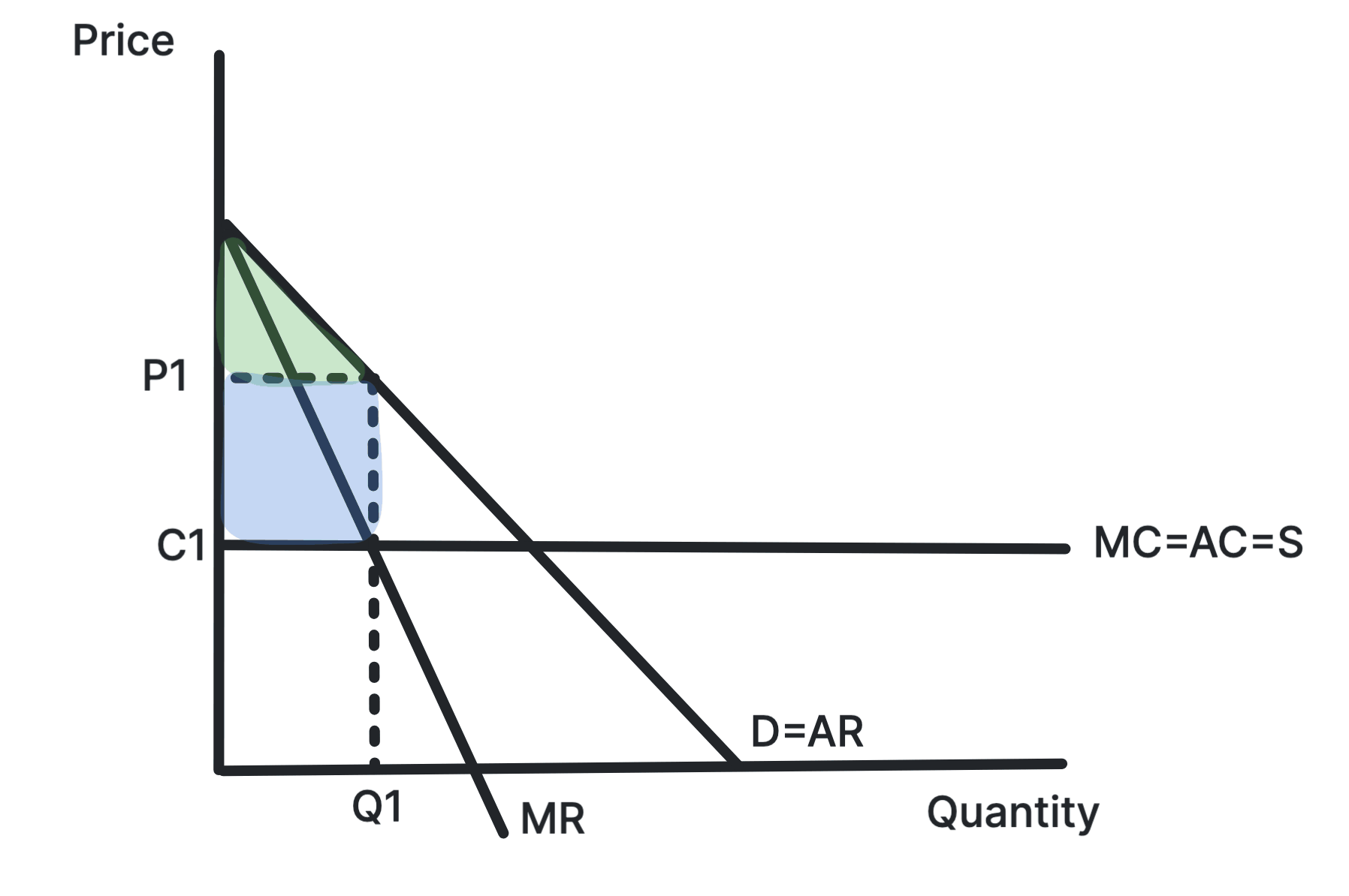
Prior to price discrimination, consumer and producer surplus are distributed as shown in Figure 6, with consumer surplus represented by the green area and producer surplus represented by the blue area.
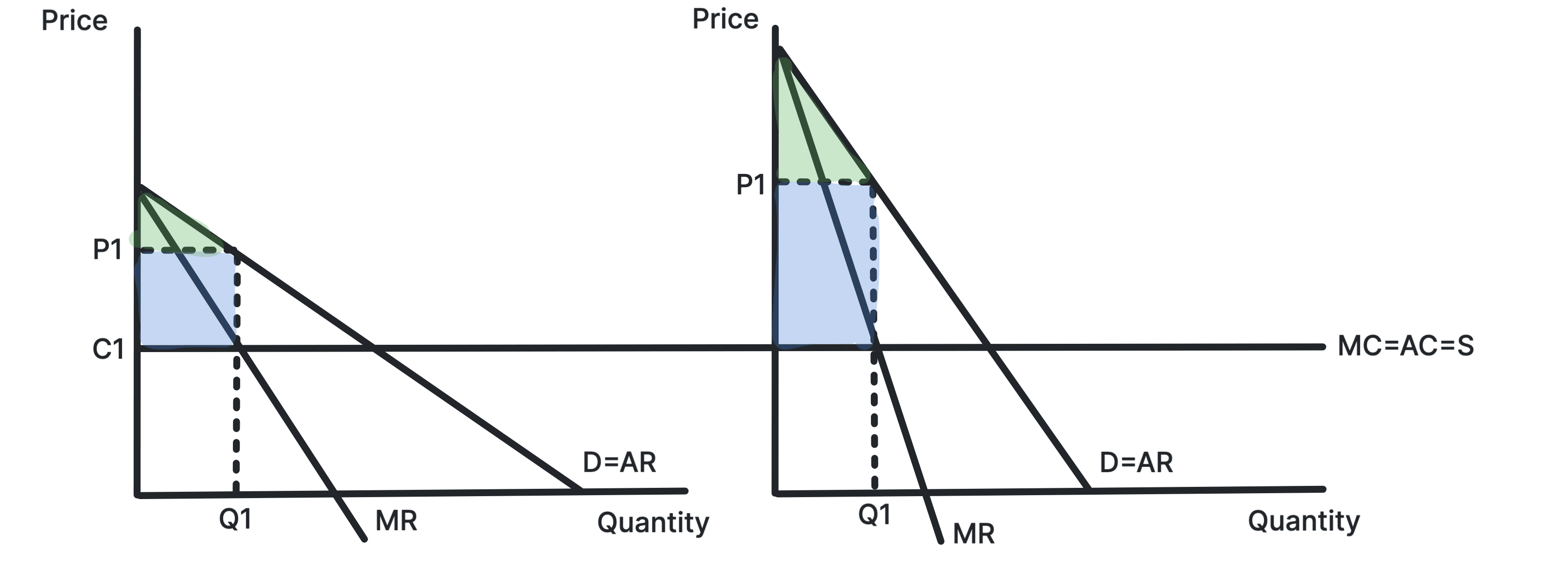
After price discrimination, consumer and producer surplus are distributed as shown in Figure 7, with consumer surplus represented by the green area and producer surplus represented by the blue area.
- Price Elastic Consumers: Benefit from a rise in consumer surplus, as they are charged a lower price and consume more.
- Price Inelastic Consumers: Lose consumer surplus, as they are charged a higher price and consume less.
- Producers: Gain producer surplus, as they are able to charge a higher price to price inelastic consumers and sell more to price elastic consumers.
Overall, consumer surplus decreases as the loss of consumer surplus for inelastic consumers outweights the gain for elastic consumers.
Stuck on this topic? Work through it with an online A-Level Economics tutor in a free 15-minute intro call, or send an essay on it for A-Level Economics essay marking.